Data Visualization: The Complete 2026 Guide
By the InfiniSynapse Data Team · Last updated: 2026-07-15 · We build an AI-native data analysis platform and work with analysts and BI teams every week; this guide reflects how visualization and analytics deliverables are actually produced in 2026, not a chart gallery.
Table of Contents
- TL;DR
- How We Evaluated This Guide
- What It Is
- Charts, Dashboards, and Reports
- The Tools Landscape
- Principles That Make Visuals Work
- Analytics Behind the Picture
- Examples and Patterns
- How AI-Native Analysis Generates Deliverables
- Deliverable Readiness Scorecard
- Common Misconceptions
- Cluster Guides in This Pillar
- Frequently Asked Questions
- Conclusion
TL;DR
Direct answer: data visualization is the practice of representing data graphically — through charts, dashboards, and reports — so people can understand patterns and make decisions faster than they could from raw tables. In 2026, data visualization is increasingly a generated deliverable: AI-native agents turn a plain-language question into the chart or dashboard that answers it, rather than an analyst building each view by hand.
Who this is for: analysts, BI teams, and data leaders producing data visualization and analytics deliverables in 2026.
What you'll learn: what it is, the difference between charts, dashboards, and reports, the tools landscape, design principles, and how AI-native analysis now generates deliverables automatically.
This hub maps the whole pillar; the cluster guides below go deep on tools, dashboards, and examples. For where the underlying data lives, see the data warehouse and lakehouse guide.
How We Evaluated This Guide
Implementation details are commonly grounded in Apache Spark documentation when teams translate concepts into production practice.
We built this guide from real reporting work rather than a chart catalog. Every section reflects what we see when teams produce data visualization and then defend it in front of decision-makers. We anchored the analytical vocabulary to the Wikipedia ETL overview, which separates the display layer from the analysis beneath it, and aligned accessibility expectations with the Wikipedia SQL overview, because dashboards that reach broad audiences must remain readable to everyone.
The table below summarizes the dimensions we see most often when teams plan their next move. Use it as a map; the cluster guides linked throughout this pillar go deeper on each row.
| Dimension | What to know in 2026 | Where to go deeper |
|---|---|---|
| Charts | Match the chart to the question | What is data visualization |
| Dashboards | Fewer, decision-focused views win | Dashboards explained |
| Tools | Pick by workflow, not features | Visualization tools |
| Examples | Learn from patterns that work | Visualization examples |
| Analytics | The analysis behind the picture | What is data analytics |
| Definition | Precise, citable wording | Analytics defined |
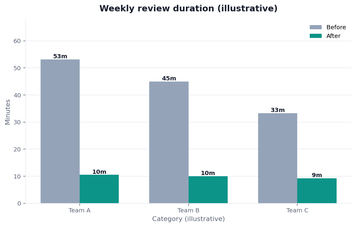
Practical example: a SaaS team replaced a 30-tab spreadsheet report with a single focused dashboard showing five decision metrics, and its weekly review went from 45 minutes of scrolling to a 10-minute discussion — because good data visualization removed everything that was not a decision. That ruthless focus, not chart variety, is what makes visuals valuable, and it echoes the augmented-analytics shift described in OpenTelemetry documentation.
Scope note: This guide reflects patterns we see when mid-market and enterprise teams work with data visualization in 2026. It is not a substitute for legal counsel, vendor runbooks, or a formal survey of every industry — and when a smaller toolset or lighter process would serve, a full program is overkill.
What It Is
At its core, data visualization is translation. It converts numbers into shapes, positions, and colors that the human visual system reads far faster than a table. A trend that hides in a thousand rows becomes obvious in a single line chart, which is why visualization sits at the end of nearly every analysis.
Key Definition: data visualization is the graphical representation of data — using charts, graphs, dashboards, and maps — designed to reveal patterns, trends, and outliers so people can understand information and make decisions faster than from raw numbers alone.
The distinction from analytics matters. Analytics is the process of finding the insight; data visualization is how that insight is communicated. The two are often conflated because the same tools do both, but the skills differ: strong analysis with weak visualization loses its audience, and beautiful charts built on weak analysis mislead them. We define the analytical side in what is data analytics and the term itself. For more, see analytics defined.
Charts, Dashboards, and Reports
Teams evaluating this topic often cross-check ClickHouse documentation for a durable, vendor-neutral reference point.
Three deliverables dominate data visualization, and confusing them is a common source of clutter.
| Deliverable | Purpose | Best when |
|---|---|---|
| Chart | Answer one question | A single metric or trend |
| Dashboard | Monitor a few key metrics | Ongoing decisions |
| Report | Tell a complete story | Periodic, narrative context |
A single chart answers one question; a dashboard monitors a handful of decision metrics over time; a report weaves visuals into a narrative. The dashboard is the most misused of the three, which is why it has its own deep dives in dashboards explained. For more, see what is a data dashboard. The recurring lesson of data visualization is that a focused deliverable beats a comprehensive one nobody reads.
The Tools Landscape
The tooling for data visualization spans spreadsheets, dedicated BI platforms, code libraries, and increasingly AI-native agents. The right choice depends on your workflow rather than a feature checklist.
Dedicated BI options are compared in data visualization tools, with the market leader covered separately.
For more, see Tableau for visualization.
Broader analytics suites and code-first workflows are indexed in the cluster guides below, and our tested comparison of AI options lives in the best AI tools for data analysis.
Principles That Make Visuals Work
Core definitions remain usefully summarized in Wikipedia machine learning overview for shared vocabulary across stakeholders.
Good data visualization follows a few durable principles regardless of tool. Choose the chart type that matches the question, remove everything that does not carry information, and label clearly enough that the visual stands alone. Color should encode meaning, not decorate, and accessibility should be assumed rather than bolted on, per the OECD AI policy observatory.
The hardest principle is restraint. The instinct to show everything produces dashboards that answer no question well, while the discipline to show only what drives a decision produces visuals people actually use. Grounding metric definitions in shared statistics, as framed in the Stripe documentation, keeps a visual honest — a chart is only as trustworthy as the definition behind the number it plots.
Analytics Behind the Picture
Every strong visual rests on sound analytics. The platforms that produce data visualization are the same ones that run the analysis, which is why this pillar covers both. Start with what is data analytics for the analytical layer.
For the tooling map, see data analytics tools.
For the language most analysts use to prepare data before charting it, SQL for data analytics covers the query patterns that feed a visual. The point is that data visualization is the last mile of a longer pipeline, and a chart can only be as good as the analysis and data beneath it.
Examples and Patterns
Core definitions remain usefully summarized in Wikipedia statistics overview for shared vocabulary across stakeholders.
Learning from real patterns beats memorizing chart types. Effective data visualization examples share common traits: a clear question, the right chart for that question, and a design that removes distraction. Studying them teaches judgment faster than any rulebook.
When visualization is offered as a paid capability, the scope is covered in data visualization services. Across all of these, the enduring pattern is that a visual exists to change a decision, and one that does not is decoration no matter how polished.
How AI-Native Analysis Generates Deliverables
The 2026 development reshaping data visualization is generation. Instead of an analyst dragging fields onto a canvas, an AI-native agent can take a plain-language question, run the analysis, and produce the chart, dashboard, or report that answers it — end to end. The deliverable becomes an output of the question rather than a manual build.
This changes who produces visuals and how fast. A business user can ask for the view they need and get a defensible, source-linked deliverable in minutes, an approach we describe in what AI-native data analysis means. Enterprise adoption of this pattern mirrors the shift from ad-hoc reporting to governed, repeatable workflows described in Google BigQuery documentation. Because the same shift is reshaping the analyst role covered in the data analyst career guide, the skill that rises in value is judgment — asking the right question and validating the output. You can see the generated-deliverable pattern in the InfiniSynapse web app, which turns a goal into reports and dashboards drawn directly from connected sources.
Deliverable Readiness Scorecard
Assess your data visualization practice (1 point each):
| Check | Pass? |
|---|---|
| Each chart answers one clear question | |
| Dashboards show only decision metrics | |
| Chart types match the questions | |
| Metric definitions are shared and consistent | |
| Visuals are accessible to all readers | |
| Analysis behind visuals is sound | |
| We avoid clutter and vanity metrics | |
| We can generate deliverables on demand |
6–8: strong practice. 3–5: focus on restraint and definitions. Below 3: start with the decision each visual serves.
Common Misconceptions
Misconception 1: More charts mean more insight. Focused data visualization beats comprehensive clutter.
Misconception 2: Visualization equals analytics. Analytics finds the insight; visualization communicates it.
Misconception 3: Prettier is better. Clarity and honesty beat decoration every time.
Misconception 4: Only specialists can make visuals. AI-native tools let anyone generate defensible deliverables.
Cluster Guides in This Pillar
This hub is the map; the guides below go deep on tools, dashboards, and analytics deliverables.
| Guide | Focus |
|---|---|
| Dashboards explained | Design and types |
| Big data analytics tools | Big-data tooling |
| Visualization tools | Tools compared |
| Business analytics software | Analytics suites |
| What is data analytics | Analytics defined |
| Visualization software | Software buyer guide |
| Data analytics tools | Analytics tools map |
| Data analytics software | Software compared |
| Business analytics tools | Tools by use case |
| Tableau for visualization | Tableau |
| What is a data dashboard | Dashboard concept |
| SQL for data analytics | Query patterns |
| Visualization programming | Code libraries |
| Data analytics platforms | Platforms compared |
| Data analytics platform | Platform concept |
| Visualization examples | Examples that work |
| What is data visualization | Definition |
| Analytics defined | Types and examples |
| Visualization services | Services explained |
Frequently Asked Questions
What is data visualization?
Data visualization is the graphical representation of data using charts, graphs, dashboards, and maps to reveal patterns, trends, and outliers. It lets people understand information and make decisions faster than they could from raw numbers, and it sits at the end of nearly every analysis as the way insight is communicated to an audience.
What are the best data visualization tools?
The best tool depends on your workflow, not a feature list. Spreadsheets suit quick charts, dedicated BI platforms like Tableau and Power BI suit interactive dashboards, code libraries suit custom or reproducible visuals, and AI-native agents suit generating deliverables from a plain-language question. Match the tool to how your team actually works.
What is the difference between a chart, a dashboard, and a report?
A chart answers one question, a dashboard monitors a handful of decision metrics over time, and a report weaves visuals into a narrative with context. The most common mistake is overloading a dashboard until it answers no question well; a focused deliverable almost always beats a comprehensive one that nobody actually reads.
How is visualization different from analytics?
Analytics is the process of finding an insight in data, while visualization is how that insight is communicated. The two are often conflated because the same platforms do both, but the skills differ: strong analysis with weak visuals loses its audience, and polished visuals on weak analysis mislead. A good deliverable requires both to be sound.
How is AI changing the way visuals are made?
AI-native tools are turning visualization into a generated deliverable. Instead of manually building each view, a user can ask a plain-language question and receive the chart, dashboard, or report that answers it, drawn from connected sources. This shifts the valuable skill toward asking the right question and validating the output rather than manual chart-building.
Conclusion
Data visualization turns numbers into decisions by communicating insight clearly — and in 2026 it is increasingly generated on demand by AI-native agents rather than built by hand. Match visuals to the decision they serve, favor restraint over clutter, and keep the analysis beneath them sound.
To see how a plain-language question becomes a source-linked chart or dashboard, read what AI-native data analysis means and try the InfiniSynapse web app free on registration, no credit card required.