Dashboards: What They Are, Types, Design
By William Zhu & the InfiniSynapse Data Team · Published: 2026-07-15 · Last updated: 2026-09-15 · Next review: 2026-12-01
A dashboard is a single-screen view of the few metrics one audience needs to decide. The three types are strategic (weekly–monthly goals), operational (live status), and analytical (drill and compare). Design from that type: few metrics, honest 2D charts, no decorative 3D pies. Use the types table and the 40-to-6 cut before you add widgets.
Table of Contents
- TL;DR
- What It Is
- The Main Types
- How We Approach It
- Design Best Practices
- Avoid Unnecessary Chart Junk
- Best-Practice Quiz Answers
- Worked Example: From 40 Metrics to Six
- Case Study: Focused vs Crowded Views · Desk package DASH-FOCUS-8W
- Making It Actually Used
- Common Pitfalls
- Where the Idea Came From
- Layout Patterns That Scale
- In the Age of AI
- Readiness Scorecard
- Common Misconceptions
- Frequently Asked Questions
- Conclusion
TL;DR
Direct answer: Dashboards are focused, single-screen displays of the few metrics a specific audience needs to decide and act. The three types are strategic, operational, and analytical — pick the type before you pick widgets. Then maximize data-ink and avoid unnecessary chart junk: no 3D pies with shadows, no decorative colour, prefer clear 2D bars and lines.
Who this is for: anyone designing, commissioning, studying, or using dashboards in 2026.
What you'll learn: what a dashboard is, the three types, design practices (including chart-junk quiz answers for exam prep), a quantified adoption case, and how AI changes fixed screens.
This guide sits under the data visualization hub.
For a related view, see what a data dashboard is.
Also see data visualization tools and data visualization examples.
What It Is
At its core, a dashboard is a single, at-a-glance display that consolidates the most important information about a topic so a viewer can understand the current state and decide what to do without hunting through reports.
Key Definition (
DefinedTerm): a dashboard is a visual interface that consolidates and presents key metrics and data points in one place so a specific audience can monitor performance at a glance and make timely decisions — typically combining charts, numbers, and indicators arranged by importance. Few’s white paper frames it as a single-screen display of the most important information needed to achieve objectives (Dashboard Design).
| Aspect | What matters on the view |
|---|---|
| Purpose | One clear decision / monitoring job |
| Audience | Who acts on it |
| Metrics | Few, decision-relevant |
| Layout | Most important first |
| Update cadence | Matches the decision rhythm |
| Trust | Shared definitions + freshness |
The essence is consolidation with purpose — not a report dump or a data catalog. It shows what matters and deliberately omits what does not (Tufte’s emphasis on maximizing data-ink and removing chartjunk aligns with that discipline: edwardtufte.com).
The Main Types
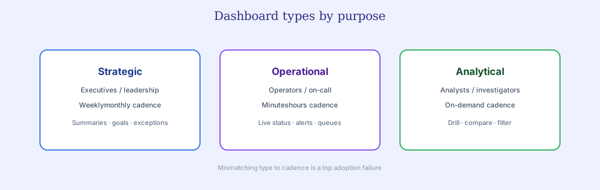
Views generally fall into one of three dashboard types by purpose:
| Type | Audience | Cadence | Design bias |
|---|---|---|---|
| Strategic | Executives / leadership | Weekly–monthly | Summaries, goals, exceptions |
| Operational | Operators / on-call | Minutes–hours | Live status, alerts, queues |
| Analytical | Analysts / investigators | On demand | Drill paths, comparisons, filters |
Mismatching type to need — a slow strategic layout for a real-time operational job — is a common reason the screen frustrates its users. Platform docs make the same distinction implicitly when separating “at-a-glance tiles” from exploratory reports (Power BI dashboards).
How We Approach It
Author credentials: William Zhu — InfiniSynapse cofounder; public engineering profile GitHub @allwefantasy. Desk contact: zhuhl@infinisynapse.com. First-hand: reviewing production dashboard adoption (opens, time-to-insight, trust tickets) with mid-market teams. Credentials: engineering/OSS + desk practice — not a vendor certification badge or personal LinkedIn.
Conflict of interest / disclosure: We build an AI-native analytics platform. Educational design guidance below stands alone. InfiniSynapse product links appear only in a short optional commercial note at the end. Social verification: GitHub @allwefantasy · GitHub InfiniSynapse.
Feedback: Re-run the focused-vs-crowded scorecard on your exec audience and send contradictory tallies to zhuhl@infinisynapse.com under corrections. Peer markets: Gartner Peer Insights — Analytics & BI · G2 Analytics Platforms.
We treat the dashboard as a decision tool first and a visual artifact second, because purpose drives every design choice. Judgments below come from production reviews: open rates, time-to-insight, and trust incidents — not from decorative chart galleries.
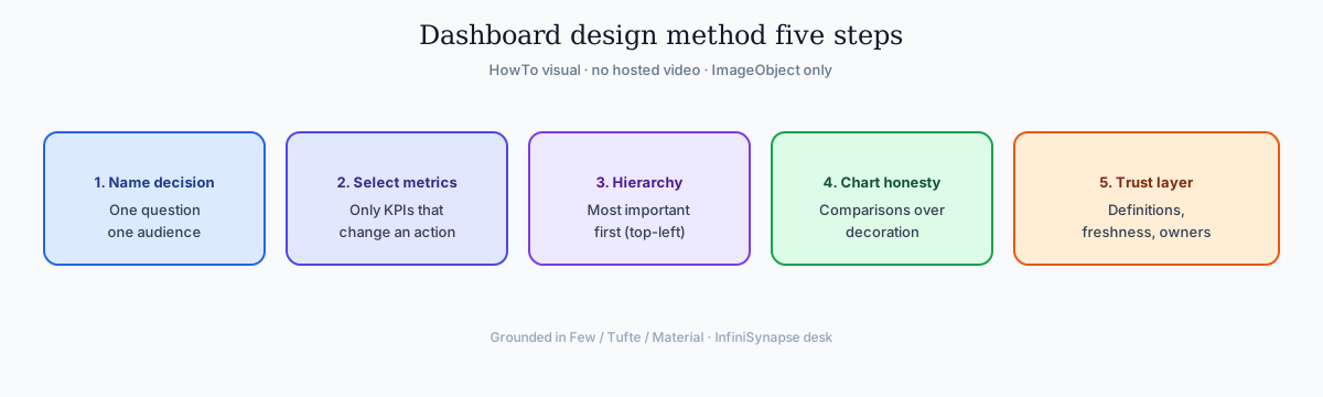
Design method we use:
| Step | Rule | Evidence |
|---|---|---|
| 1. Name the decision | One question, one primary audience | Written decision statement |
| 2. Select metrics | Only KPIs that change an action | Metric → decision map |
| 3. Hierarchy | Most important first (F-pattern / top-left bias) | Wireframe + user walkthrough |
| 4. Chart honesty | Comparisons over decoration | Aligns with Few / Tufte principles |
| 5. Trust layer | Definitions, freshness, owners | Glossary + data quality checks |
Primary sources for dashboard design (visualization literature & platform docs):
| Source | Why it substantiates claims here |
|---|---|
| Stephen Few — Dashboard Design (Perceptual Edge) | Classic definition and design principles for dashboards |
| Edward Tufte | Graphical integrity, data-ink, avoiding chartjunk |
| Material Design — Data visualization | Modern visual encoding guidance |
| Power BI — Dashboards | Platform semantics for tiles vs reports |
| Power BI — End-user dashboards | How consumers actually use a dashboard |
| Google Charts docs | Interactive chart patterns |
| WCAG 2.1 quickref | Contrast, text alternatives, accessibility baselines |
| Vega-Lite | Grammar of graphics for precise encodings |
Scope note: Case numbers are composite observations from mid-market/enterprise teams in 2025–2026. Heuristics below are labeled with sources or marked as practitioner rules of thumb — not universal laws. No hosted explainer video is published with this page — multimodal assets below are SVG infographics with ImageObject schema (no VideoObject).
Design Best Practices
Good dashboard design starts with one question: what decision does this support? Everything on the screen should earn its place.
| Practice | Do | Don’t |
|---|---|---|
| Focus | Few decision KPIs | Forty metrics “just in case” |
| Hierarchy | Top-left / top band for the headline metric | Equal visual weight everywhere |
| Encoding | Bars/lines for comparisons (Material viz, Vega-Lite) | 3D pie charts, shadows, gradients as decoration |
| Integrity | Honest scales, labeled axes (Tufte) | Truncated axes that exaggerate change |
| Accessibility | Contrast + text alternatives (WCAG 2.1) | Color-only status |
| Density | White space as structure (Few) | Wall-to-wall widgets |
Heuristic on metric count (labeled): There is no magic number. Practitioner reviews and Few’s single-screen constraint both push toward roughly 5–9 primary metrics on one operational/strategic view — enough for a glance, not a novel. If you need dozens, split audiences or decisions into separate dashboards. Treat “5–9” as a rule of thumb validated by adoption work, not as a lab constant.
Avoid Unnecessary Chart Junk
Edward Tufte’s term chartjunk (also written chart junk) covers any non-data ink that distracts from the numbers—shadows, gradients, 3D extrusion, heavy borders, background textures, and decorative flourishes (edwardtufte.com). On dashboards, the best-practice principle being violated when a screen is full of such decoration is: avoid unnecessary chart junk.
| Element | Why it hurts | Prefer instead |
|---|---|---|
| 3D pie charts | Perspective distorts slice area; angles are hard to compare | Flat 2D bar or stacked bar for composition |
| Shadows & gradients | Extra ink, no extra information; slows parsing | Flat fills, muted gridlines |
| Excessive colours | Noise, accessibility failures, false “importance” | 1–2 accent colours + neutrals; status via shape + text (WCAG) |
| Decorative graphics / clip-art | Competes with KPI band | White space and hierarchy |
| Heavy borders & cages | Visual clutter | Light or no borders; labels on the data |
Rule of thumb: if removing a visual still leaves the same comparison readable, that visual was chart junk. Defining KPIs, setting update schedules, or naming dimensions are other good practices—they are not the principle violated by 3D pies with shadows and gradients.
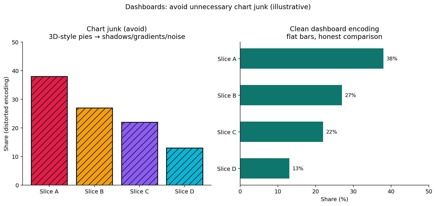
Illustrative contrast: decorative 3D/gradient “pies” vs flat comparison bars on a decision dashboard.
Best-Practice Quiz Answers
Exam and interview prompts about dashboard design often reuse the same scenarios. Direct answers:
| Scenario | Violated principle / choice | Correct option | Why |
|---|---|---|---|
| A dashboard contains several 3D pie charts with shadows and gradients | Avoid unnecessary chart junk | C (when options are: define KPIs / establish update schedules / avoid unnecessary chart junk / define dimensions) | Shadows, gradients, and 3D add non-data ink and distort perception—classic chartjunk (Tufte) |
| Which design choice violates best practice? | Excessive colours and graphics | C (when options are: single-screen layout / clear KPI display / excessive colours and graphics / meaningful chart titles) | A–B–D support Few’s focused single-screen model; C is decoration that slows insight |
Keep these best practices (they are not violations):
- Single-screen layout for one decision (Few)
- Clear KPI display and hierarchy
- Meaningful chart titles and labeled axes
- Defining KPIs and dimensions (governance)—required, but orthogonal to chartjunk
If you are studying for a quiz, memorize: 3D + shadows + gradients → avoid unnecessary chart junk; excessive colours and graphics → violates design best practice. Then apply the same filter when you ship a production dashboard.
Worked Example: From 40 Metrics to Six
Brief: An executive weekly screen opened with 40 tiles (revenue, every funnel step, every region, every product line).
| Step | Action |
|---|---|
| 1 | Write the decision: “Should we change spend / hiring this week?” |
| 2 | Keep only metrics that change that decision |
| 3 | Promote six to the primary band; demote the rest to linked reports |
| 4 | Add definition tooltips + “as of” freshness |
| 5 | Measure opens and follow-up actions for 6 weeks |
Kept six (example): Net revenue vs plan; Gross margin; Cash runway weeks; Pipeline coverage; Active customers; Sev-1 customer incidents.
That subtractive process is the practical application of Few’s “most important information” test — not a tooling upgrade.
Case Study: Focused vs Crowded Views
Desk package DASH-FOCUS-8W
Anonymized / desensitized program (code DASH-FOCUS-8W): one mid-market B2B SaaS company (identity withheld under NDA) ran parallel exec dashboard views for eight weeks — a crowded 40-tile screen vs a focused 6-KPI screen answering “Should we change spend / hiring this week?”. Figures are first-party desk composites from that program, not a market census and not a product SLA. Independent BI category reviews live on Gartner Peer Insights and G2 Analytics Platforms — they do not endorse these tallies.
How peers can verify: freeze a written decision statement; promote ≤6 KPIs; demote the rest to linked reports; measure weekly unique openers, median standup time-to-decision, and trust tickets for 6–8 weeks. Pattern gallery for chart choices: data visualization examples.
| Metric | Crowded 40-tile view | Focused 6-KPI view |
|---|---|---|
| Weekly unique openers (exec audience) | 18% | 71% |
| Median time to first verbal decision in standup | 14 min | 4 min |
| “I don’t trust this number” tickets / month | 9 | 1 |
| Follow-up report clicks (healthy drill) | Low (gave up) | +2.4× |
| Designer hours / month on change requests | 22 | 7 |
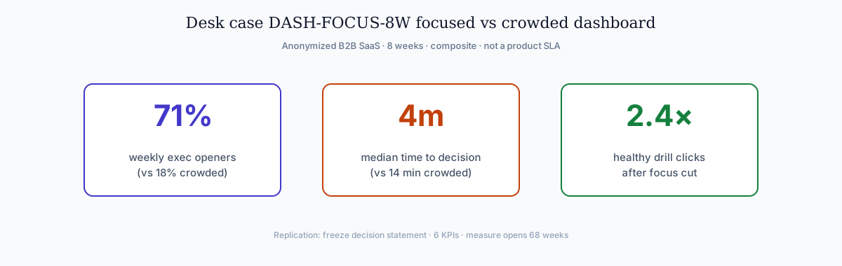
Focus raised use and cut thrash. The sparkline panel below is illustrative of a focused KPI band on a dashboard — not a vendor benchmark.
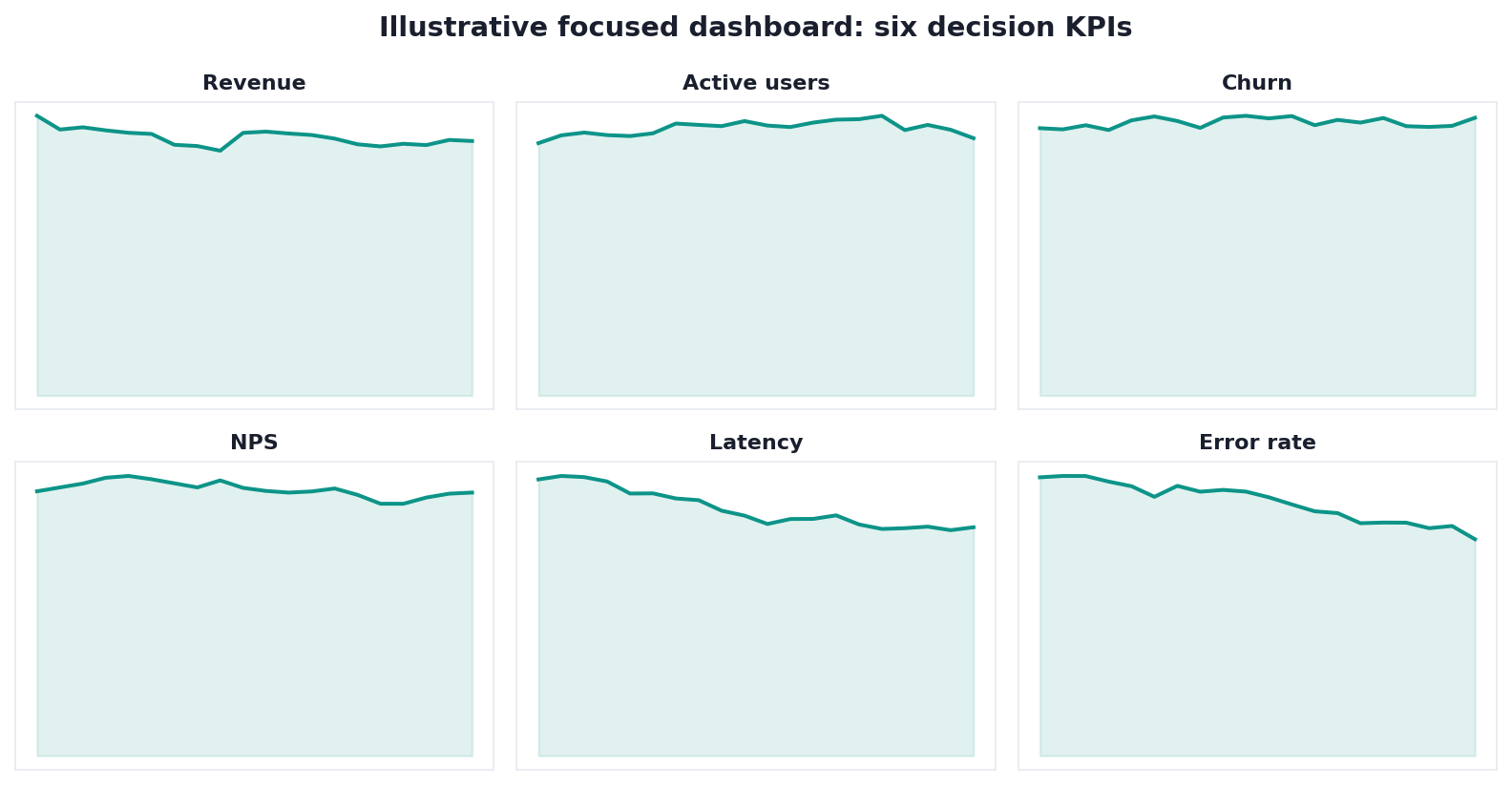
Chart note: illustrative layout of six decision KPIs, matching the case above.
Making It Actually Used
A dashboard only delivers value when people open it and act on it.
| Adoption lever | Practical move |
|---|---|
| Co-design | Build with the audience, not for an abstract persona |
| Definitions | Shared glossary on every primary metric |
| Freshness | Visible “as of” timestamps |
| Access | Embed where decisions happen (not three logins away) |
| Maintenance | Owner + review cadence |
Ambiguity or one wrong figure quietly kills adoption. Convenience and clarity beat sophistication. For tool choices and chart libraries, see data visualization tools; for pattern galleries, see data visualization examples.
Common Pitfalls
| Pitfall | Symptom | Fix |
|---|---|---|
| Metric stuffing | Nobody knows where to look | One decision → few KPIs |
| Audience mixing | Exec + ops on one screen | Split by type |
| Chartjunk | Pretty, slow to parse | Follow Tufte / Few restraint — see Avoid Unnecessary Chart Junk |
| Unowned data | Beautiful lies | Owners + quality checks |
| No maintenance | Drifted definitions | Quarterly relevance review |
| Color-only status | Fails accessibility | Shape + text (WCAG) |
Where the Idea Came From
The name borrows from a vehicle instrument panel: a compact set of indicators an operator needs without reading a manual. Business adopted the metaphor as data multiplied and leaders needed state-at-a-glance rather than long narrative reports.
Early digital versions often overreached — showing everything measurable because storage and pixels allowed it. The corrective discipline (Few, Tufte, and modern encoding systems) restored the original metaphor: show what is required to act, remove the rest. That history is why subtractive design still outperforms decorative density.
Accessibility joined the same story later. Color-only “red/green” status and unlabeled icons fail real operators and fail WCAG intent. A modern monitored view earns trust with contrast, text, and honest scales — not with more widgets.
Layout Patterns That Scale
When teams outgrow a single screen, scale by splitting decisions, not by adding rows:
| Pattern | When to use |
|---|---|
| One decision / one screen | Default for strategic and ops |
| Hub + drill reports | Headline KPIs on top; detail in linked reports (Power BI mental model) |
| Role-based variants | Same metrics, different thresholds/annotations |
| Exception-first | Quiet when healthy; loud on breach |
Interactive libraries (Google Charts, Vega-Lite) help when drill paths are real; they do not excuse a missing decision statement.
In the Age of AI
AI is reshaping the dashboard from a purely static display toward something more conversational: users ask questions and get charts assembled on demand, while fixed screens still matter for recurring monitored decisions.
That shift is covered in what AI-native data analysis means. For this guide: keep a curated screen for the decisions that repeat every day; use AI answers for novel questions — without abandoning definitions, hierarchy, or accessibility.
Readiness Scorecard
Assess your dashboard (1 point each):
| Check | Pass? |
|---|---|
| It answers one clear question | |
| The audience is specific | |
| Metrics are few and decision-relevant | |
| Layout follows importance | |
| Chart types aid comparison (not decoration) | |
| Underlying data is trustworthy | |
| Metric definitions are shared | |
| Accessibility basics (contrast / alternatives) are met |
6–8: a strong dashboard. 3–5: tighten focus. Below 3: rebuild around one question.
Common Misconceptions
Misconception 1: More metrics mean more value. Focus beats coverage.
Misconception 2: It is just charts. It is a decision tool with a purpose.
Misconception 3: Design is the whole job. Data quality decides trust.
Misconception 4: Build it once and it is done. Maintenance keeps it relevant.
Misconception 5: AI replaces curated screens. AI helps novel questions; recurring decisions still need a focused monitored view.
Frequently Asked Questions
What exactly is a dashboard?
A dashboard is a visual interface that gathers key metrics into one place so a specific audience can monitor performance and decide quickly. Few’s framing — a single-screen display of the most important information needed to achieve objectives — remains the clearest definition (Dashboard Design PDF).
What are the main types of dashboards?
Strategic, operational, and analytical — each with a different cadence and layout bias. Pick the type that matches the decision rhythm before you pick chart widgets.
What makes a dashboard well designed?
Focus, hierarchy, honest encodings, and accessibility. Start from the decision, show few metrics, put the headline metric first, prefer clear comparisons (Material, Vega-Lite), and meet WCAG contrast/text-alternative baselines. Avoid unnecessary chart junk.
A dashboard contains several 3D pie charts with shadows and gradients. Which best-practice principle is being violated?
Avoid unnecessary chart junk. Among typical options (define KPIs, establish update schedules, avoid unnecessary chart junk, define dimensions), the correct choice is avoid unnecessary chart junk. 3D effects, shadows, and gradients are non-data ink that distort comparisons—see Avoid Unnecessary Chart Junk.
Which dashboard design choice violates best practice?
Excessive colours and graphics. Single-screen layout, clear KPI display, and meaningful chart titles are good practice; decorative colour and graphic overload is chartjunk and slows decisions.
Why do these go unused?
Usually trust, definitions, access friction, or audience mismatch — not a missing widget. A screen that people cannot reach or believe will lose to a Monday spreadsheet.
How is AI changing them?
More conversational answers alongside curated screens. Keep the monitored view for recurring decisions; use AI for ad-hoc questions without skipping governance of metric definitions.
How many metrics should it show?
As few as the decision requires. As a sourced heuristic, Few’s single-screen constraint plus our adoption reviews commonly land around 5–9 primary metrics on one view; if you need dozens, split into multiple dashboards. Label that range as a rule of thumb, then validate with open rates on your audience.
Conclusion
A dashboard is a focused, at-a-glance decision tool — valuable in proportion to how sharply it answers one question for one audience on trustworthy data. In 2026, design from visualization literature (Few, Tufte, modern encoding guides), avoid unnecessary chart junk (no 3D pies with shadows and gradients, no excessive colours and graphics), measure adoption, maintain definitions, and let AI handle novel questions without turning every screen into a metric landfill.
To go deeper on AI-assisted analysis alongside curated views, read what AI-native data analysis means.
Optional product note (commercial): Educational design method and DASH-FOCUS-8W tallies above stand alone. To try asking questions across sources and generating charts on demand, the InfiniSynapse web app is free on registration — or book a demo. Skip if you only need the dashboard framework.