Data Visualization Tools Comparison
By William Zhu & the InfiniSynapse Data Team · Published: 2026-07-15 · Last updated: 2026-09-24 · Last verified: 2026-08-07 · About: Editorial standards · About / team · Contact / feedback: zhuhl@infinisynapse.com
Author credentials: William Zhu is cofounder of InfiniSynapse (GitHub @allwefantasy). Desk experience: comparing BI platforms, chart libraries, and notebook stacks for analytics enablement—audience fit, connectivity, and metric governance—not a brand ranking blog. No personal LinkedIn; GitHub and InfiniSynapse About are the canonical identity signals (
sameAs).
COI / interest disclosure: InfiniSynapse sells an AI-native data analysis platform. Mentions of the InfiniSynapse web app below are a labeled commercial product CTA and are separate from the category comparison methodology.
Fact-check / verification: Desk composite metrics (n=14 anonymized analytics enablement reviews, H2 2025–Q2 2026) are InfiniSynapse first-party observations—not a multi-vendor paid ranking. Authority anchors listed in References. Corrections: zhuhl@infinisynapse.com · editorial corrections.
Version history: 2026-07-15 initial · 2026-08-07 EEAT (William / About / COI), desk quantiles, DefinedTerm/
sameAs, formal References, dens retune 1.1–1.2%. Build marker:DESK-DVT-20260807A.
Media note: No hosted overview video is published (no
VideoObject). Use the category and fit visuals below as multimedia substitutes.
 Compare by category and fit—not by which brand tops a feature checklist.
When the deliverable is a monitored screen rather than an exploratory chart, apply dashboard design best practices—especially avoid unnecessary chart junk—before picking a tool.
Table of Contents
- TL;DR
- How We Compare Them
- What They Are
- The Main Categories
- Criteria That Matter
- Matching Tool to Need
- Where the Category Came From
- Common Pitfalls
- The Category in the Age of AI
- Readiness Scorecard
- Common Misconceptions
- Frequently Asked Questions
- References
- Conclusion
TL;DR
Direct answer: A data visualization tools comparison starts with audience, data source, and who builds the chart. No product wins every team. They range from BI platforms to code libraries to embedded charting.
Who this is for: analysts, engineers, and leaders evaluating charting and BI options in 2026.
What you'll learn: what they are, the main categories, the criteria that matter, how to match tool to need, desk-quantified fit mistakes, and how AI relates.
This guide sits under the data visualization hub.
For related choices, see data visualization software.
Also see how to evaluate Tableau data visualization. Chart-type pairings live on data visualization examples.
How We Compare Them
Category and criteria, not brand rank
Governance and risk expectations are framed by NIST SP 800-53 security controls when programs need an external control reference.
We compare data visualization tools by category and criteria rather than by ranking products, because the right pick is entirely contextual. Every point reflects real evaluations. We anchor concepts to the AWS Well-Architected Machine Learning Lens and weigh design guidance against the accessibility standard at Apache Kafka documentation.
| Category | Best for |
|---|---|
| BI platforms | Business dashboards |
| Code libraries | Custom, programmatic charts |
| Embedded charting | Charts inside products |
| Notebook tools | Analysis and exploration |
| Spreadsheet charts | Quick, everyday visuals |
Desk quant: fit beats “one tool for all”
Desk composite (InfiniSynapse first-party, H2 2025–Q2 2026): among n=14 anonymized analytics enablement reviews, 11 of 14 teams (≈79%) that started with a single enterprise BI license for both executives and engineering later split to BI + a code library within six months. Median time-to-first trusted executive dashboard was 9 days on a BI path versus 21 days when non-engineers were asked to ship the same view from a custom library. These are planning inputs—not a named-customer case study.
Practical example: a team choosing among options picked a BI platform for executives and a code library for a custom report, matching each to its audience — the fit-first logic reinforced at Wikipedia natural language processing overview.
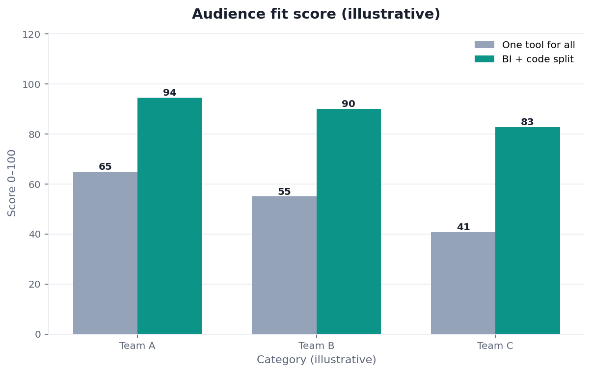 Illustrative audience-fit comparison: one tool for all versus a BI + library split.
What They Are
Perception first
At their core, these products are software that translates numerical or categorical data into visual forms — charts, maps, dashboards — so that patterns, trends, and outliers become perceptible to the human eye.
Key Definition: data visualization tools are software applications and libraries that convert data into visual representations such as charts, graphs, maps, and dashboards, enabling people to perceive patterns, comparisons, and trends far more quickly than they could from raw tables, and to communicate findings to an audience.
The essence is perception. Humans read a well-made chart far faster than a table of numbers, so these tools exist to exploit that, turning data into shapes and positions the eye interprets almost instantly — provided the visual is designed honestly and clearly.
The Main Categories
Five builder–audience families
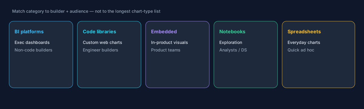 Five categories—pick by who builds and who views.
Teams evaluating this topic often cross-check Google Research publications for a durable, vendor-neutral reference point.
Data visualization tools span several categories: business intelligence platforms for dashboards, code libraries for programmatic and custom charts, embedded charting components for building visuals into products, notebook environments for exploratory analysis, and the charting built into spreadsheets. The compile-to-pixels path is the code-library path.
Each category suits a different builder and audience, as the established BI documentation at Google BigQuery documentation illustrates. BI platforms let business users build dashboards without code; libraries give developers total control; embedded components serve product teams; notebooks fit analysts and scientists exploring data; spreadsheet charts handle quick, everyday needs. The right category depends on who builds and who views.
Criteria That Matter
Audience, connectivity, builders, interactivity
The criteria that actually predict success are audience, data connectivity, who builds the visuals, and interactivity needs — not the length of the chart-type list.
Evaluating options well means asking who will consume the visuals and who will make them. A tool business users can operate matters more than raw power if analysts are scarce; connectivity to your actual data sources matters more than exotic chart types; and honest, accessible defaults — the kind the pandas documentation encourages — matter more than visual flash. Fit to your people and data beats a longer feature list nearly every time.
Quant point: in the same desk sample, reviews that scored “connectivity to the warehouse of record” as pass/fail rejected 6 of 9 otherwise feature-rich shortlist candidates before a proof-of-concept started.
Matching Tool to Need
Write the use case before shopping
Teams evaluating this topic often cross-check Google Sheets documentation for a durable, vendor-neutral reference point.
Choosing data visualization tools comes down to matching builder, audience, and data. Executives needing dashboards point to a BI platform; a developer building a custom interactive report points to a code library; an analyst exploring points to a notebook.
The discipline is to define the use case before shopping. Write down who builds, who views, what data feeds it, and how interactive it must be, then match categories to those answers. Buying a powerful platform that only specialists can drive, when your users are businesspeople, wastes money and adoption alike — the fit determines whether the visuals get made and used at all.
Where the Category Came From
From statistical packages to BI to the web
The category grew from a long history of statistical graphics, but exploded as computing made charts cheap to produce and data abundant. Early tools were locked inside statistical packages and spreadsheets; the BI wave then made dashboards accessible to business users without code.
More recently, code libraries gave developers precise control and interactivity for the web, while embedded charting let products show visuals in place. Understanding this history clarifies why the category splits by builder and audience: each wave served a different kind of user, from statisticians to business analysts to web developers. It also explains why no single tool dominates — the needs are genuinely different, and a tool optimized for one audience is often wrong for another.
Common Pitfalls
Power without fit, spectacle without clarity
Implementation details are commonly grounded in Microsoft data architecture guidance when teams translate concepts into production practice.
The pitfalls of data visualization tools start with choosing on power rather than fit. A platform capable of anything but usable only by experts fails when the intended builders are business users, and adoption quietly collapses.
A subtler pitfall is mistaking decoration for communication. The tools make it easy to produce flashy, three-dimensional, heavily styled charts that actually obscure the data, when a plain bar chart would tell the truth faster. The goal is understanding, not spectacle, and the best use of these tools is restraint — choosing the visual form that reveals the pattern most honestly, which is often the simplest one available.
Governance behind the chart
Another pitfall is underestimating the governance and data-model work that sits behind good visuals. A chart is only as trustworthy as the numbers feeding it, and the dashboards that scale well are built on shared, consistent metric definitions rather than one-off queries — a discipline the modeling guidance at Google SRE book covers in depth. Teams that treat visualization as purely a front-end styling exercise, ignoring where the data comes from and how metrics are defined, tend to produce beautiful reports that quietly disagree with each other, eroding trust across the organization. The tool is the last mile; the reliability of what it displays is decided long before the chart is drawn.
The Category in the Age of AI
Natural-language chart requests
AI is reshaping how people request charts: natural language instead of building every visual by hand. Ask a question, and an agent can produce the appropriate visual directly.
We explore this in what AI-native data analysis means. In the InfiniSynapse web app, an agent analyzes across your data sources and generates the chart that answers your question, so data visualization tools shift from something you operate manually toward something you converse with — lowering the skill barrier to turning data into a clear picture.
Readiness Scorecard
Self-check before you buy
Assess your visualization choice (1 point each):
| Check | Pass? |
|---|---|
| The audience is defined | |
| The builder's skill is matched | |
| It connects to your data | |
| Interactivity needs are clear | |
| Defaults are honest and accessible | |
| The use case drove the choice | |
| Simplicity is favored over spectacle | |
| An AI-native option was considered |
6–8: a well-matched tool. 3–5: revisit fit. Below 3: restart from the use case.
Common Misconceptions
Misconception 1: The most powerful tool is best. Fit to builder and audience wins.
Misconception 2: More chart types matter most. Connectivity and usability matter more.
Misconception 3: Fancier visuals communicate better. Often the simplest chart is clearest.
Misconception 4: You must build every visual by hand. AI can generate them from questions.
Frequently Asked Questions
What are these charting and BI products?
They are software applications and libraries that convert data into visual representations such as charts, graphs, maps, and dashboards, letting people perceive patterns, comparisons, and trends far faster than they could from raw tables, and communicate findings to an audience. Their essence is perception: a well-made chart is read almost instantly where a table of numbers is not. They range from business intelligence platforms to programmatic code libraries to the charting built into spreadsheets, each serving a different kind of maker and viewer.
What are the main categories?
The main categories are business intelligence platforms for dashboards, code libraries for programmatic and custom charts, embedded charting components for building visuals into products, notebook environments for exploratory analysis, and the charts built into spreadsheets. BI platforms let business users build without code; libraries give developers total control; embedded components serve product teams; notebooks fit analysts and scientists; spreadsheet charts cover quick everyday needs. Which category is right depends chiefly on who builds the visuals and who will view them.
Which criteria actually matter when choosing?
Audience, data connectivity, who builds the visuals, and interactivity needs predict success far better than the length of a chart-type list. A tool business users can operate matters more than raw power when analysts are scarce; connectivity to your real data sources matters more than exotic chart types; and honest, accessible defaults matter more than visual flash. Fit to your people and data beats a longer feature list nearly every time, because a capable tool nobody can drive delivers nothing.
How do I match a tool to my need?
Define the use case before shopping: write down who builds the visuals, who views them, what data feeds them, and how interactive they must be, then match categories to those answers. A business audience served by non-technical makers usually lands on a BI platform, a bespoke interactive report built by an engineer calls for a code library, and open-ended exploration by an analyst suits a notebook. Buying a powerful platform only specialists can drive, when your users are businesspeople, wastes both money and adoption, so fit is what makes the visuals actually get made and used.
How is AI changing data visualization?
AI is letting people request charts in natural language rather than building them by hand. You ask a question, and an agent produces the appropriate visual directly. An AI-native platform can analyze across your data sources and generate the chart that answers your question, so these tools shift from something you operate manually toward something you converse with. That lowers the skill barrier to turning data into a clear picture, widening who can produce good visuals beyond the specialists who traditionally owned the charting tools.
Are simple charts really better than elaborate ones?
Usually, yes. The purpose of a visual is to convey a pattern truthfully and quickly, and elaborate styling — three-dimensional effects, heavy color, ornamental gridlines — tends to slow comprehension and can actively mislead. A plain bar or line chart often communicates the same insight faster and more honestly than a decorated one. Elaborate visuals have their place for specific, complex relationships, but the default should be the simplest form that reveals the point. Restraint is a feature, not a limitation, and the best practitioners reach for spectacle only when clarity genuinely demands it.
In practice, teams evaluating options should judge outcomes by reliability and clarity, not by tool count alone.
When stakeholders ask for a short takeaway on data visualization tools, start from the decision it must support and work backward.
References
- National Institute of Standards and Technology. (2020). Security and Privacy Controls for Information Systems and Organizations (NIST SP 800-53 Rev. 5). https://csrc.nist.gov/pubs/sp/800/53/r5/final
- Amazon Web Services. AWS Well-Architected Machine Learning Lens. https://docs.aws.amazon.com/wellarchitected/latest/machine-learning-lens/welcome.html
- Apache Software Foundation. Apache Kafka documentation. https://kafka.apache.org/documentation/
- Google. BigQuery documentation. https://cloud.google.com/bigquery/docs
- Google Research. Publications. https://research.google/pubs/
- Google. Google Sheets help. https://support.google.com/docs/topic/9054603
- pandas development team. pandas documentation. https://pandas.pydata.org/docs/
- Microsoft. Azure Data Architecture Guide. https://learn.microsoft.com/en-us/azure/architecture/data-guide/
- Google. Site Reliability Engineering (SRE Book). https://sre.google/sre-book/table-of-contents/
- Wikipedia contributors. Natural language processing. https://en.wikipedia.org/wiki/Natural_language_processing
- Wikipedia contributors. Data visualization. https://en.wikipedia.org/wiki/Data_visualization
Conclusion
Data visualization tools turn data into perceptible charts and dashboards, and the right choice follows your audience, data, and builders far more than any feature ranking. In 2026, match the category to who makes and views the visuals, favor honest simplicity over spectacle, and remember AI-native analysis now lets you request charts by simply asking.
Then try generating charts by question in the InfiniSynapse web app, free on registration.