Tableau Data Visualization: How to Evaluate It
By William Zhu & the InfiniSynapse Data Team · Published: 2026-07-15 · Last updated: 2026-09-17 · About: Editorial standards · About / team
Author credentials: William Zhu — InfiniSynapse cofounder; public engineering profile GitHub @allwefantasy. Desk contact: zhuhl@infinisynapse.com. Reviewers: analytics engineering · data platform.
Disclosure: We build an AI-native data analysis platform and sit beside BI tools in customer stacks. This page evaluates Tableau data visualization as a practice and a product — not as a Tableau endorsement. InfiniSynapse is not a Tableau reseller. Product links sit only in the labeled note at the end.
Version history: 2026-07-15 initial · 2026-09-17 evaluate rubric (viz engine, interactivity, governance, license, Pulse). Marker:
DESK-TDV-20260917A.Standards & third-party anchors: Tableau Help · Wikipedia — Tableau Software · Wikipedia — Business intelligence · Gartner Peer Insights — Analytics & BI.
Table of Contents
- TL;DR
- How to evaluate Tableau on data visualization
- What it is
- How it works
- When it fits
- The trade-offs
- Where it came from
- Common pitfalls
- The tool in the age of AI
- Readiness scorecard
- Common misconceptions
- Frequently Asked Questions
- Who wrote this
- References
- Conclusion
TL;DR
Direct answer: Tableau data visualization is Salesforce’s BI product for interactive charts and dashboards (drag-and-drop, not a charting library). To evaluate the data analytics company Tableau on data visualization, score the viz engine, interactivity, metric governance, license cost, and whether Pulse/AI sits on clean data — not how pretty a demo looks.
Who this is for: analysts, buyers, and students who must evaluate Tableau as a visualization company, and teams deciding if it still fits in 2026. If the gap is the AI insight rather than the chart, see which Tableau alternatives offer better AI-driven insights.
This guide sits under the data visualization hub. Tools map: data visualization tools. Code vs shelf: data visualization programming. Software buy: data visualization software.
How to evaluate Tableau on data visualization
The search evaluate the data analytics company tableau on data visualization is a rubric, not a feature tour. Official product behavior lives on Tableau Help. Company and product orientation: Wikipedia — Tableau Software. Category reviews (not an endorsement of our rows): Gartner Peer Insights — Analytics & BI. Salesforce’s product page is the parent-company pitch: Tableau analytics. For the usual alternative, read Power BI overview before a feature-count bake-off.
| Criterion | What “good” looks like | Typical miss |
|---|---|---|
| Viz engine | Marks, shelves, vizQL-style encoding; many chart types without code | Treating it as PowerPoint |
| Interactivity | Filters, highlight, dashboard actions, Server / Cloud / Public share | Static PNG exports |
| Data prep | Live vs extract; joins; Tableau Prep when the file is dirty | Building on a messy CSV |
| Governance | Shared published data source / agreed definitions | 40 workbooks, 40 “revenue”s |
| Cost | Creator / Explorer / Viewer seats vs actual use | Ignoring license in the eval |
| AI / Pulse | Natural language on agreed metrics | Asking Pulse to invent KPIs |
| Vs Power BI | Viz-first, multi-source comfort; Microsoft shops may still pick PBI | Feature-count bake-off |
Pass bar for a course or RFP: name one strength of Tableau data visualization (interactive viz), one constraint (license + metric drift), and one alternative (Power BI or a code library). If you cannot fill the table, you have described a screenshot, not evaluated the company.
The grouped chart below is illustrative, not a Gartner ranking. Use it to see how a memo scores Tableau data visualization against Power BI on the same seven rows — then replace the numbers with your own desk scores.
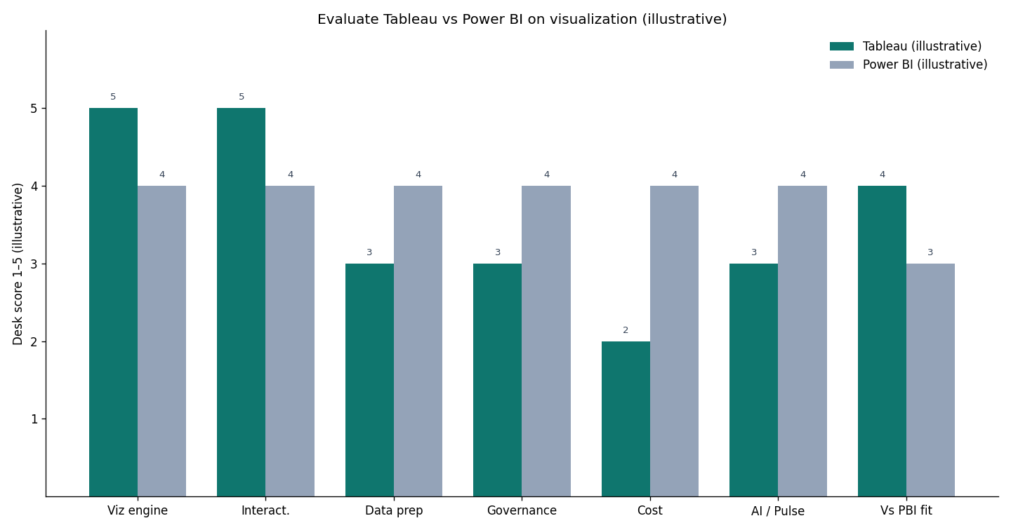
Do not invent market-share percentages here. Re-check Tableau’s current seat names and Pulse scope on Help the day you write the memo. A fair Tableau data visualization write-up cites Help for product facts and keeps Peer Insights as a market signal, not as your score.
What it is
At its core, Tableau data visualization is the practice of using Tableau’s visual interface to build interactive charts, dashboards, and stories from connected data, without needing to write code.
Key definition: Tableau data visualization is the use of Tableau — a business intelligence and analytics platform now under Salesforce — to connect to data sources and build interactive visualizations and dashboards through a drag-and-drop interface.
The essence is approachable interactivity. People who are not programmers connect to data, drag fields onto a canvas, and produce polished dashboards. That is what made Tableau data visualization a category leader in self-service BI, as the Wikipedia business intelligence overview frames the wider market. For the broader craft (not the vendor), see Wikipedia — data visualization.
How it works
Understanding Tableau data visualization means following its flow: connect to a data source, drag dimensions and measures onto a canvas, and Tableau renders charts you refine into interactive dashboards that others can filter and explore. Start from Tableau Desktop / authoring help rather than a third-party screenshot.
The experience rewards clean, well-modeled data. Drag-and-drop is smooth when metrics are consistently defined; it becomes frustrating when definitions conflict. Tableau data visualization shows what it is given, so the quality of the result tracks the quality of the connected source.
When it fits
Tableau data visualization fits organizations that need interactive dashboards built by analysts or capable business users, shared across teams, on top of reasonably clean data — especially where self-service exploration matters more than heavy custom programming. If the job is a one-page PDF once a quarter, Tableau data visualization is usually more product than you need.
It is not universal. Teams needing fully bespoke, code-driven visuals may prefer a library — see when Tableau is the wrong job. Those wanting simple one-off charts may find Tableau data visualization heavier than necessary. It shines where interactive, shareable dashboards on connected data are the recurring need.
The trade-offs
The trade-offs of Tableau data visualization balance power against cost and dependency. It delivers polished, interactive dashboards approachable by non-programmers, but licensing can be significant and the visuals are only as trustworthy as the data behind them.
Weighing it honestly means accepting that it does not remove the need for data governance. A beautiful dashboard on inconsistent data spreads confident-looking errors, and ease can tempt teams to build widely before metrics are agreed. Used with governed, well-defined data, Tableau data visualization is genuinely powerful; used as a substitute for that discipline, it merely makes bad numbers look authoritative.
Where it came from
Tableau data visualization rose in the self-service BI wave, when organizations wanted business users and analysts to explore data without waiting on specialists. The drag-and-drop interface made interactive visualization accessible to a far wider audience than earlier reporting tools. Wikipedia’s Tableau Software page is the orientation layer for that history — not a vendor ranking.
That history clarifies the recurring caveat: because Tableau data visualization made building dashboards easy, it also made it easy to build them on ungoverned data. The discipline of clean sources and consistent definitions had to catch up with the ease of production.
Common pitfalls
The pitfalls of Tableau data visualization start with building on poor data. Because producing a dashboard is easy, teams sometimes rush to visualize before the underlying data is clean and the metrics agreed, yielding polished reports that quietly disagree with each other.
A subtler pitfall is proliferation without governance — dozens of dashboards created by different people, overlapping and inconsistent, until nobody knows which is authoritative. A further trap is using it for jobs it does not suit: bespoke code-driven graphics or heavy data preparation.
Underpinning this is the semantic model. If “revenue” or “active user” lives only inside individual workbooks, each author reinvent the formula and the numbers drift. Mature deployments push those definitions into a shared, governed layer that every workbook draws from. Investing in that shared model early is the difference between a fleet of dashboards that agree and a pile of pretty reports that contradict one another.
The tool in the age of AI
AI is reshaping how Tableau data visualization is used — people request charts in natural language rather than building every view by hand. Tableau Pulse and similar NL layers sit on agreed metrics. They do not replace the evaluate-the-company rubric above.
We explore the agent side in what AI-native data analysis means. For Pulse-class copilots versus chart generators, see AI data visualization tools. Commercial note: the InfiniSynapse web app is one option for asking a new question without a new workbook. Canonical, scheduled dashboards remain a Tableau job.
Readiness scorecard
Assess your own Tableau usage (1 point each). This is a deployment checklist, not the company-evaluation table above.
| Check | Pass? |
|---|---|
| Underlying data is clean | |
| Metric definitions are agreed | |
| Interactive dashboards are the real need | |
| Builders can operate it | |
| Canonical dashboards are clear | |
| Proliferation is governed | |
| Licensing cost is justified | |
| An AI-native option was considered for the long tail |
6–8: strong, governed usage. 3–5: shore up data and governance. Below 3: fix the foundation first.
Common misconceptions
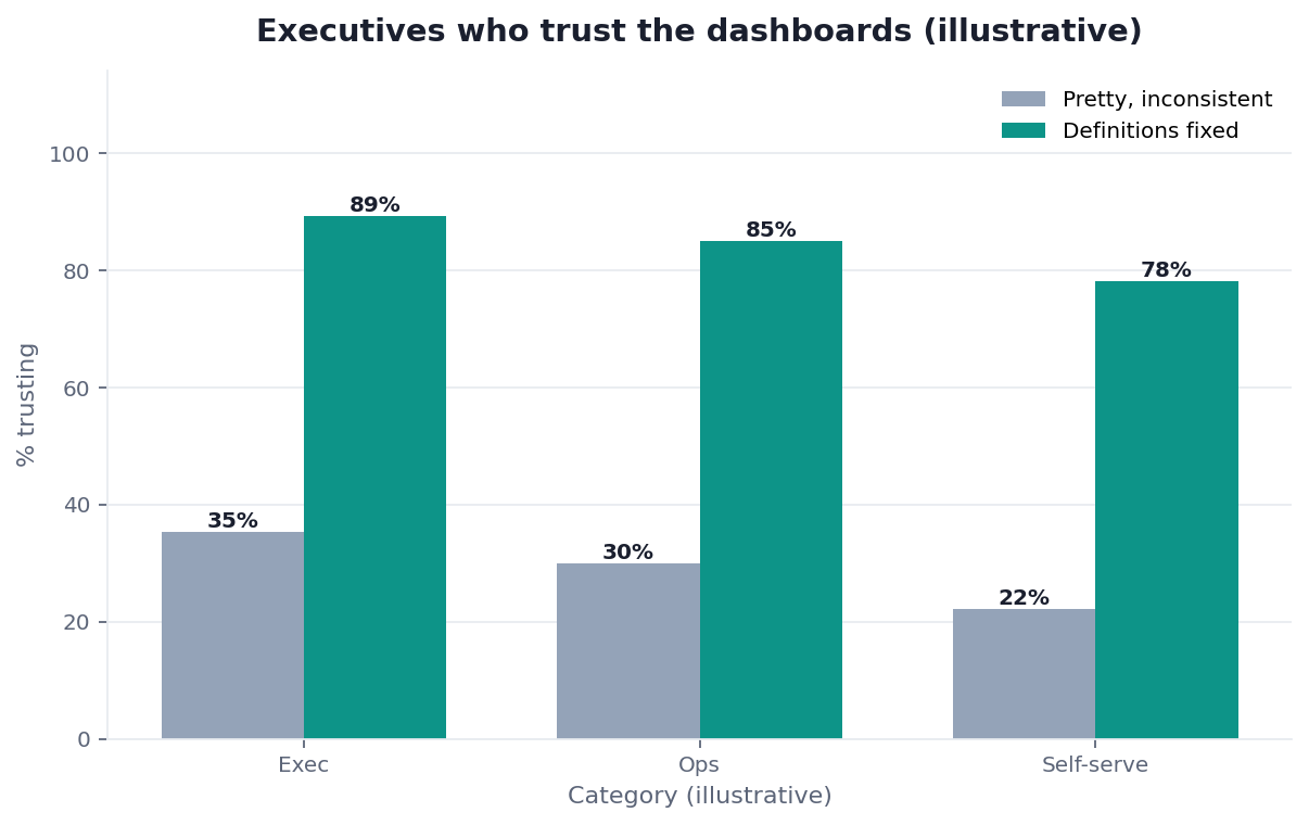
Misconception 1: A pretty dashboard means trustworthy data. The data behind Tableau data visualization decides trust.
Misconception 2: It replaces data governance. Tableau data visualization visualizes whatever it is given.
Misconception 3: It suits every visualization job. Bespoke, code-driven work fits a library. Tableau data visualization is a BI shelf, not a charting API.
Misconception 4: You must build every view by hand. AI can generate views from questions — after definitions exist.
Frequently Asked Questions
What is Tableau data visualization?
It is the use of Tableau — a business intelligence and analytics platform — to connect to data sources and build interactive visualizations and dashboards through a drag-and-drop interface, letting analysts and business users explore data and share findings without programming. That accessibility is what established the tool as a leader in self-service BI.
How do I evaluate Tableau as a data analytics company on visualization?
Use the seven-row rubric: viz engine, interactivity, data prep, governance, cost, Pulse/AI, and vs Power BI. A course or RFP answer names one strength, one constraint, and one alternative. Filling the table is the evaluation; listing menu items is not.
How does it work?
You connect to a data source, drag dimensions and measures onto a canvas, and the tool renders charts you refine into interactive dashboards others can filter and explore. See Tableau Help for the current authoring model. Quality of Tableau data visualization tracks the connected source.
When does it fit best?
It fits organizations that need interactive dashboards built by analysts or capable business users and shared across teams, on reasonably clean data, where self-service matters more than custom code. One-off charts and product-surface graphics are usually the wrong job.
What are its main trade-offs?
Power against cost and dependency. Non-programmers can build refined dashboards; licensing can run high; every chart is only as reliable as the data. Used as a substitute for governance, Tableau data visualization makes bad numbers look authoritative.
Do I still need Tableau if an AI agent can make charts?
Often complementary. A dashboard tool remains valuable for curated, governed views many people monitor on a schedule. An agent excels at the long tail of one-off questions that do not justify a permanent dashboard.
Who wrote this
Named author. William Zhu — InfiniSynapse cofounder (GitHub @allwefantasy). Team: InfiniSynapse Data Team. About: editorial standards · corrections.
References
- [Vendor] Tableau. Tableau Help. help.tableau.com
- [Vendor] Tableau. Tableau Desktop / authoring. help.tableau.com — Desktop
- [Vendor] Salesforce. Tableau analytics. salesforce.com
- [Vendor] Microsoft. Power BI overview. learn.microsoft.com
- [Reference] Wikipedia. Tableau Software. en.wikipedia.org
- [Reference] Wikipedia. Business intelligence. en.wikipedia.org
- [Reference] Wikipedia. Data visualization. en.wikipedia.org
- [Peer market] Gartner Peer Insights. Analytics & Business Intelligence Platforms. gartner.com
- [Policy / About] InfiniSynapse — Editorial standards
Conclusion
Tableau data visualization turns connected data into approachable, interactive dashboards. Evaluate the company on the viz engine, interactivity, governance, and license — then pair a yes with a shared metric layer and clear canonical dashboards. AI-native analysis complements Tableau data visualization for questions that should not become another workbook.
Optional product note: To ask a one-off question without a new dashboard, try the InfiniSynapse web app free on registration. Skip if you only needed the evaluate rubric.