Data Visualization Examples: Charts by Question
By the InfiniSynapse Data Team · Last updated: 2026-09-23 · We review charts in production analysis work. This page is a question-to-chart gallery, not a tool shortlist.
Table of Contents
- TL;DR
- What are data visualization examples?
- Data visualization examples by question
- Bar, line, and scatter examples
- Stacked bar and map examples
- Bad data visualization examples
- Famous vs operational examples
- How to pick an example
- Readiness scorecard
- Frequently asked questions
- Official galleries
- Conclusion
TL;DR
Data visualization examples pair one question with one chart. A line shows change, a bar compares categories, a scatter tests a relationship. Interactive galleries such as Flourish and Data Viz Project show more types; this page is the operational shortlist.
This spoke sits under the data visualization hub. Definitions live on what is data visualization. Buying lives on data visualization tools. Code libraries live on data visualization programming.
What are data visualization examples?
Key Definition: Data visualization examples are concrete pairings of a data question with the chart that answers it — not a mood board of decoration. Form follows the question.
A useful example states the question, the grain, the chart, and one thing the viewer should see. A pretty picture with no question is not an example you can reuse.
Data visualization examples by question
Numbers below are illustrative. They show grain, not a customer study.
| Question | Chart | Illustrative read |
|---|---|---|
| How has it changed? | Line | Monthly revenue 1.2 → 1.3 → 1.1 → 1.5 |
| How do categories compare? | Bar | Region A 42, B 31, C 19 |
| Is there a relationship? | Scatter | 40 accounts; spend vs retention move together |
| What is the mix? | Stacked bar | Products 50 / 30 / 20 of one month |
| Where is it? | Map | One value per region, same color scale |
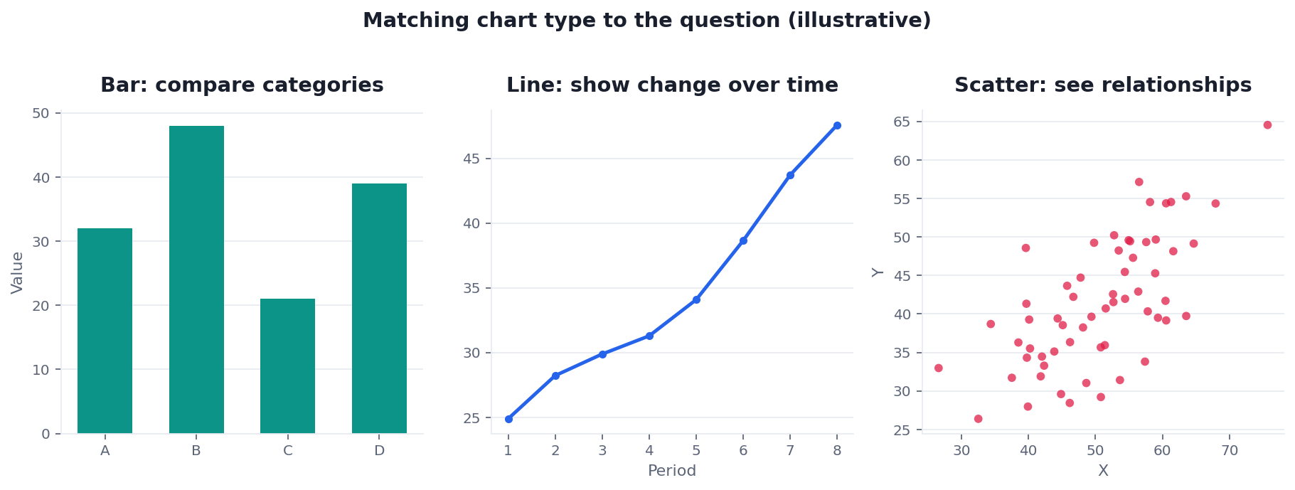
One idea per chart. A second question earns a second chart. Dashboard layout and chartjunk rules stay on dashboard.
Bar, line, and scatter examples
Bar — use when categories are unordered. Height (or length) compares. Do not use a bar to imply a time trend if the axis is not time. Truncating the value axis from 38–42 to make a 2-point gap look huge is a bad example.
Line — use when the x-axis is ordered time (or another sequence). The eye tracks position. Do not connect unordered categories with a line; that invents a path that is not in the data.
Scatter — use when both axes are measures. Clouds, outliers, and a weak or strong slope are the point. A bubble's area is harder to read than position; keep size optional.
These three cover most operational reviews. Reach for a richer mark only after one of them fails the question.
Stacked bar and map examples
Stacked bar — use for composition of a whole at one grain. The illustrative 50 / 30 / 20 mix is readable if there are few parts and one part dominates. Many thin slices belong on a bar of the parts, not a stack.
Map — use when location is the question. One value per region, one color scale, a legend. A map that also tries to rank products and show a 12-month trend is three questions. GIS product choice is not this page.
Bad data visualization examples
These fail even when the data are correct:
- 3D or exploded pies that ask the eye to judge angles and depth
- A truncated bar axis that exaggerates a small gap
- A dual axis that implies two series share a cause
- A line across unordered labels
- Several questions crammed into one mark
Chartjunk on a board (shadows, extra colors, ornament) is covered on dashboard. A pie can work when one slice clearly dominates and you are not asking for a close comparison; default to bars when viewers must rank parts.
Famous vs operational examples
Tableau's historical set (Minard, budget treemaps, large news interactives) is worth studying. Those pieces are stories. An operational example is smaller: one question, one grain, a chart a weekly review can reread.
Do not copy a campaign map onto a SaaS KPI pack. Copy the discipline: encode what the eye reads well (length, position), then stop.
How to pick an example
- Write the question in one sentence.
- Name the grain (one row = …).
- Pick the simplest mark that answers it.
- Remove gridlines, extra hues, and effects that do not carry meaning.
- Check the axis: zero for bars unless you document a zoom; time only on lines that claim a trend.
If a generator (including an AI chart) proposes a type, run the same five checks. Production still lives on what AI-native data analysis means; this page only judges the picture.
Readiness scorecard
| Check | Pass? |
|---|---|
| Form fits the question | |
| It reads at a glance | |
| Decoration is gone | |
| The axis is honest | |
| One idea per chart | |
| Labels name the grain |
5–6: ship. 3–4: simplify. Below 3: change the mark.
Frequently asked questions
What are data visualization examples?
They are pairings of a question with a chart: line for change, bar for comparison, scatter for a relationship, stacked bar for mix, map for place. The best example is the one whose form matches the question so the answer is obvious.
Why do those examples work?
Length and position are easy to compare. Angle and area (pies, many bubbles) are not. That is why a plain bar often beats a richer mark at the same job.
How do I match an example to my question?
Start with the question, not the chart menu. Then strip anything that does not help. A second question gets a second chart.
Are pie charts ever a good example?
Rarely. Use one when a single part dominates and you are not ranking close slices. Otherwise use a bar.
How is AI changing the gallery?
Agents can propose a type from a sentence. The test is unchanged: does the form fit the question, with an honest axis? Tool choice stays on data visualization tools.
What makes a bad example?
Looks-first charts, truncated axes, dual-axis false stories, and one graphic that tries to answer three questions.
Official galleries
These are the SERP galleries this page does not try to replace:
- Flourish: data visualization examples
- Data Viz Project
- Tableau: historical visualization examples
- Google Charts gallery
- Wikipedia: data visualization
Conclusion
Match the question, then the mark. Line, bar, and scatter cover most operational work. Stacked bars and maps earn a slot when mix or place is the question. Interactive galleries show the long tail of types; this page is the reusable shortlist.