What Is a Data Dashboard? (2026)
By the InfiniSynapse Data Team · Last updated: 2026-07-15 · We build an AI-native data analysis platform and design dashboards with customers regularly; this explainer covers what a data dashboard is in 2026, in plain terms rather than a product pitch.
Table of Contents
- TL;DR
- How We Approach It
- What It Is
- How It Differs From a Report
- When It Fits
- Design Essentials
- Where the Idea Came From
- Common Pitfalls
- In the Age of AI
- Readiness Scorecard
- Common Misconceptions
- Frequently Asked Questions
- Conclusion
TL;DR
Direct answer: a data dashboard is a visual display that pulls together the key metrics from one or more data sources into a single, usually live view, so people can monitor performance and act. In 2026, a good data dashboard is defined by focus and freshness — showing the few metrics a specific audience needs, kept current enough for the decisions it supports — not by how much data it manages to fit on screen.
Who this is for: anyone building or using a data dashboard in 2026.
What you'll learn: what it is, how it differs from a report, when it fits, design essentials, and how AI relates.
This guide sits under the data visualization hub.
For the broader concept—types, design best practices, and why 3D pies with shadows violate avoid unnecessary chart junk—see Dashboards: design best practices and chart junk.
Also see data visualization tools.
How We Approach It
Core definitions remain usefully summarized in Wikipedia data quality overview for shared vocabulary across stakeholders.
We treat a data dashboard as a live monitoring tool first, judging it by whether it supports timely decisions. Every point reflects real projects. We anchor concepts to the Databricks documentation) and weigh design against the reference guidance at MariaDB documentation.
The table below frames the data dashboard.
| Aspect | What matters |
|---|---|
| Purpose | Monitor and decide |
| Sources | One or many, unified |
| Freshness | As current as the decision needs |
| Focus | Few key metrics |
| Audience | Who acts on it |
Practical example: a team's data dashboard pulled from five systems but refreshed weekly, too stale for the daily decisions it served; matching freshness to the decision — the fit lesson echoed at CISA AI security guidance — made it useful.
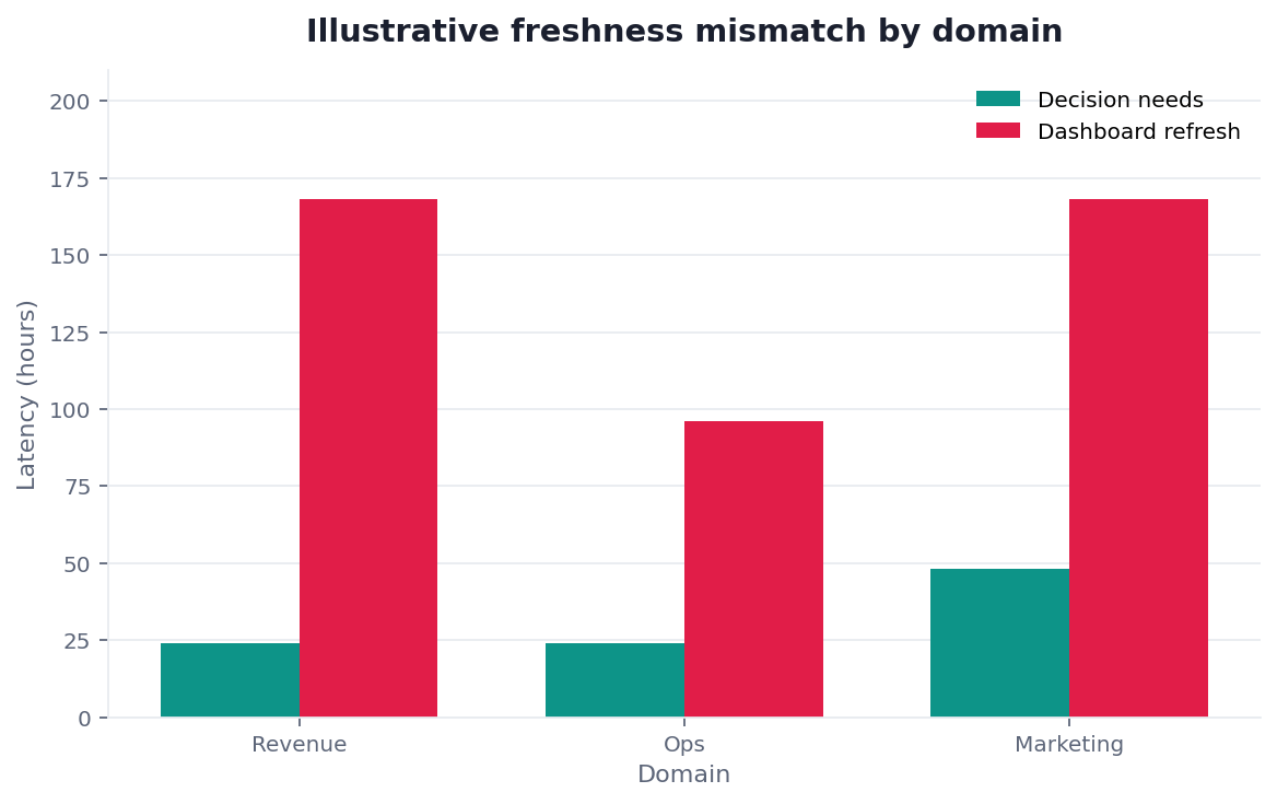
Scope note: This guide reflects patterns we see when mid-market and enterprise teams work with data dashboard in 2026. It is not a substitute for legal counsel, vendor runbooks, or a formal survey of every industry — and when a smaller toolset or lighter process would serve, a full program is overkill.
What It Is
At its core, a data dashboard is a single visual interface that consolidates key metrics, often drawn from multiple data sources, and presents them so an audience can monitor the current state at a glance.
Key Definition: a data dashboard is a visual display that gathers and presents key metrics and data points — frequently from several sources — in one unified, typically real-time or regularly refreshed view, enabling a specific audience to monitor performance and make timely decisions without assembling the underlying data themselves.
The essence of a data dashboard is unified, current monitoring. It exists to save people from gathering scattered numbers themselves, presenting the few metrics that matter in one place, kept fresh enough that decisions can rely on them.
How It Differs From a Report
Implementation details are commonly grounded in Microsoft data architecture guidance when teams translate concepts into production practice.
A data dashboard differs from a traditional report chiefly in being live and monitored rather than static and periodic. A report is a snapshot produced on a schedule; a dashboard is an ongoing view meant to be checked whenever a decision arises.
The practical difference a data dashboard makes is immediacy, as reporting guidance at RFC 4180 CSV format on analytics workloads reflects. A report answers "what happened last month"; a dashboard answers "what is happening now, and do I need to act." That shift from periodic snapshot to continuous view is why dashboards suit operational monitoring, while reports still suit periodic, detailed analysis and record-keeping.
When It Fits
A data dashboard fits situations where people need to monitor changing metrics and act on them — operations, sales, service levels, project status — especially when the relevant data lives across several systems and would otherwise be tedious to gather.
Like any tool, a data dashboard is not always the answer. The accessibility guidance at Wikipedia natural language processing overview is a reminder that a display is only useful if its audience can read and understand it; a one-off analysis is better as a report, and a decision made once a year rarely needs a live view. The dashboard earns its place where monitoring is ongoing and timeliness genuinely changes what people do.
Design Essentials
Implementation details are commonly grounded in Amazon Redshift documentation when teams translate concepts into production practice.
Good data dashboard design rests on focus, hierarchy, freshness, and trust. Show the few metrics the audience acts on, order them by importance, refresh them at the cadence the decision requires, and ensure the numbers are reliable and clearly defined.
The essentials of a data dashboard are easy to state and hard to hold to. The temptation is always to add more metrics, more sources, more detail, until the view becomes a data dump nobody reads. Restraint is the discipline: a focused, current, trustworthy display beats an exhaustive one, because the point is a quick, confident decision, not a comprehensive archive of everything measurable.
Where the Idea Came From
The data dashboard extends the older dashboard metaphor — a car's compact display of essential indicators — into the world of business data drawn from many systems. As organizations accumulated data across separate tools, the need arose for a single place to see the important numbers without logging into each source.
Understanding this history clarifies why unification and freshness define it: the whole point was to bring scattered, changing metrics into one current view. It also explains the recurring overload pitfall — because a dashboard can technically pull from any number of sources, the temptation to include everything is constant, and resisting it, keeping the display focused on what people actually act on, is what separates a useful monitoring tool from an unreadable wall of numbers.
Common Pitfalls
Implementation details are commonly grounded in Google Vertex AI documentation when teams translate concepts into production practice.
The pitfalls of a data dashboard cluster around overload and staleness. Cramming in too many metrics buries the signal; refreshing too slowly for the decisions it serves makes it misleading; and both quietly train the audience to stop trusting it.
A subtler pitfall with a data dashboard is building it on ungoverned data from many sources. Pulling metrics from several systems is powerful, but if those systems define terms differently or contain dirty data, the unified view presents contradictions as if they were facts. The healthiest approach keeps the display focused, refreshes it appropriately, and rests it on governed, consistently defined data — so the single view people rely on is actually reliable.
Another quiet failure is the orphaned display that no one owns. A view built for a launch or a specific project often keeps running long after anyone checks it, slowly drifting out of date as the systems behind it change, until someone makes a decision from numbers that stopped being meaningful months ago. Every view that matters needs a named owner responsible for confirming it still answers a live question, its sources still feed it correctly, and its definitions still hold. Retiring displays that no longer serve a decision is as important as building new ones; an estate of stale, unowned views is not an asset but a growing liability that erodes trust in the whole practice.
In the Age of AI
AI is reshaping the data dashboard from a fixed set of pre-built views toward something you can query directly, asking new questions without waiting for a rebuild.
We explore this in what AI-native data analysis means. In the InfiniSynapse web app, an agent analyzes across your data sources and answers directly, so a data dashboard becomes less a frozen layout someone had to anticipate and more a living interface where the next question is simply asked — while curated dashboards still serve recurring monitoring.
Readiness Scorecard
Teams evaluating this topic often cross-check Anthropic research for a durable, vendor-neutral reference point.
Assess your data dashboard (1 point each):
| Check | Pass? |
|---|---|
| It supports a real decision | |
| Metrics are few and relevant | |
| Freshness matches the decision | |
| Sources are unified cleanly | |
| Data is governed and defined | |
| The audience is specific | |
| It is trusted and used | |
| An AI-native option was considered |
6–8: a strong monitoring tool. 3–5: tighten focus and freshness. Below 3: rebuild around the decision.
Common Misconceptions
Misconception 1: More metrics mean more value. Focus beats coverage.
Misconception 2: A dashboard is just a fancy report. It is a live monitoring tool.
Misconception 3: Pulling many sources guarantees insight. Ungoverned sources create contradictions.
Misconception 4: It must be a fixed layout. AI lets you ask new questions directly.
Frequently Asked Questions
What is a data dashboard?
It is a visual display that gathers and presents key metrics and data points — frequently from several sources — in one unified, typically real-time or regularly refreshed view, letting a specific audience monitor performance and make timely decisions without assembling the underlying data themselves. Its essence is unified, current monitoring: it saves people from gathering scattered numbers by hand, presenting the few metrics that matter in one place, kept fresh enough that decisions can genuinely rely on it rather than on a stale or partial picture.
How does it differ from a report?
Chiefly in being live and monitored rather than static and periodic. A report is a snapshot produced on a schedule, answering "what happened last month," while a dashboard is an ongoing view meant to be checked whenever a decision arises, answering "what is happening now, and do I need to act." That shift from periodic snapshot to continuous view is why dashboards suit operational monitoring, whereas reports still suit periodic, detailed analysis and record-keeping. The two are complementary rather than interchangeable, serving different rhythms of decision.
When does it fit?
It fits situations where people need to monitor changing metrics and act on them — operations, sales, service levels, project status — especially when the relevant data lives across several systems and would otherwise be tedious to gather. It is not always the answer: a one-off analysis is better delivered as a report, and a decision made once a year rarely justifies a live view. It earns its place where monitoring is ongoing and timeliness genuinely changes what the audience does in response.
What makes a good one?
Focus, hierarchy, freshness, and trust. Show only the few metrics the audience acts on, order them by importance, refresh them at the cadence the decision requires, and ensure the numbers are reliable and clearly defined. These essentials are easy to state and hard to hold to, because the constant temptation is to add more metrics, more sources, and more detail until the view becomes a data dump nobody reads. Restraint is the real discipline: a focused, current, trustworthy display beats an exhaustive one every time.
How is AI changing it?
AI is shifting it from a fixed set of pre-built views toward something you can query directly, asking new questions without waiting for a rebuild. An AI-native platform can analyze across your data sources and answer immediately, so the display becomes less a frozen layout someone had to anticipate and more a living interface where the next question is simply asked. Curated dashboards still serve recurring monitoring, but the long tail of ad-hoc questions no longer requires building a new view each time one comes up.
How often should a data dashboard refresh?
As often as the decisions it supports require, and no more. An operational dashboard guiding minute-to-minute work may need near-real-time updates, while a strategic one reviewed weekly is fine refreshing daily or even weekly. Refreshing far more frequently than the decision needs wastes compute and can introduce noise, making people react to normal fluctuation; refreshing too slowly makes the view misleading for its purpose. Match the cadence to the decision rhythm, and state the freshness clearly on the display so viewers know how current the numbers they are acting on actually are.
Conclusion
A data dashboard is a unified, current view of the key metrics an audience monitors to make timely decisions — valuable in proportion to its focus, freshness, and the trustworthiness of its data. In 2026, keep it focused and governed, match its refresh to the decision, and remember AI-native analysis is turning dashboards into living interfaces you can simply ask.
Then try asking your data directly in the InfiniSynapse web app, free on registration.