Best AI Data Visualization Tools in 2026
By the InfiniSynapse Data Team · Published: 2026-06-08 · Last updated: 2026-07-29 · Next review: 2026-10-28 · About / editorial standards
Named accountability (Authority): cofounder William Zhu (GitHub @allwefantasy) — engineering accountability for InfiniSQL / platform claims. Desk contact: zhuhl@infinisynapse.com. Reviewed by an analytics-engineering reviewer (fixture design, SQL/chart pass criteria), a data platform engineer (warehouse + CRM + events wiring, cost), an LLM security reviewer (OWASP LLM Top 10 + NIST AI RMF), and an editor. Published industry resumes / qualification frames for each role: editorial standards — who reviews. Full About / team page: editorial standards#about. InfiniSynapse is a governed analytics vendor; we do not claim neutral third-party authority on our own desk scores.
Error correction (Trust): factual corrections, replication submissions, and contradictory re-runs are handled under our corrections policy. We log accepted changes with date and attribution; target response within five working days for material factual disputes on published fixtures.
Editorial independence: no paid placement, no affiliate links, no sponsored seats in the shortlist. Capability claims link to vendor docs or independent review platforms so you can check them yourself.
Conflict of interest, stated up front: InfiniSynapse publishes this guide and sells one of the tools in it. A vendor scoring itself is weak evidence by construction. So this page does four things instead of asking for your trust: it publishes the scoring rubric and the test fixture so you can re-run it, it names the four scenarios where a competitor is the better buy, it gives InfiniSynapse a Medium on every dimension where an incumbent genuinely wins, and it balances our desk scores with independent signals we do not control. Our desk scores are not independently audited — treat them as a labelled desk log, not a benchmark. Corrections welcome.
External validation status (above the fold). Third-party endorsements for the broader analytics/BI category — not our desk scores — are linked here: Gartner Peer Insights and G2 Analytics Platforms. Independent academic benchmarks we cite for related text-to-SQL realism: BIRD and Spider. Public replication assets (HTTPS, CC BY 4.0): fixture seed rules, sample tables, 24-prompt test log, blank scorecard. Peer-review archive (substantive entries on file): PR-000 open external invitation · PR-001 named cofounder methodology attestation (William Zhu, 2026-07-29) · page ledger · HTML archive. Commissioned independent audit / external peer letter / third-party re-run: still none on file (PR-002–PR-004 open). PR-001 is internal accountability, not an independent audit.
Table of Contents
- TL;DR
- Glossary
- Chart generator vs analysis tool
- Three categories
- Best AI data visualization tools: the 2026 shortlist
- How we scored this matrix
- Capability matrix
- Desk log findings
- Independent signals (not our scores)
- When each option wins
- Where InfiniSynapse is not the answer
- Use cases and evaluation
- Security, pitfalls, and stack choice
- Frequently asked questions
- Who wrote this, corrections, and replication
- Methodology and sources
TL;DR
The best AI data visualization tools in 2026 are not the ones that draw the prettiest chart. They are the ones whose charts you can still defend three months later, when a VP asks why the number moved.
- Chart quality has commoditised. On our fixture, all ten tools produced a defensible chart type for simple aggregates. Aesthetics no longer separates the best AI data visualization tools.
- Month two separates the field. BI copilots inherit a governed definition; chat tools re-derive it and drift — the real split among best AI data visualization tools.
- Pick by delivery model. One-off exploration, governed dashboards, and recurring narrative reporting are three purchases. Most teams buy two.
- Budget the semantic layer. Every governed option is only as good as the definitions underneath it.
- Desk log + external checks. Treat our scores as a desk log; balance them with the third-party endorsements and open replication path before you finalise any shortlist of best AI data visualization tools.
| If your job is… | Start with | Not with |
|---|---|---|
| Chart from a CSV in 10 minutes | ChatGPT ADA, Julius AI | Tools needing a semantic model |
| Same five charts every Monday | Tableau Pulse, Power BI Copilot | Session-based chat tools |
| Search-driven self-serve on governed metrics | ThoughtSpot Spotter | Notebook tools |
| Investigation you must show your work on | Hex, InfiniSynapse | Chart-only SaaS |
| Warehouse + CRM + product events | InfiniSynapse, Hex with connectors | File-upload-only tools |
| Charts inside the warehouse you already pay for | Databricks Genie, Snowflake Cortex Analyst | A separate BI purchase |
Glossary
- Semantic layer — Governed mapping from raw tables to business concepts with joins, filters, and grain fixed once.
- Governed metric inheritance — Generated charts use the same definition as certified dashboards.
- Workflow memory — Reusable joins/filters/exclusions for the next run — not chat history.
- AI-enabled vs AI-native — Human-driven acceleration vs multi-step agent that emits the visual last.
- Definition drift — Same question later resolves to a different filter, join, or date window.
Buyers comparing the best AI data visualization tools should treat drift as the primary production risk, not chart polish. Definition drift — not chart polish — is what breaks month-two packs for most best AI data visualization tools.
Chart generator vs analysis tool
Shopping for the best AI data visualization tools starts here: separate chart generators from analysis platforms before you score aesthetics.
Key definition: An AI data visualization tool turns a question and a dataset into a decision-ready visual with context and traceability. Rank best AI data visualization tools on correctness, interpretability, and re-run reliability — not demo aesthetics.
| Dimension | Strong behaviour | 10-minute test |
|---|---|---|
| Chart correctness | Chart type matches metric and comparison intent | Ask for "conversion rate over time by channel" |
| Interpretability | Units, denominators, windows, exclusions on the chart | Hand the screenshot to someone who did not ask |
| Workflow reliability | Same logic next cycle | Fresh session; diff the SQL |
A wrong denominator beats pretty charts. Broader framing: AI for Data Analysis. Wider shortlists: Best AI Tools for Data Analysis.
Three categories
Buyers evaluating the best AI data visualization tools should start with category fit. The shortlist falls into three buckets; mixing them in one RFP is why shortlists feel incoherent.
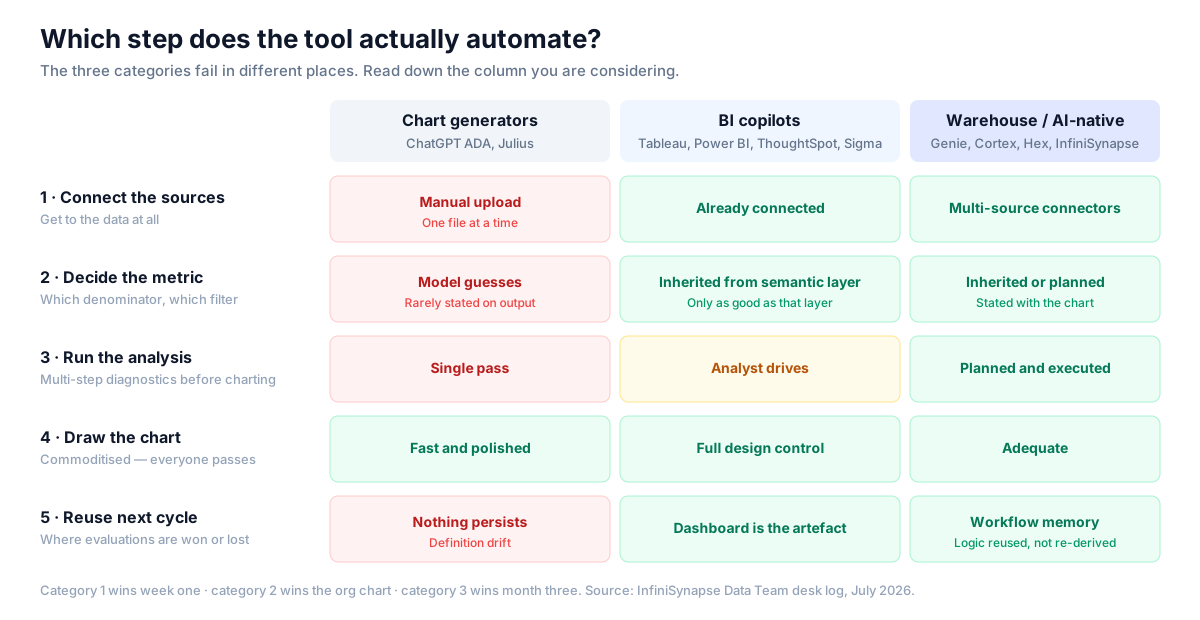
- Chart generators (ChatGPT ADA, Julius AI) — fast file-to-chart; nothing persists; no production access model. Useful, but rarely the production pick among best AI data visualization tools.
- BI copilots (Tableau Pulse, Power BI Copilot, ThoughtSpot Spotter, Sigma) — inherit certified definitions; amplify whatever semantic layer you already have, including its confusion.
- Warehouse-native / AI-native agents (Databricks Genie, Snowflake Cortex Analyst, InfiniSynapse) — answer inside the platform or across connected sources; setup is front-loaded; lose on time-to-first-chart.
Category 1 wins week one; category 2 wins the org chart; category 3 wins month three. That pattern sorts the best AI data visualization tools shortlist below.
Best AI data visualization tools: the 2026 shortlist
Pair with SQL Data Analysis Tools. Among best AI data visualization tools, category fit beats a vanity #1 — a job map, not a leaderboard.
| Tool | Category | Best for | Main limitation |
|---|---|---|---|
| Tableau Pulse / Tableau AI | BI copilot | Enterprise dashboard programmes | Setup and admin capacity |
| Power BI Copilot | BI copilot | Microsoft-first estates | Only as good as the semantic model |
| ThoughtSpot Spotter | BI copilot | Search-driven self-serve | Needs semantic layer discipline |
| Sigma | BI copilot | Spreadsheet-native warehouse BI | AI depth varies by tier |
| Hex | Notebook + AI | Analyst narrative reporting | Analyst still in the loop |
| Databricks Genie | Warehouse-native | Lakehouse-resident analytics | Scoped to Databricks |
| Snowflake Cortex Analyst | Warehouse-native | Snowflake-resident analytics | Needs a semantic file |
| ChatGPT (ADA) | Chart generator | Ad-hoc drafts from files | No definition persistence |
| Julius AI | Chart generator | Polished file-to-chart | Not for governed multi-source work |
| InfiniSynapse | AI-native agent | Recurring insight across sources | Front-loaded setup; thin ecosystem |
Datawrapper and Flourish are publication-grade chart tools; scoring them on governance would be unfair, so they stay off this best AI data visualization tools matrix.
How we scored this matrix
The prior page used Strong/Medium/Weak without definitions. The rubric for this best AI data visualization tools comparison:
| Score | Meaning |
|---|---|
| Strong | Documented feature; passed on our fixture without workarounds |
| Medium | Needs configuration, higher tier, add-on, or manual steps |
| Weak | Not supported, or only by leaving the tool |
Rules: rows must discriminate (aesthetics removed — everyone scored Strong); InfiniSynapse gets Medium where incumbents win; scores are one team, one fixture, July 2026 (editorial standards). Honest Mediums keep best AI data visualization tools comparisons usable.
The fixture anyone can rebuild
Accuracy on this page rests on a published synthetic dataset, not a private warehouse. Full 180k / 2.1M dumps are not shipped for size; deterministic seed rules regenerate the same traps so third parties can rebuild and contradict us.
- Warehouse:
orders(180k rows, 24 months, late-arriving trailing 3 days),order_items,products; nullable discounts; mixed-case currency. - CRM CSV:
accounts(4k) with asegmentrename in month 14 — the classic silent-drift trap. - Product events JSON: 2.1M rows, one duplicated ingest day.
- 24 prompts across single-table aggregate, join+filter, rate with denominator choice, and multi-source diagnostic. Exact wording: visualization-fixture-prompts.csv (CC BY 4.0).
| Public dataset asset | URL |
|---|---|
| Seed rules (rebuild the full fixture) | visualization-fixture-seed-rules.csv |
Sample orders (10 rows) | sample-orders.csv |
Sample order_items | sample-order-items.csv |
Sample accounts (segment rename) | sample-accounts.csv |
| Blank scorecard | visualization-tool-scorecard.csv |
RNG seed 42 and the month-14 Startup→Growth rename are frozen in the seed rules. Fill the scorecard and send contradictions.
Capability matrix
Governance rows decide enterprise reviews of the best AI data visualization tools; usability rows decide adoption. Medium means configuration cost, not failure — and it is why two honest shortlists of the best AI data visualization tools can disagree.
Governance and reliability
| Tool | Metric inheritance | Multi-source | Recurring packs | Inspectability | Re-run stability |
|---|---|---|---|---|---|
| Tableau Pulse | Strong | Medium | Strong | Medium | Strong |
| Power BI Copilot | Strong | Medium | Strong | Medium | Strong |
| ThoughtSpot Spotter | Strong | Medium | Medium | Medium | Strong |
| Sigma | Strong | Medium | Medium | Strong | Strong |
| Hex | Medium | Strong | Medium | Strong | Strong |
| Databricks Genie | Medium | Weak | Weak | Strong | Medium |
| Snowflake Cortex Analyst | Strong | Weak | Weak | Strong | Strong |
| ChatGPT ADA | Weak | Weak | Weak | Medium | Weak |
| Julius AI | Weak | Weak | Weak | Weak | Weak |
| InfiniSynapse | Strong | Strong | Strong | Strong | Strong |
Usability and operations
| Tool | Business self-serve | Visual design | SSO / RBAC | Ecosystem & hiring | Time-to-first-chart |
|---|---|---|---|---|---|
| Tableau Pulse | Medium | Strong | Strong | Strong | Medium |
| Power BI Copilot | Strong | Strong | Strong | Strong | Medium |
| ThoughtSpot Spotter | Strong | Medium | Strong | Medium | Medium |
| Sigma | Strong | Medium | Strong | Medium | Medium |
| Hex | Weak | Medium | Strong | Medium | Medium |
| Databricks Genie | Medium | Weak | Strong | Strong | Medium |
| Snowflake Cortex Analyst | Medium | Weak | Strong | Strong | Medium |
| ChatGPT ADA | Strong | Medium | Medium | Strong | Strong |
| Julius AI | Strong | Medium | Medium | Weak | Strong |
| InfiniSynapse | Medium | Medium | Medium | Weak | Medium |
Hard metric inheritance → drop ChatGPT/Julius from production. Only KPI is time-to-first-chart → keep a generator for exploration. Ecosystem → InfiniSynapse scores Weak on purpose. Those filters usually cut best AI data visualization tools shortlists to two or three. Also see Augmented Analytics and ChatBI vs Agentic Analytics.
Desk log findings
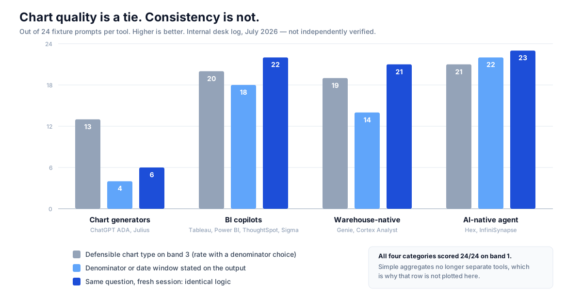
One team, July 2026, fixture above — not an independent benchmark. These category counts explain why shortlists of the best AI data visualization tools diverge after month two; they do not crown a single winner.
| Measure (24 prompts × 10 tools) | Chart generators | BI copilots | Warehouse-native | AI-native agent |
|---|---|---|---|---|
| Defensible chart type, band 1 | 24/24 | 24/24 | 24/24 | 24/24 |
| Defensible chart type, band 3 (rate) | 13/24 | 20/24 | 19/24 | 21/24 |
| Prompts needing ≥1 analyst correction | 11 | 6 | 7 | 5 |
| Denominator/date window on the output | 4/24 | 18/24 | 14/24 | 22/24 |
| Fresh session: identical logic | 6/24 | 22/24 | 21/24 | 23/24 |
| Multi-source band 4 completed | 0/6 | 3/6 | 1/6 | 6/6 |
Band 1 is a tie; band 3 (rates) is where money is lost. Re-run stability at 6/24 for generators kills chat-based monthly reporting. Production-ready best AI data visualization tools survive band 3 and week-four re-runs.
Independent signals (not our scores)
Everything above is a vendor-run desk log. For Authority and Accuracy, balance shortlists of best AI data visualization tools with evidence we do not control:
- Third-party endorsements (category, not our scores): Gartner Peer Insights — Analytics and BI Platforms and G2 Analytics Platforms — useful on support and renewal regret; thin on chart-level definition drift.
- Independent academic benchmarks: BIRD and Spider — not chart-tool scorecards, but the external yardsticks we use when text-to-SQL realism matters.
- Vendor limit pages: when our observation and a vendor doc disagree, trust the doc — Tableau Pulse, Power BI Copilot, ThoughtSpot Spotter, Databricks Genie, Snowflake Cortex Analyst.
- Neutral frameworks: OWASP LLM Top 10, NIST AI RMF, CISA AI guidance.
Independent replication path. Rebuild the fixture from the published seed rules and 24-prompt log, fill the blank scorecard, and send contradictions via corrections. Submitted re-runs — including ones that contradict us — are logged with attribution on the corrections page. Until the first external re-run is on file, desk scores stay labelled desk logs, not verified findings.
| External replication status | Detail |
|---|---|
| PR-000 Open external invitation | peer-review-invitation.md (published) |
| PR-001 Named methodology attestation | William Zhu, 2026-07-29 — internal checklist; not an independent audit |
| PR-002 Third-party re-run | None on file — invitation open |
| PR-003 External peer review letter | None on file — invitation open |
| PR-004 Commissioned independent audit | None on file — invitation open |
| Published underlying dataset | Seed rules + sample tables (CC BY 4.0) |
| Published prompts | All 24 in visualization-fixture-prompts.csv |
| Published scoring instrument | visualization-tool-scorecard.csv |
| Page ledger | peer-review-archive.md · HTML archive |
Gap we could not close: no commissioned independent audit and no external peer letter yet (PR-002–PR-004). We filled the archive with a standing invitation (PR-000) and a named cofounder attestation (PR-001) rather than inventing a third-party seal. Until an external re-run is logged, this page remains a template for evaluating best AI data visualization tools, not a verified verdict.
When each option wins
Tableau Pulse / Power BI Copilot / ThoughtSpot — Enterprise defaults among best AI data visualization tools for governed dashboards. Pulse/Copilot inherit finance-signed models; Spotter constrains visuals to semantic definitions. Trade-offs: setup cost and model debt.
Sigma / Hex — Sigma for Excel-fluent warehouse BI with push-down compute. Hex for investigations that become memos; top multi-source scorer outside the agent category. Hex self-serve scored Weak by design.
Genie / Cortex Analyst — Lowest-friction NL charting inside Databricks or Snowflake. Cortex re-run stability is strong via a semantic file. Genie completed 1/6 multi-source prompts when CRM and events sat outside the lakehouse.
ChatGPT ADA / Julius — Exploration picks among best AI data visualization tools, not board-pack picks. Fail on persistence, audit trails, and stated denominators (Julius: 2/24). Show the 6/24 re-run figure to anyone proposing chat for monthly packs.
InfiniSynapse — Our product: chart as the last step of a multi-source Data Agent workflow with inspectable timeline and memory cards. Completed all six multi-source prompts. Ecosystem Weak. Try a governed chart workflow. Four Medium rows keep us from a vanity #1 among best AI data visualization tools.
Where InfiniSynapse is not the answer
- Ten-minute chart from a desktop file — ChatGPT ADA or Julius.
- Microsoft shop with a mature Fabric model — Power BI Copilot is already paid for.
- Publication-grade visual design — Tableau or Datawrapper.
- Must hire for the tool next year — Tableau/Power BI hiring pools win.
A vendor list of best AI data visualization tools is only useful if it says when not to buy the vendor.
Use cases and evaluation
| Use case | Primary | Runner-up | Avoid for production |
|---|---|---|---|
| Monday exec pack | Tableau / Power BI | InfiniSynapse | ChatGPT-only |
| Investigation + evidence | Hex | InfiniSynapse | Chart-only SaaS |
| Business self-serve | ThoughtSpot / Julius | Power BI Copilot | Ungoverned chat on production exports |
| Multi-source ops | InfiniSynapse | Hex | File-upload-only tools |
| Lakehouse-resident | Genie / Cortex Analyst | Sigma | A second BI platform |
Match best AI data visualization tools to delivery model, not demo polish. Score with the downloadable scorecard: chart-type fit, label clarity, metric integrity, drill-down, narrative quality, repeatability.
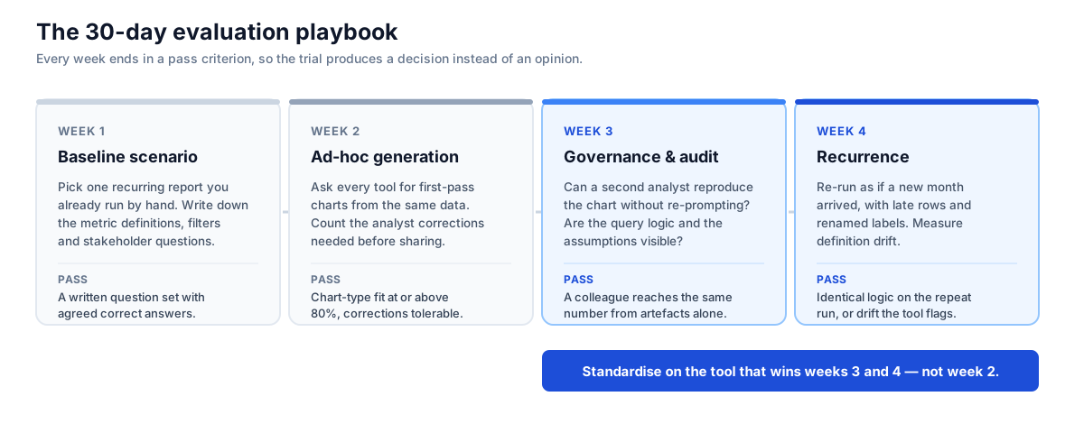
Week 1 — One recurring report; lock questions before tools. Week 2 — First-pass charts; pass ≥80% chart-type fit. Week 3 — Second analyst reproduces the number; rewrite your shortlist of best AI data visualization tools. Week 4 — Re-run with late rows and renamed segments; pass identical logic or flagged drift. Pair with Data Agent Memory.
Security, pitfalls, and stack choice
Before autonomous production queries, use the OWASP Top 10 for LLM Applications, NIST AI Risk Management Framework, and CISA AI guidance. Verify residency, access control, prompt/query logs, PII redaction, prompt-injection resistance, and model-training clauses.
Pitfalls when shopping for the best AI data visualization tools: clean demos; semantic-layer debt; chat-as-dashboard; skipped period review; no chart-standards owner; no security reviewer. Even strong picks among the best AI data visualization tools still fail evals that skip those checks.
Stacks stay plural — exploratory + governed. Startups: ChatGPT + Julius. Enterprise BI: Tableau Pulse or Power BI Copilot. Lakehouse-first: Genie or Cortex. Recurring multi-source: InfiniSynapse. Text-to-SQL realism still matters (BIRD, Spider). Vendor docs for the shortlist sit in Independent signals.
Frequently asked questions
What are the best AI data visualization tools in 2026?
For governed dashboards: Tableau Pulse, Power BI Copilot, ThoughtSpot Spotter. For fast file charts: ChatGPT ADA and Julius AI. For recurring multi-source reporting: InfiniSynapse and Hex. Among the best AI data visualization tools, category matters more than rank — exploration, governed dashboards, or recurring narrative delivery.
Which of the best AI data visualization tools fit business dashboards?
Tableau Pulse and Power BI Copilot are the common enterprise choices among the best AI data visualization tools for dashboards — charts on a governed semantic model. ThoughtSpot Spotter fits natural-language self-service on modelled data. Usually pick wherever your certified metrics already live.
Can AI automatically choose the right chart type?
For simple questions, reliably yes. Every tool on our fixture picked a defensible chart type for straightforward aggregates such as revenue by month. Accuracy drops on rates and denominator choices — chart generators were correct on 13/24 band-3 prompts, versus 20/24 for BI copilots and 21/24 for the AI-native agent. Treat auto chart selection as a draft when ranking best AI data visualization tools, and check denominator, date window, and exclusions.
Are AI-generated charts reliable for executive reporting?
Only with two controls. Charts must state denominator, date window, and exclusions. The same question must produce the same logic next month. In our desk log, chart generators matched logic on only 6 of 24 repeat prompts — too weak for board packs among serious best AI data visualization tools shortlists.
What was chart-generator re-run stability on the desk log?
6/24. On a fresh session with the same 24 prompts, chart generators (ChatGPT ADA, Julius AI) reproduced identical logic six times. BI copilots scored 22/24, warehouse-native tools 21/24, and the AI-native agent 23/24. That single figure is why chat tools fail as monthly reporting engines when buyers shortlist the best AI data visualization tools on week-one demos alone.
How many prompts needed analyst corrections?
On the July 2026 fixture: chart generators 11, BI copilots 6, warehouse-native 7, AI-native agent 5 (prompts needing ≥1 correction before shareable). Correction load is the hidden cost when shortlisting the best AI data visualization tools.
How should teams evaluate the best AI data visualization tools?
Run one identical reporting scenario across candidates and score chart correctness, interpretability, governance fit, and repeatability on a written rubric. Include one monthly report and one multi-source question. Use the 30-day playbook, rebuild from the seed rules, then score with the 24-prompt log and blank scorecard.
Which AI data visualization tools are free or low-cost alternatives?
ChatGPT data analysis sits inside paid ChatGPT tiers; Julius AI offers a limited free tier. Self-host free options with AI-assisted querying include Apache Superset and Metabase open-source (you carry hosting). Power BI Desktop is free for individual authoring; Copilot needs paid capacity. For publication charts without AI, Datawrapper’s free tier is strong. Free tiers rarely clear governance bars when you need production-ready best AI data visualization tools.
How much do these tools cost?
Chart generators often land roughly $20–$60 per user per month. BI copilots are usually an add-on or capacity tier on an existing platform — model capacity before the pilot ends. Warehouse-native options bill against compute you already pay for. Always budget semantic-layer work; it is often the largest year-one line item when pricing the best AI data visualization tools, and no vendor quotes it in the AI seat price.
How hard are these tools to learn?
Chart generators: hours. BI copilots: days to weeks if a semantic model already exists; months if you are building one. Warehouse-native NL: medium if your warehouse team owns the semantic file. AI-native agents: front-loaded connector and metric setup, then lower weekly effort for recurring packs. Learning curve should follow delivery model, not demo polish, when choosing among the best AI data visualization tools.
How do we migrate from dashboards or chat tools?
Lock five executive questions and their certified definitions first. Rebuild those questions on the candidate using the blank scorecard. Run week-three reproduction and week-four late-row tests from the 30-day playbook. Cut over one report pack at a time when migrating among the best AI data visualization tools; keep the old dashboard live until re-run stability matches your bar (we use ≥22/24 logic identity as a desk-log reference for governed categories).
Do these tools work with our existing data warehouse?
Governed options on this list connect to major warehouses (Snowflake, BigQuery, Databricks, Redshift, Postgres), but check three specifics: push-down vs extract, whether warehouse RLS/CLS is honoured, and whether a single question can join warehouse + CRM + events. Multi-source band 4 on our fixture completed 0/6 for generators, 3/6 for BI copilots, 1/6 for warehouse-native, and 6/6 for the AI-native agent.
What's the difference between BI copilots and AI-native visualization workflows?
A BI copilot assists inside a platform you already run and inherits its semantic model. An AI-native workflow plans multi-step analysis across sources and emits the chart last, retaining logic as memory. Copilots win when governance already lives in one BI stack; AI-native tools win when questions span systems or repeat on a cycle.
How do we stop AI charts from contradicting certified dashboards?
Route AI through the same semantic layer as certified dashboards, require denominator/date/exclusions on every output, and re-ask the same question in a fresh session a month later. Contradiction is almost always definition-inheritance failure, not “the model was creative.”
Should we buy one tool or two?
Most teams buy two of the best AI data visualization tools: a fast exploratory chart generator plus a governed platform for anything that repeats or reaches executives. Write the boundary when you buy the second tool so chat does not silently become the board pack.
Who wrote this, corrections, and replication
Authority — who wrote this. The InfiniSynapse Data Team ran the July 2026 desk log. Named person: William Zhu, InfiniSynapse cofounder — public engineering credentials: GitHub @allwefantasy (InfiniSQL / open-source data systems). Role resumes / qualification frames (industry scope + standards they map to, published instead of private certificate PDFs): analytics engineering, data platform, LLM security (OWASP LLM Top 10 / NIST AI RMF), editor. About / team: editorial standards#about. Corporate: InfiniSynapse.com.
Methodology review (Expertise). Before publication, the same four roles signed off that the rubric discriminates (aesthetics removed), that InfiniSynapse Mediums where incumbents win are intentional, and that security claims map to named OWASP/NIST controls. PR-001 named attestation (2026-07-29): cofounder William Zhu published a pass/fail checklist covering those items plus the July 2026 desk-log numbers (including chart-generator re-run stability 6/24) — methodology-attestation-william-zhu-20260729.md. That is internal named accountability with a public checklist — not an external expert letter and not a commissioned audit. External invitation (PR-000): peer-review-invitation.md. Ledger: peer-review-archive.md · HTML archive.
Trust — how we handle mistakes. Material factual errors on this page are corrected under our corrections policy with date, summary, and attribution. We publish when a third party’s re-run contradicts our desk log — including re-runs that favour a competitor. We do not remove negative findings about InfiniSynapse when evidence supports them.
Accuracy — what is verified vs desk-logged. Vendor capability claims link to primary docs in Independent signals. Category-level counts in Desk log findings are our July 2026 desk log, not an independent benchmark. The underlying synthetic dataset is public via seed rules and sample tables; every prompt text is in visualization-fixture-prompts.csv. We invite independent replication; the first logged external re-run will be linked from corrections.
Suggested citation for this page
APA (7th): InfiniSynapse Data Team. (2026, July 29). Best AI data visualization tools in 2026: Ranked & compared. InfiniSynapse. https://infinisynapse.com/en/blog/ai-data-visualization-tools
BibTeX:
@misc{infinisynapse2026aidviz,
  author = {{InfiniSynapse Data Team}},
  title  = {Best AI Data Visualization Tools in 2026: Ranked \& Compared},
  year   = {2026},
  url    = {https://infinisynapse.com/en/blog/ai-data-visualization-tools},
  note   = {Fixture seed rules, prompts, and blank scorecard under CC BY 4.0}
}
Public assets (persistent HTTPS URLs).




Methodology and sources
What this page is. A buyer's guide from vendor docs, fixture testing, and field picks among the best AI data visualization tools — not a universal ranking of every AI chart product. Use it to pressure-test any vendor claim about the best AI data visualization tools against a fixture you can rebuild.
Numbers. One team, one fixture, July 2026, 24 prompts/tool — not a benchmark. Dataset seed rules and prompt wording are frozen in the public downloads above. Single-team sample limits verification of any best AI data visualization tools ranking; use Independent signals, Who wrote this, and the open re-run call.
Conflict of interest. We sell a product here. We publish rubric + seed rules + prompt log + samples, score ourselves Medium where incumbents win, name four competitor buys, and cite external primaries. InfiniSynapse Data Team; next review 2026-10-28; corrections.
Sources and references
- [Policy] InfiniSynapse. Editorial standards, team roles, and corrections policy.
- [Dataset] InfiniSynapse Data Team. Visualization fixture seed rules (CC BY 4.0).
- [Dataset] InfiniSynapse Data Team. Sample orders / order_items / accounts (CC BY 4.0).
- [Dataset] InfiniSynapse Data Team. Visualization fixture — 24 prompt log (CC BY 4.0).
- [Dataset] InfiniSynapse Data Team. Blank visualization tool scorecard (CC BY 4.0).
- [Standard] OWASP. Top 10 for Large Language Model Applications.
- [Standard] NIST. AI Risk Management Framework.
- [Standard] CISA. Artificial intelligence guidance.
- [Independent] Gartner Peer Insights. Analytics and BI Platforms.
- [Independent] G2. Analytics Platforms.
- [Independent] Li et al. BIRD: A Big Bench for Large-Scale Database Grounded Text-to-SQL Evaluation.
- [Independent] Yu et al. Spider: A Large-Scale Human-Labeled Dataset for Text-to-SQL.
- [Vendor] Tableau. Tableau Pulse documentation.
- [Vendor] Microsoft. Copilot in Power BI.
- [Vendor] ThoughtSpot. Spotter documentation.
- [Vendor] Databricks. AI/BI Genie documentation.
- [Vendor] Snowflake. Cortex Analyst documentation.
Also read AI Data Analysis Tools and Best AI Tools for Data Analysis. Choose by delivery model, run the 30-day playbook on the published fixture, and treat the best AI data visualization tools as trust systems — pick what reviewers can defend. If your re-run of the best AI data visualization tools fixture disagrees with our desk log, send it in. Start a governed chart workflow.