ThoughtSpot Alternatives in 2026: 6 Options Compared
By William Zhu & the InfiniSynapse Data Team · Published: 2026-06-08 · Last updated: 2026-08-05 · Marker:
DESK-TSA-TITLE-20260805A· About: Editorial standards · About / team
Author credentials: William Zhu is cofounder of InfiniSynapse (GitHub @allwefantasy). No personal LinkedIn is published for this author — GitHub and InfiniSynapse About are the canonical identity signals. Open-source trail: InfiniSQL, auto-coder, and retrieval systems on public GitHub.
Desk experience (first-hand): In 2025–2026 our team ran side-by-side pilots for ThoughtSpot Spotter/Sage versus Power BI Copilot, Tableau Pulse, Hex, Databricks Genie, Sigma, and InfiniSynapse on customer-shaped reporting packs (retail KPI digests and finance close packs). Claims below reflect those pilots and RFP scorecards — not a paid vendor bake-off of every SKU. One recurring case: a mid-market retailer kept ThoughtSpot Liveboards for executives while moving root-cause loops to an agent/notebook stack after metric drift blocked self-service.
Commercial interest (COI): InfiniSynapse sells an AI-native analysis platform listed among the alternatives below. Product CTAs appear only in a labeled commercial note at the end. Scoring criteria and competitor trade-offs are written for buyer diligence, not a sales deck.
Table of Contents
- TL;DR
- Why Teams Search for ThoughtSpot Alternatives
- Evaluation Criteria
- 6 ThoughtSpot Alternatives — Deep Dives
- Decision Matrix
- Buyer Checklist
- Migration Notes from ThoughtSpot
- Governance and Compliance Considerations
- Frequently Asked Questions
- Conclusion
TL;DR
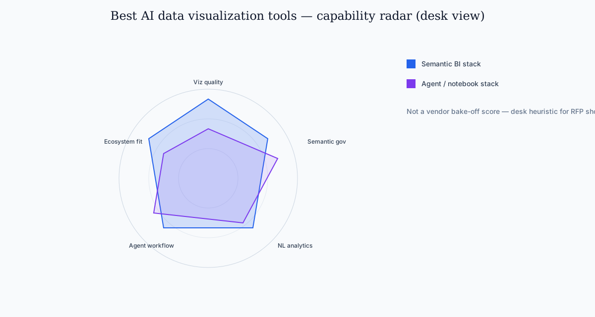
ThoughtSpot alternatives are not interchangeable with a generic chart shortlist. ThoughtSpot is strong in semantic-governed self-service BI, but teams often evaluate alternatives for notebook flexibility, lower switching cost, stronger lakehouse alignment, or more autonomous analysis workflows.
Top alternatives in 2026 include Power BI Copilot, Tableau Pulse, Hex, Databricks Genie, Sigma, and InfiniSynapse. When you compare options, prioritize chart correctness, semantic governance, and whether visualization is the end product or one phase in a recurring analytical workflow. The fixture-scored category bake-off is on AI data visualization tools.
Who this is for: BI leaders, analytics platform owners, and data teams evaluating ThoughtSpot Spotter or Sage against other governed-BI and agent stacks.
What you will get: six tool deep-dives with architecture / pricing-model / scale cards, a decision matrix, a buyer checklist, migration notes, and a governance section aligned to enterprise reporting.
Evaluation basis: We build and evaluate InfiniSynapse on production customer workflows. Governance, adoption, and security context is cited inline from NIST, OECD, ISO, and vendor docs — not a standalone dump of Wikipedia pages.
Why Teams Search for ThoughtSpot Alternatives
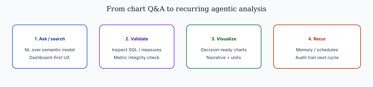
NL interfaces for data still inherit limits called out in the NIST AI Risk Management Framework, especially ambiguity and grounding. Teams usually start evaluating alternatives for one of four reasons.
- Ecosystem fit: they are already standardized on Microsoft, Tableau, or Databricks.
- Cost and procurement model: they want lower entry cost or different packaging.
- Workflow style: they need notebook-native or agent-native analysis, not only semantic BI.
- Expansion scope: they need cross-source operational analysis beyond dashboard Q&A.
ThoughtSpot still fits many enterprise BI scenarios. The key is matching tool architecture to team operating model. Many organizations keep ThoughtSpot for governed self-service while adding complementary platforms for notebook depth, lakehouse operations, or agentic recurring analysis — the same shift enterprise buyers discuss when ranking the alternatives for 2026 RFPs.
Common pain points that trigger a search for ThoughtSpot alternatives:
| Pain point | What teams feel | What they ask for next |
|---|---|---|
| Semantic model lock-in | Every new metric requires modeling sprint | Faster path from question to chart |
| Session-only AI | Insights do not compound between cycles | Workflow memory and reusable definitions |
| Dashboard-first UX | Hard to move from KPI view to root-cause drill | Multi-phase analysis with audit trail |
| Procurement concentration | Single-vendor dependency | Ecosystem-aligned alternatives |
For foundational agent context, see What Is a Data Agent and Data Agent Memory.
Evaluation Criteria
| Criterion | Why it matters |
|---|---|
| Visualization quality | Charts must be decision-ready, not just query outputs |
| Semantic governance | Metric consistency and trust in executive reporting |
| Natural-language analytics | Speed of insight for non-SQL stakeholders |
| Workflow extensibility | Ability to move from dashboard Q&A to deeper analysis |
| Deployment fit | Cloud, identity, compliance, and procurement alignment |
| Recurring workflow durability | How well methods persist between reporting cycles |
Three dimensions separate the alternatives from generic chart generators:
| Dimension | What strong tools do |
|---|---|
| Chart correctness | Select chart types aligned with metric and comparison intent |
| Interpretability | Provide clean labels, units, and narrative context |
| Workflow reliability | Keep outputs reproducible across recurring reporting cycles |
Use these criteria when you score candidates in a 30-day pilot — demos alone inflate viz polish and hide metric drift. Still treat the exercise as a shortlist of the alternatives for your constraints.
6 ThoughtSpot Alternatives — Deep Dives
1) Power BI + Copilot
- Best for: Microsoft-centric organizations
- Strength: deep integration with Fabric and Microsoft identity stack
- Trade-off: AI depth varies by model and workspace maturity
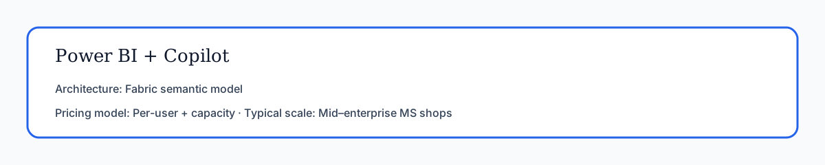
| Spec | Detail |
|---|---|
| Architecture | Fabric / Power BI semantic model + Copilot over DAX and report surfaces (Microsoft Fabric Copilot docs) |
| Pricing model | Per-user Power BI licenses plus Fabric capacity for Copilot/AI workloads (public Microsoft packaging; validate SKUs in procurement) |
| Typical customer scale | Mid-market to large enterprises already on Azure AD / Microsoft 365 |
Power BI remains one of the alternatives for teams already on Azure, Fabric, and Microsoft 365. Copilot accelerates DAX suggestions, report layout, and natural-language exploration over semantic models. Visualization quality is strong for standard business charts — bar, line, waterfall, decomposition trees — and executive audiences already trust the Power BI rendering engine.
Where it differs from ThoughtSpot: search-first UX is less central; users navigate reports and workspaces. Governance flows through Fabric capacity, workspace roles, and row-level security in the semantic model. For recurring workflows, analysts still orchestrate refresh schedules and model changes manually unless paired with broader automation.
Migration note: teams on ThoughtSpot often export metric definitions and rebuild them as Power BI measures. Budget two to four weeks for semantic parity on your top 20 KPIs — a common RFP step when Microsoft shops rank the alternatives.
2) Tableau Pulse
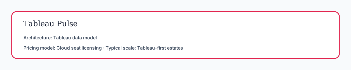
- Best for: Tableau-heavy teams wanting AI narrative augmentation
- Strength: strong visualization ecosystem and familiar UX
- Trade-off: requires robust Tableau data model discipline
| Spec | Detail |
|---|---|
| Architecture | Tableau Cloud metrics + Pulse narratives over existing published data sources (Tableau Pulse help) |
| Pricing model | Tableau Cloud / Creator–Viewer style seat licensing (confirm Pulse entitlement with your account team) |
| Typical customer scale | Organizations where Tableau is already the dashboard system of record |
Tableau Pulse adds metric narratives and monitoring on top of Tableau Cloud's visualization stack. For estates already standardized on Tableau, Pulse is often the lowest-friction path among AI-augmented BI options — a practical pick when buyers compare alternatives without rewriting their whole BI estate.
Pulse excels at digestible KPI stories for business users who live in Tableau. It is less suited to cross-source autonomous analysis or notebook-style transparency. Pair Pulse with a deeper analytics layer when teams need root-cause investigation beyond metric summaries. Foundational chart grammar still matters; Tableau Desktop documentation remains a useful refresher when reviewers validate generated visuals.
3) Hex Magic
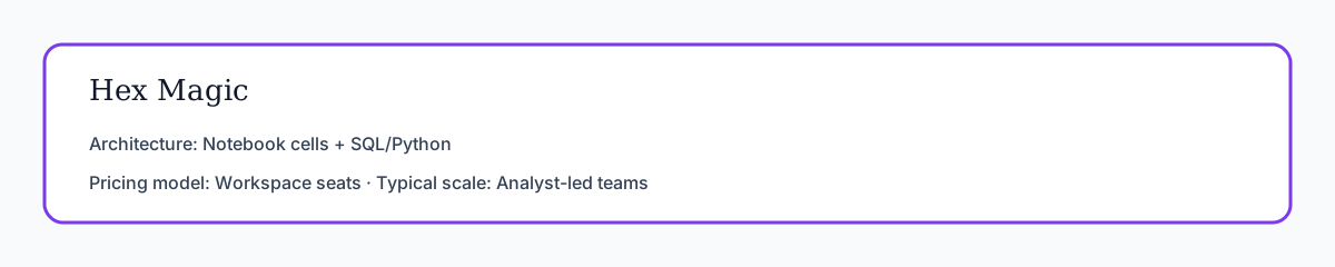
- Best for: analyst-led organizations that blend BI and notebook workflows
- Strength: interactive notebook transparency and collaboration
- Trade-off: higher skill requirement for business-only users
| Spec | Detail |
|---|---|
| Architecture | Collaborative notebooks with SQL/Python cells, Magic AI assist, and app publishing (Hex docs) |
| Pricing model | Workspace / seat licensing (public Hex packaging; validate AI feature tiers) |
| Typical customer scale | Analyst-led mid-market and growth companies; data-science-adjacent teams |
Hex is one of the alternatives when analysts need to inspect, edit, and version every analytical step. Magic AI accelerates SQL and Python cell generation; charts render inline with lineage visible at the cell level. Teams that treat transparency as a hard requirement often put Hex near the top when they evaluate the alternatives for notebook-native work.
Compared to ThoughtSpot's semantic search model, Hex favors analyst ownership over business self-service at scale — a deliberate trade-off when scoring the alternatives. Governance comes from workspace permissions, version history, and review workflows — not a centralized semantic layer alone.
4) Databricks Genie
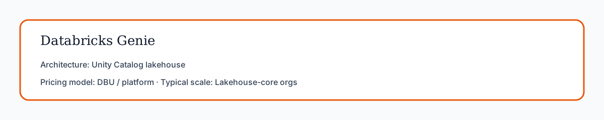
- Best for: Unity Catalog-centered lakehouse teams
- Strength: governance alignment with Databricks platform controls
- Trade-off: best value appears when Databricks is already core
| Spec | Detail |
|---|---|
| Architecture | Genie spaces over Unity Catalog tables/views with platform lineage (Databricks docs; Genie architecture post) |
| Pricing model | Databricks platform / DBU consumption plus workspace entitlements |
| Typical customer scale | Lakehouse-core enterprises and data platforms standardized on Databricks |
Databricks Genie delivers governed natural-language analytics over curated lakehouse assets. For organizations standardized on Unity Catalog, Genie ranks among the alternatives when charts must inherit catalog permissions, lineage, and data quality signals natively — a common RFP filter among lakehouse buyers ranking the alternatives.
Genie text-to-SQL and chart suggestions work well inside the Databricks boundary. Lakehouse RFPs still place Genie among the alternatives when catalog inheritance is non-negotiable. Teams needing broad no-code exploration across non-Databricks sources often add complementary tools. Visualization is session-oriented unless paired with scheduled jobs or external reporting layers.
5) Sigma
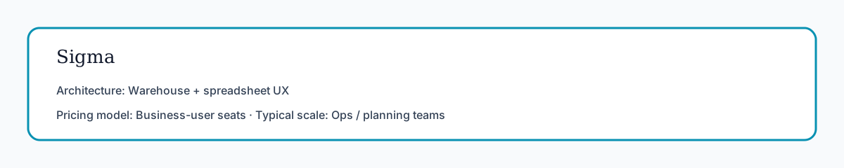
- Best for: spreadsheet-native business analysts in modern cloud warehouses
- Strength: familiar spreadsheet interactions on warehouse-backed data
- Trade-off: less agentic autonomy for multi-phase analysis loops
| Spec | Detail |
|---|---|
| Architecture | Spreadsheet UX compiled to warehouse SQL with governed datasets (Sigma docs) |
| Pricing model | Business-user / creator seat licensing against cloud warehouse compute |
| Typical customer scale | Ops, finance planning, and revenue teams on Snowflake/BigQuery/Redshift |
Sigma's spreadsheet UX makes it one of the alternatives for business teams uncomfortable with SQL but fluent in Excel logic. Ask Sigma and related AI features accelerate chart creation from governed warehouse tables. Adoption speed is the usual win for operational reporting and planning workflows.
It offers less autonomous multi-phase execution than agent-native platforms. Governance flows through warehouse roles and Sigma's access model — validate row-level security mapping during evaluation. Spreadsheet-native teams frequently name Sigma among the alternatives for planner adoption.
6) InfiniSynapse
- Best for: teams needing visualization plus autonomous recurring analysis
- Strength: AI-native Data Agent workflow with transparent task execution
- Trade-off: requires a shift from dashboard-first to goal-first operations; not a drop-in ThoughtSpot Liveboard clone
| Spec | Detail |
|---|---|
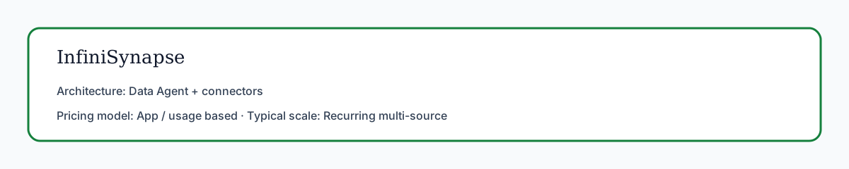
| Architecture | Goal-driven Data Agent across connectors with phase timelines and memory cards |
| Pricing model | Application access / usage-based packaging (see commercial note; free trial available) |
| Typical customer scale | Teams running recurring multi-source packs alongside or beyond semantic BI |
Among the alternatives evaluated for recurring packs, InfiniSynapse treats visualization as one deliverable in a goal-driven workflow, not the entire product surface. It matters most when teams need multi-step analysis, phase-level audit trails, and memory cards that preserve metric definitions between cycles — a pattern buyers look for when the alternatives must do more than one-shot chart Q&A.
InfiniSynapse can generate visualization outputs while preserving query lineage and reusable memory for repeated reporting cycles. Analysts submit goals via app, chat, or API; the Data Agent plans phases, executes queries across connected sources, and distills approved methods into memory. Strong fit when ThoughtSpot's semantic BI is sufficient for self-service but insufficient for autonomous cross-source execution. Operational maturity for analytics agents aligns with the EU AI Act overview (monitoring, rollback, ownership).
Limitations (honest): InfiniSynapse is not a full replacement for every Liveboard or search UX pattern among the alternatives; semantic modeling culture still belongs in your warehouse/catalog. Hybrid stacks are common for 12+ months.
Decision Matrix
| Team priority | Consider first |
|---|---|
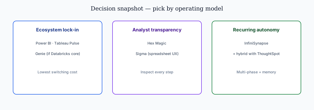
| Tight Microsoft ecosystem integration | Power BI + Copilot |
| Tableau-first reporting culture | Tableau Pulse |
| Hybrid notebook + BI operation | Hex Magic |
| Lakehouse-native governance | Databricks Genie |
| Spreadsheet-style warehouse analysis | Sigma |
| Autonomous recurring visualization workflows | InfiniSynapse |
- Do you need semantic BI only, or semantic BI plus autonomous execution?
- Is your reporting mostly dashboard consumption, or recurring multi-step investigation?
BI comparison exercises should reference the NIST Cybersecurity Framework when judging visualization depth versus agentic analysis. Production rollouts that reshape notebook cells should align with pandas documentation for reproducible transforms.
| Workflow need | Semantic BI tools | Agent-native tools |
|---|---|---|
| One-time executive chart | Excellent | Strong |
| Multi-step diagnostics before charting | Medium | Strong |
| Repeatable monthly chart packs | Medium | Strong |
| Full query audit for compliance | Medium | Strong |
Buyer Checklist
Platform teams often read SQL data analysis tools alongside this topic. Analysts scaling this workflow should skim AI data analysis tools before rollout.
| # | Question | Pass condition |
|---|---|---|
| 1 | Chart-type fit | Tool selects line/bar/scatter appropriately for metric intent |
| 2 | Metric integrity | Denominators, filters, and date windows are explicit |
| 3 | Semantic alignment | KPI definitions match your governed model or catalog |
| 4 | Drill-down transparency | Analysts can inspect logic behind every visual |
| 5 | Recurring reuse | Same chart logic runs next cycle without full rebuild |
| 6 | Identity and access | SSO, row-level security, and workspace roles map cleanly |
| 7 | Ecosystem fit | Connectors cover your warehouse, files, and operational DBs |
| 8 | Pilot signal | Time-to-insight improves 20%+ on five real workflows in 30 days |
Practical rule: run the same reporting scenario across all candidates. Never choose among the alternatives based on demo aesthetics alone.
Score each candidate 1–5 on visualization quality, governance, and workflow durability. Weight governance highest if CFO-facing reporting is in scope. Document which candidates passed each checklist row — procurement teams need that evidence trail when they finalize the alternatives for your stack.
Include business users and analysts in scoring. The alternatives for your organization must work for both audiences, not only power users.
Migration Notes from ThoughtSpot
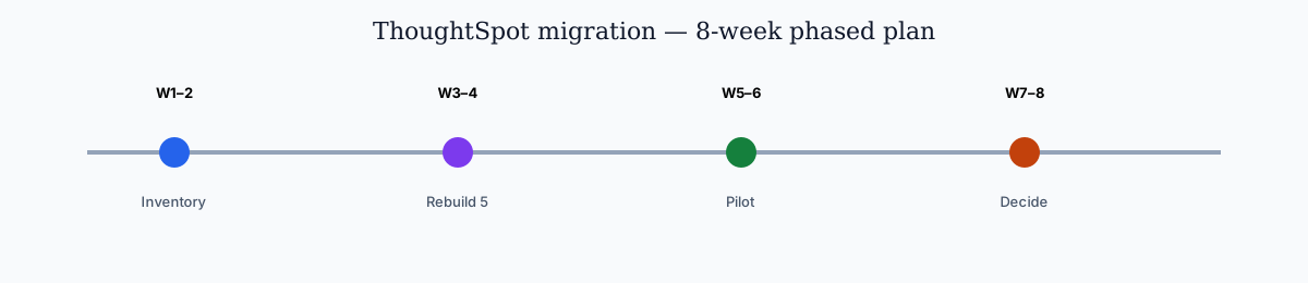
Most teams do not rip out ThoughtSpot on day one. A phased migration reduces risk:
| Phase | Action | Success metric |
|---|---|---|
| Week 1–2 | Inventory top 20 ThoughtSpot Liveboards and metric owners | 100% mapped to source tables and definitions |
| Week 3–4 | Rebuild five high-impact visuals in shortlisted tool(s) | Output parity on at least 4/5 workflows |
| Week 5–6 | Run side-by-side pilot with analysts and business users | Time-to-insight improves measurably |
| Week 7–8 | Decide hybrid vs full migration architecture | Signed rollout plan with governance controls |
Semantic layer migration: export ThoughtSpot worksheet and formula definitions before you crown any of the alternatives as the new system of record. Reconcile naming with your target platform's measure or metric layer before user-facing rollout. Mismatched definitions cause more adoption failure than interface differences.
Hybrid pattern: keep ThoughtSpot for governed dashboard self-service; add Hex, Genie, or InfiniSynapse for notebook depth, lakehouse operations, or agentic recurring analysis. Many enterprises run this dual-stack for 12+ months before consolidating.
User communication: frame the change as expanded capability, not replacement. Business users who lose search UX without training will resist even stronger platforms among the alternatives.
Vendor overlap: several of the alternatives can coexist — Pulse for narratives, Hex for analyst depth, InfiniSynapse for recurring agentic delivery. Map each tool to a workflow segment before consolidating contracts.
Governance and Compliance Considerations
Procurement and architecture reviews may include best AI tools for data analysis.
| Control area | What to verify |
|---|---|
| Access management | SSO, SCIM provisioning, workspace or catalog roles |
| Row-level security | User sees only authorized rows in every chart path |
| Audit logging | Query and tool execution logged with user attribution |
| Metric versioning | Definition changes tracked and approvable |
| Data residency | Runtime and storage meet contractual boundaries |
| AI policy alignment | Model usage, retention, and opt-out match internal AI policy |
ThoughtSpot's strength is semantic trust for self-service BI. Alternatives must match or exceed that trust model for your risk profile. Power BI and Databricks offer mature enterprise controls among the alternatives; Hex and InfiniSynapse require explicit workspace and task-timeline review workflows.
For regulated industries, prioritize options with inspectable query lineage. When an executive asks "where did this number come from?", the answer must trace to source tables in minutes, not days. Finance and healthcare teams should reject any shortlist entry that cannot produce query-level audit logs on demand — visualization without lineage is a liability, even among otherwise strong alternatives.
Pair this section with Data Agent Memory if recurring workflows and definition locking are part of your governance model.
Enterprise adoption framing should cite ISO/IEC 27001 when comparing regional governance expectations. Spreadsheet connectors should align with the NIST AI Risk Management Framework for sharing rules, ranges, and API quotas. Lakehouse integrations should use Databricks documentation for Unity Catalog, SQL warehouses, and agent grounding patterns.
Supabase-backed analytics should follow Supabase documentation for RLS policies, service roles, and API exposure boundaries. Document-store connectors should follow MongoDB documentation for read scopes, aggregation safety, and schema discovery. Warehouse vendors describe governed NL2SQL agents in Databricks' Genie architecture post — compare memory depth and audit trails against your internal requirements. Enterprise adoption framing should also cite the OECD AI policy observatory when comparing regional governance expectations. Production rollouts should align access and review controls with the NIST AI Risk Management Framework, especially when recurring queries touch live schemas.
Frequently Asked Questions
What are the best ThoughtSpot alternatives in 2026?
Power BI + Copilot, Tableau Pulse, Hex Magic, Databricks Genie, Sigma, and InfiniSynapse. Pick by ecosystem, governance, and need for autonomous workflows beyond semantic BI.
Which alternative is best for AI data visualization tools?
Among the alternatives, Tableau Pulse and Power BI lead for pure viz ecosystems. Hex and InfiniSynapse fit better when you need AI visualization plus deeper analytical execution.
What if my team needs a governed semantic layer like ThoughtSpot?
Prioritize Power BI/Fabric or Databricks + Unity Catalog. Governance maturity beats interface polish for executive trust.
Are there alternatives better for notebook-first analysts?
Yes — Hex, because analysts can inspect, edit, and version each step while still using AI acceleration.
How does InfiniSynapse compare to ThoughtSpot for visualization workflows?
ThoughtSpot optimizes governed NL BI over semantic models; InfiniSynapse extends into multi-phase analysis with auditable timelines and reusable memory.
Should teams migrate away from ThoughtSpot completely?
Not necessarily. Many keep ThoughtSpot for self-service Liveboards and add complementary tools for notebooks, lakehouse ops, or recurring agentic packs.
Conclusion
When evaluating ThoughtSpot alternatives, the right pick among the alternatives depends on whether you optimize for dashboard consumption, analyst flexibility, or recurring autonomous analysis.
ThoughtSpot remains strong for semantic BI. Alternatives among the alternatives win when your team needs different ecosystem alignment or broader AI-native workflow behavior. Compare the alternatives on your semantic layer — not demo datasets.
The platforms that earn a durable place on a alternatives shortlist share one trait: they tie every chart to trustworthy definitions and repeatable methods. Pick the stack that preserves that trust as usage scales.
Commercial note (optional product trial): To pilot agentic recurring packs after you shortlist platforms, you can try the InfiniSynapse web app (free on registration, no credit card required). This block is separate from the editorial comparison above. For non-product depth, start with what AI-native data analysis means.