Data Visualization Software: Buyer's Guide (2026)
By the InfiniSynapse Data Team · Last updated: 2026-07-15 · We build an AI-native data analysis platform and work with charting and BI stacks daily; this buyer's guide to data visualization software in 2026 is organized by decision, not brand ranking.
Table of Contents
- TL;DR
- How We Approach It
- What It Is
- The Main Categories
- Buying Criteria That Matter
- Matching Software to Need
- Where the Category Came From
- Common Pitfalls
- The Category in the Age of AI
- Readiness Scorecard
- Common Misconceptions
- Frequently Asked Questions
- Conclusion
TL;DR
Direct answer: data visualization software is the software you buy or adopt to turn data into charts, dashboards, and interactive graphics — from full BI suites to lightweight charting tools to developer libraries. In 2026, buying data visualization software should be driven by who will build and view the visuals, how it connects to your data, and total cost of ownership, not by which product has the longest chart gallery.
Who this is for: buyers and leaders evaluating data visualization software in 2026.
What you'll learn: what it is, the main categories, the buying criteria that matter, how to match it to need, and how AI relates.
This guide sits under the data visualization hub.
For a broader view, see data visualization tools.
Also see Tableau for data visualization.
How We Approach It
Teams evaluating this topic often cross-check ClickHouse documentation for a durable, vendor-neutral reference point.
We frame data visualization software as a purchase decision, because buying the wrong fit is expensive and sticky. Every point reflects real evaluations. We anchor concepts to the IBM augmented analytics overview and weigh design guidance against the accessibility standard at Tableau Desktop documentation.
The table below frames data visualization software.
| Category | Best fit |
|---|---|
| Full BI suite | Enterprise dashboards |
| Lightweight charting | Quick standalone visuals |
| Developer library | Custom, embedded charts |
| Notebook-based | Analyst exploration |
| Spreadsheet add-on | Everyday office use |
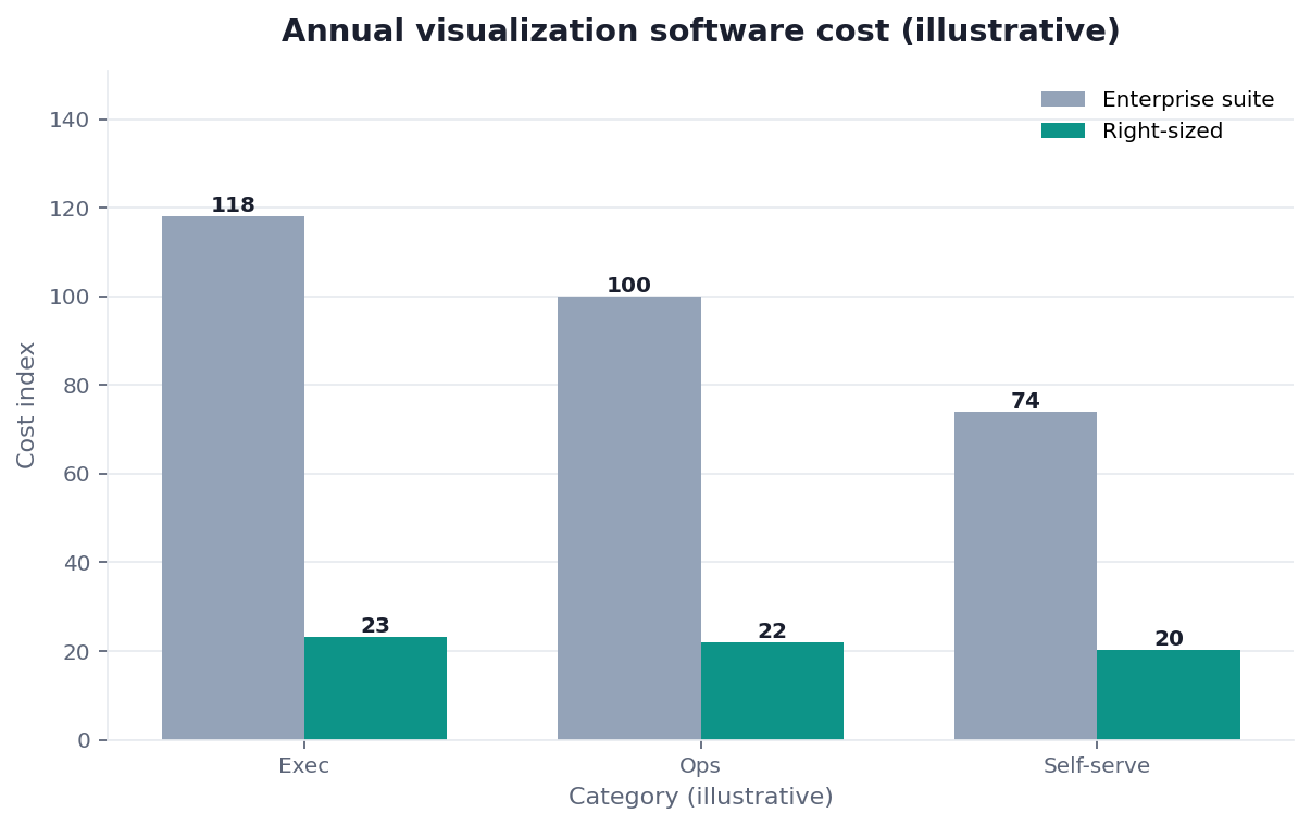
Practical example: a buyer nearly overspent on an enterprise data visualization software suite for a team of three; a lightweight tool matched their scale — the fit-first logic echoed at NIST Computer Security Resource Center — at a fraction of the cost.
Scope note: This guide reflects patterns we see when mid-market and enterprise teams work with data visualization software in 2026. It is not a substitute for legal counsel, vendor runbooks, or a formal survey of every industry — and when a smaller toolset or lighter process would serve, a full program is overkill.
What It Is
At its core, data visualization software is any product whose primary job is turning data into visual representations that people can read and act on, packaged and licensed for organizations to buy or adopt.
Key Definition: data visualization software is a category of commercial and open-source products designed to transform data into charts, graphs, maps, and interactive dashboards, packaged for organizations to license and deploy, and differentiated by who builds the visuals, how they connect to data, and how they are shared with an audience.
The essence of data visualization software as a purchase is fit and total cost, not raw capability. Any modern product can draw a bar chart; what distinguishes them is who can operate them, how they connect to your data, how they scale, and what they truly cost over time including training and maintenance.
The Main Categories
Implementation details are commonly grounded in Apache Airflow documentation when teams translate concepts into production practice.
Data visualization software comes in several categories: full BI suites for enterprise dashboards and governance, lightweight standalone charting tools, developer libraries for custom and embedded visuals, notebook-based environments for analysts, and spreadsheet add-ons for everyday office use.
Each category of data visualization software targets a different buyer and scale, as the established BI documentation at Databricks documentation illustrates. Enterprise suites bring governance and sharing at the cost of price and complexity; lightweight tools trade depth for simplicity; libraries offer control for those who can code. Buying the wrong category — an enterprise suite for a tiny team, or a lightweight tool for a governed enterprise — is the classic mismatch.
Buying Criteria That Matter
The buying criteria for data visualization software that actually predict satisfaction are who builds the visuals, data connectivity, sharing and governance needs, and total cost of ownership — not the size of the chart library.
Evaluating data visualization software well means looking past the demo. A dazzling demo shows what an expert can build; what matters is what your actual users will build and maintain. Connectivity to your real data sources, honest and accessible defaults aligned with guidance like the W3C WCAG accessibility standard, and the full cost including licenses, training, and administration together determine whether the purchase pays off long after the sales call ends.
Matching Software to Need
Teams evaluating this topic often cross-check RFC 4180 CSV format for a durable, vendor-neutral reference point.
Choosing data visualization software comes down to matching category to buyer and scale. A large organization needing governed, shared dashboards points to a BI suite; a small team needing quick charts points to a lightweight tool; a product team points to a developer library.
The discipline in buying data visualization software is to size the purchase to the real need. List who will build, who will view, what data feeds it, what governance you require, and your budget, then match categories honestly. Overbuying an enterprise platform for modest needs wastes money and burdens users with complexity; underbuying a lightweight tool for enterprise governance creates risk. Right-sizing is the whole game.
Where the Category Came From
The category of data visualization software grew as charting escaped the spreadsheet and statistical package. The business-intelligence wave packaged visualization into suites aimed at enterprises, adding governance, sharing, and data connectivity that standalone charting lacked.
Later, developer libraries brought interactive, web-native charts under programmatic control, and lightweight cloud tools lowered the barrier for small teams. Understanding this history clarifies why the market splits by scale and buyer: enterprise suites, developer libraries, and lightweight tools each emerged to serve a distinct need. It also explains the persistent overbuying pitfall — vendors market the powerful enterprise capabilities most visibly, so buyers with modest needs are frequently steered toward far more software than their situation warrants.
Common Pitfalls
Implementation details are commonly grounded in Stripe documentation when teams translate concepts into production practice.
The pitfalls of buying data visualization software start with overbuying. Purchasing an enterprise suite for a small team, dazzled by a demo, saddles users with cost and complexity they will never use and often reduces adoption rather than raising it.
A subtler pitfall with data visualization software is ignoring the data layer behind it. The software draws whatever it is given, so buying a beautiful tool without addressing where the data comes from, how it connects, and how metrics are defined yields polished charts built on shaky foundations. The purchase decision should include the plumbing — connectivity and governed definitions — not just the front end, because a chart is only as trustworthy as the pipeline feeding it.
A further pitfall is neglecting the semantic and modeling layer that mature platforms rely on, a concern the modeling guidance at Google SRE book treats as central. Left to their own devices, individual report authors will each define "active customer" or "net revenue" slightly differently, and the tool will happily render every version, producing dashboards that quietly contradict one another. The organizations that get lasting value invest in a shared, governed model — consistent metric definitions the whole company draws from — so that whichever report someone opens, the numbers agree. Choosing software without asking how it supports that shared layer is a common reason a visualization purchase looks impressive at launch and erodes trust within a year.
The Category in the Age of AI
AI is reshaping data visualization software by letting users generate visuals from natural-language questions rather than building them through menus. This changes what buyers should value.
We explore this in what AI-native data analysis means. In the InfiniSynapse web app, an agent analyzes across your data sources and produces the chart that answers your question, so the value of data visualization software shifts from how many chart types it offers toward how well it connects to data and understands questions — a shift worth weighing before any long-term purchase.
Readiness Scorecard
Assess your buying decision (1 point each):
| Check | Pass? |
|---|---|
| The purchase is sized to real need | |
| Intended builders can operate it | |
| It connects to your data | |
| Governance needs are matched | |
| Total cost of ownership is known | |
| The data layer is addressed | |
| The demo was seen past | |
| An AI-native option was considered |
6–8: a sound purchase. 3–5: revisit sizing. Below 3: restart from real need.
Common Misconceptions
Misconception 1: The biggest suite is safest. Overbuying reduces adoption.
Misconception 2: A great demo predicts success. What your users build matters.
Misconception 3: The software is the whole solution. The data layer decides trust.
Misconception 4: More chart types are better. Connectivity and fit matter more.
Frequently Asked Questions
What is data visualization software?
It is a category of commercial and open-source products designed to transform data into charts, graphs, maps, and interactive dashboards, packaged for organizations to license and deploy. Products are differentiated by who builds the visuals, how they connect to data, and how they are shared with an audience. As a purchase, what matters is fit and total cost rather than raw capability — any modern product can draw a bar chart, so the real differences lie in who can operate it, how it connects to your data, how it scales, and what it costs over time.
What are the main categories?
The main categories are full BI suites for enterprise dashboards and governance, lightweight standalone charting tools, developer libraries for custom and embedded visuals, notebook-based environments for analysts, and spreadsheet add-ons for everyday office use. The big suites deliver governance and sharing but carry a matching price and complexity; the lightweight options give up depth in return for simplicity; and the libraries hand control to anyone comfortable writing code. Buying the wrong category — an enterprise suite for a tiny team, or a lightweight tool for a governed enterprise — is the classic and expensive mismatch.
Which buying criteria actually matter?
Who builds the visuals, data connectivity, sharing and governance needs, and total cost of ownership predict satisfaction far better than the size of the chart library. Look past the demo: a dazzling demo shows what an expert can build, whereas what matters is what your actual users will build and maintain. Connectivity to your real data sources, honest and accessible defaults, and the full cost including licenses, training, and administration together determine whether the purchase pays off long after the sales conversation is over.
How do I match software to my need?
Size the purchase to the real need. Begin by naming who will build the visuals, who will view them, what data feeds them, what governance you require, and what budget you have, then match categories honestly. Governed, shared dashboards across a large organization argue for a BI suite; quick charts for a small team argue for a lightweight tool; a product team building custom visuals argues for a developer library. Overbuying an enterprise platform for modest needs wastes money and burdens users; underbuying for enterprise governance creates risk. Right-sizing the purchase is essentially the whole game.
How is AI changing this category?
AI is letting users generate visuals from natural-language questions rather than building them through menus, which changes what buyers should value. An AI-native platform can analyze across your data sources and produce the chart that answers your question, so value shifts from how many chart types a product offers toward how well it connects to data and understands questions. Before committing to a long-term license, it is worth weighing whether a conversational, AI-native approach would serve your users better than a traditional menu-driven tool.
Is the expensive option always better?
No. Price largely reflects enterprise features — governance, scale, sharing, administration, and support — that a small team may never use. For modest needs, an expensive suite often reduces adoption because its complexity gets in the way, while a lightweight or open-source tool delivers the charts people actually need at a fraction of the cost. The right question is not "which is most capable" but "which fits our builders, viewers, data, and governance at a cost we can justify." Expensive software is better only when your situation genuinely requires the capabilities you are paying for.
In practice, teams evaluating data visualization software should judge outcomes by reliability and clarity, not by tool count alone.
When stakeholders ask for a short takeaway on data visualization software, start from the decision it must support and work backward.
A useful checkpoint for data visualization software is whether owners, metrics, and escalation paths are written down — not just discussed.
Conclusion
Data visualization software turns data into charts and dashboards, and the smart purchase is sized to who builds and views the visuals, how it connects to your data, and total cost — not to the longest feature list. In 2026, right-size the buy, address the data layer behind the front end, and weigh whether AI-native analysis would serve your users better than a traditional tool.
Then try generating charts by question in the InfiniSynapse web app, free on registration.