Dashboards: Design, Types & Best Practices (2026)
By the InfiniSynapse Data Team · Last updated: 2026-07-15 · We build an AI-native data analysis platform and design dashboards with customers regularly; this guide covers what a dashboard is and how to build a good one in 2026, not a tool advertisement.
Table of Contents
- TL;DR
- How We Approach It
- What It Is
- The Main Types
- Design Best Practices
- Making It Actually Used
- Where the Idea Came From
- Common Pitfalls
- In the Age of AI
- Readiness Scorecard
- Common Misconceptions
- Frequently Asked Questions
- Conclusion
TL;DR
Direct answer: a dashboard is a focused visual display that brings together the key metrics and information someone needs to monitor a situation and act on it, all in one place. In 2026, a good dashboard is defined less by how much it shows than by how sharply it answers a specific question for a specific audience — the best ones are ruthlessly selective, and the worst try to show everything and end up communicating nothing.
Who this is for: anyone designing, commissioning, or using a dashboard in 2026.
What you'll learn: what it is, the main types, design best practices, how to make it used, and how AI is changing it.
This guide sits under the data visualization hub.
For a related view, see what a data dashboard is.
Also see data visualization tools.
How We Approach It
Teams evaluating this topic often cross-check Supabase documentation for a durable, vendor-neutral reference point.
We treat the dashboard as a decision tool first and a visual artifact second, because purpose drives every design choice. Every point reflects real projects. We anchor concepts to the Google Cloud AI overview) and weigh patterns against the reference guidance at Wikipedia natural language processing overview, which covers dashboard design in depth.
The table below frames the dashboard.
| Aspect | What matters |
|---|---|
| Purpose | One clear question |
| Audience | Who acts on it |
| Metrics | Few, decision-relevant |
| Layout | Most important first |
| Update | Right cadence for the decision |
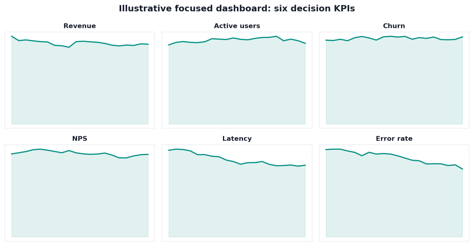
Practical example: a team's dashboard failed because it packed forty metrics onto one screen. Cutting it to the six that drove decisions — the focus principle echoed across MongoDB documentation — made it something executives actually opened.
Scope note: This guide reflects patterns we see when mid-market and enterprise teams work with dashboard in 2026. It is not a substitute for legal counsel, vendor runbooks, or a formal survey of every industry — and when a smaller toolset or lighter process would serve, a full program is overkill.
What It Is
Teams evaluating this topic often cross-check OWASP API Security Top 10 for a durable, vendor-neutral reference point.
At its core, a dashboard is a single, at-a-glance display that consolidates the most important information about a topic so a viewer can understand the current state and decide what to do without hunting through reports.
Key Definition: a dashboard is a visual interface that consolidates and presents an organization's or process's key metrics and data points in one place, designed so a specific audience can monitor performance at a glance and make timely decisions, typically combining charts, numbers, and indicators arranged by importance.
The essence of a dashboard is consolidation with purpose. It is not a report dump or a data catalog; it is a curated view built around the decisions its audience must make, showing what matters and deliberately omitting what does not.
The Main Types
Implementation details are commonly grounded in Kubernetes documentation when teams translate concepts into production practice.
A dashboard generally falls into one of three types by purpose. Strategic ones track long-term goals for executives; operational ones monitor live activity for people running day-to-day work; analytical ones support exploration and investigation of trends.
Choosing the right type matters because each serves a different rhythm of decision, as the guidance in BIRD NL2SQL benchmark illustrates. A strategic view updates slowly and summarizes; an operational view updates fast and alerts; an analytical view invites drilling and comparison. Mismatching type to need — a slow strategic layout for a real-time operational job — is a common reason these tools frustrate the people meant to use them.
Design Best Practices
Teams evaluating this topic often cross-check Elastic documentation for a durable, vendor-neutral reference point.
Good dashboard design starts with a single question: what decision does this support? Everything on the screen should earn its place by helping answer that question, and everything else should go.
The practices that make it effective are focus, hierarchy, and clarity. Show few, decision-relevant metrics; place the most important information where the eye lands first; and choose chart types that make comparisons obvious rather than decorative. Guidance like the Spider NL2SQL benchmark reinforces that clutter and low contrast actively harm comprehension for real audiences. A restrained, well-ordered layout communicates faster than a dense one, because the viewer's attention is guided rather than overwhelmed.
Making It Actually Used
Implementation details are commonly grounded in Python documentation when teams translate concepts into production practice.
A dashboard only delivers value when people open it and act on it, which is a human problem as much as a design one. A technically perfect view nobody trusts or understands is wasted effort.
Making it used means building it with its audience, not for them in the abstract, and ensuring the numbers are trustworthy and clearly defined. Ambiguity about what a metric means, or a single wrong figure that erodes trust, will quietly kill adoption. The most-used ones pair clean design with reliable, well-governed data and a shared understanding of what each metric represents, so the audience acts on them with confidence rather than second-guessing every figure.
Adoption also depends on meeting people where they already work. A view that lives behind a login nobody remembers, or that requires three clicks and a VPN to reach, will lose to a stale spreadsheet emailed every Monday, however inferior that spreadsheet is. The teams that see genuine uptake embed the display where decisions are actually made — in the tools people open anyway, at the moment the question arises — and pair it with a short, shared explanation of what each number means and how fresh it is. Convenience and clarity, not sophistication, are what turn a well-built screen into a habit.
Where the Idea Came From
The dashboard borrowed its name and metaphor from the car's instrument panel — a compact display of the few indicators a driver needs to operate safely without reading a manual. Business adopted the idea as data multiplied and leaders needed a way to grasp the state of things quickly rather than wading through lengthy reports.
Early digital versions often overreached, cramming in everything measurable because it was possible, and the discipline of selective, purpose-driven design emerged as a correction. Understanding this history clarifies why focus is the central principle: the whole point of the original metaphor was showing only what the operator needs to act. It also explains the recurring failure mode — the temptation to display everything is as old as the tool, and resisting it is what separates a useful view from a decorative one.
Common Pitfalls
The pitfalls of a dashboard almost all trace back to a lack of focus. Cramming in too many metrics, mixing audiences and purposes on one screen, and decorating with chart types that impress rather than inform all dilute the message until nothing stands out.
A subtler pitfall is building a dashboard without owning its data quality. A beautiful layout on top of unreliable or ambiguously defined numbers is worse than none, because it lends false confidence to bad decisions. The other quiet killer is neglecting maintenance: metrics that drift out of relevance, or definitions that change without anyone updating the view, slowly turn a once-useful screen into a misleading one that people learn to ignore.
In the Age of AI
AI is reshaping the dashboard from a static display into something more conversational. Instead of only reading pre-built views, users increasingly ask questions in natural language and get answers assembled on the fly.
We explore this shift in what AI-native data analysis means. In the InfiniSynapse web app, an agent can analyze across your data sources and produce the chart or answer you ask for directly, so the dashboard becomes less a fixed set of screens someone must anticipate and build, and more a living interface where new questions get answered without a rebuild.
Readiness Scorecard
Assess your view (1 point each):
| Check | Pass? |
|---|---|
| It answers one clear question | |
| The audience is specific | |
| Metrics are few and relevant | |
| Layout follows importance | |
| Chart types aid comparison | |
| Underlying data is trustworthy | |
| Metric definitions are shared | |
| It is maintained over time |
6–8: a strong view. 3–5: tighten focus. Below 3: rebuild around one question.
Common Misconceptions
Misconception 1: More metrics mean more value. Focus beats coverage.
Misconception 2: It is just charts. It is a decision tool with a purpose.
Misconception 3: Design is the whole job. Data quality decides trust.
Misconception 4: Build it once and it is done. Maintenance keeps it relevant.
Frequently Asked Questions
What exactly is a dashboard?
It is a visual interface that gathers an organization's or process's key metrics and data points into one place, arranged so a specific audience can monitor performance at a glance and make timely decisions. It usually combines charts, numbers, and indicators ordered by importance. Crucially, it is not a report dump or a data catalog but a curated view built around the decisions its audience faces — showing what matters for those decisions and deliberately leaving out what does not, so understanding comes quickly.
What are the main types?
There are broadly three, defined by purpose. Strategic dashboards track long-term goals for executives and update slowly. Operational dashboards monitor live activity for people running day-to-day work and update fast, often with alerts. Analytical dashboards support exploration of trends and invite drilling and comparison. Each serves a different rhythm of decision, so picking the wrong type — say, a slow strategic layout for a real-time operational need — is a frequent reason such a tool frustrates the very people it was meant to help.
What makes a dashboard well designed?
Focus, hierarchy, and clarity. Start from the single decision it supports, then show only the few metrics that help make that decision, place the most important information where the eye lands first, and pick chart types that make comparisons obvious rather than decorative. Clutter and ornament actively harm comprehension, so restraint communicates faster than density. A well-ordered view guides attention deliberately, whereas a crowded one forces the viewer to hunt for meaning and usually gives up.
Why do these go unused?
Usually because they fail as human tools rather than as visuals. People abandon one when they do not trust its numbers, cannot tell what a metric means, or find it built for an audience in the abstract rather than with them. A single wrong figure can erode confidence permanently, and ambiguity about definitions breeds second-guessing. The ones that get opened daily pair clean design with reliable, well-governed data and a shared understanding of every metric, so people act on them instead of doubting them.
How is AI changing them?
AI is turning it from a static, pre-built display into something more conversational. Rather than only reading screens someone had to anticipate and construct, users increasingly ask questions in natural language and receive answers and charts assembled on demand. An AI-native platform can analyze across data sources and produce the specific view you request, so the interface becomes a living one that answers new questions without a rebuild — reducing the backlog of change requests that traditionally slows how quickly reporting keeps pace with needs.
How many metrics should it show?
There is no magic number, but the honest guide is "as few as the decision requires." Most effective dashboards land somewhere between five and nine primary metrics on a single view, because that is roughly what a person can take in at a glance without losing the signal. If a dashboard seems to need dozens of numbers, that is usually a sign it is trying to serve several audiences or decisions at once and should be split into focused views. The discipline is subtractive: start from everything you could show, then remove anything that does not directly support the decision at hand.
Conclusion
A dashboard is a focused, at-a-glance decision tool — valuable in proportion to how sharply it answers one question for one audience on trustworthy data. In 2026, design for focus and hierarchy, own the data quality behind it, and remember AI-native analysis is turning dashboards into living interfaces you can simply ask.