Excel Data Analysis: Where It Lives and How Spreadsheet Analytics Works
By the InfiniSynapse Data Team · Named accountability: cofounder William Zhu (GitHub @allwefantasy) · Last updated: 2026-09-16 · We build an AI-native data analysis platform and work with spreadsheet-first teams daily; this how-to reflects the workflow that actually works, not a feature dump. About / credentials: editorial standards.
Table of Contents
- TL;DR
- How We Evaluated
- The Four-Step Workflow
- Step 1: Import and Structure
- Step 2: Clean the Data
- Step 3: Summarize With Pivots
- Step 4: Visualize and Interpret
- Where is Data Analysis in Excel?
- Spreadsheet analytics
- AI and Excel in 2026
- Excel vs Google Sheets vs Power BI vs Python
- Common Mistakes to Avoid
- Selection Scorecard
- Key Statistics
- Practical Next Steps
- Authority References
- Frequently Asked Questions
- Conclusion
TL;DR
Direct answer: Excel data analysis (also data analysis Excel) is import, clean, pivot, visualize. Spreadsheet analytics adds a refresh path and a written takeaway. Where is Data Analysis in Excel? Enable Analysis ToolPak, then Data → Data Analysis; Microsoft 365 also has Home → Analyze Data. ToolPak is for tests; the four steps cover everyday work.
Who this is for: anyone doing excel data analysis who wants a reliable end-to-end workflow, or who cannot find the Data Analysis command on the ribbon.
What you'll learn: ribbon location, how spreadsheet analytics differs from a one-off chart, how to execute each step, AI-era entities, comparisons, and handoff signals.
This how-to sits within the data analysis tools hub; for Excel's strengths as a tool, see Excel as a data analysis tool. For related depth, see Excel Data Analysis ToolPak, Using Excel for data analysis, and microsoft software for data analysis for the Excel / Power BI / Fabric map. When the grid is no longer the system of record, the handoff is data engineering — pipelines and a platform, not another workbook.
Conflict of interest: InfiniSynapse publishes this guide and sells a post-spreadsheet AI data analyst. The workflow below prioritizes Microsoft Excel practices; InfiniSynapse appears only at the handoff / practice CTA. Corrections: corrections policy.
Review mechanism: Drafts are reviewed by analytics-engineering and editor roles against Microsoft Learn / support docs before publish; next scheduled review within 90 days (editorial standards).
How We Evaluated
We assessed excel data analysis workflows against what practitioners actually need in 2026: a sequence that prevents confident-looking mistakes, features that repay learning time, and clear signals when the grid is the wrong layer. Each step was validated against Microsoft Learn Excel training paths and Excel support documentation, the Power Query connector catalog on Microsoft Learn, adoption patterns in IBM's augmented analytics overview, and agent maturity trends in the Stanford HAI AI Index.
How We Evaluated: What To Verify
We ran the same retail-style dataset through excel data analysis and through parallel paths in Google Sheets, Power BI, and Python to compare speed, transparency, and repeatability—not to crown a single winner.
How We Evaluated: In Practice
Repeatability separated strong teams from fragile ones. A one-hour excel data analysis win that cannot be refreshed next month without manual rework is a tactical success and a strategic risk.
The Four-Step Workflow
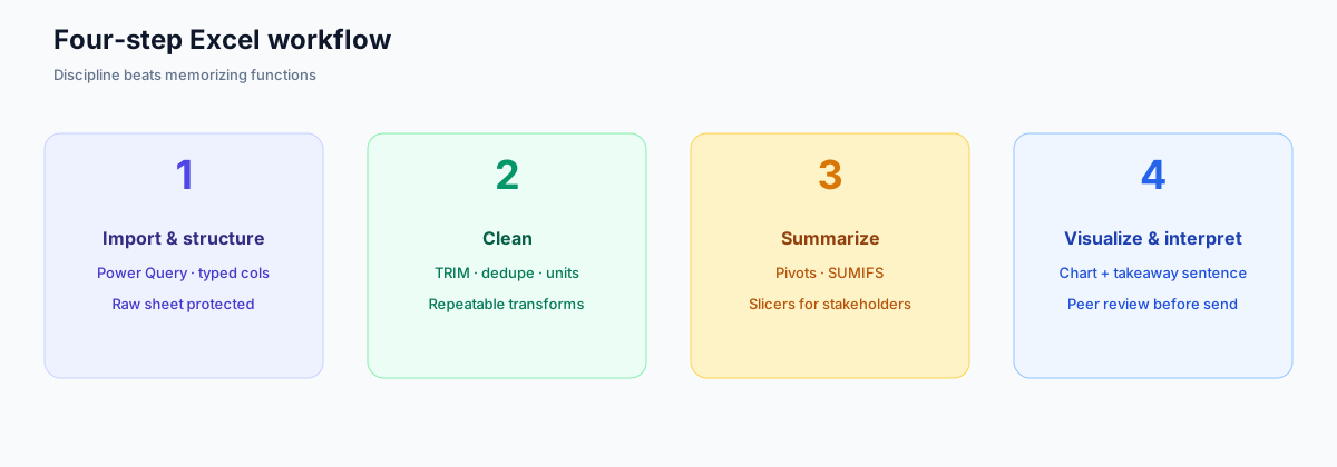
Effective excel data analysis is less about knowing hundreds of functions and more about following a disciplined sequence. Almost every real task moves through four stages: import and structure the data, clean it, summarize it, and visualize the result to answer a question. People who internalize this sequence produce reliable analysis; those who jump straight to charts on messy data produce confident-looking mistakes.
Document the question at the top of your workbook or in a README tab. When someone opens the file six months later, the excel data analysis logic should be recoverable without a verbal briefing.
Step 1: Import and Structure
Excel data analysis begins before any formula. Import CSV, Excel, or database exports with Power Query when you expect refresh; use a straight open only for true one-offs. Enforce structure: one row per record, one column per variable, headers on row one, no merged cells in the data region.
Date columns must be dates, not text that sorts alphabetically. ID columns must stay text if leading zeros matter. Category columns should use consistent spelling—"US," "U.S.," and "United States" are three different segments until you standardize them. Microsoft Learn's import modules cover connectors; the habit of profiling column types on import matters more than any connector list. Microsoft's Power Query connectors catalog lists 100+ connectors across files, databases, and online services—breadth is not the bottleneck; typed columns are.
Separate raw data onto its own sheet and protect it if others edit the file. All excel data analysis calculations should read from that staging area so you never overwrite source rows accidentally.
Step 2: Clean the Data
Cleaning is where excel data analysis wins or fails quietly. Trim whitespace with TRIM, split combined fields, fill or flag nulls deliberately, remove duplicates, and reconcile units before aggregating. A pivot built on dirty categories will look perfect while answering the wrong question.
Use Power Query for repeatable cleaning steps—filters, split columns, replace values—so next month's excel data analysis refresh replays the same transforms. For one-off fixes, helper columns are fine; label them clearly and hide them from presentation sheets when done.
Outliers deserve explicit policy. Cap them, investigate them, or leave them—but never let them pass unnoticed. IBM's augmented analytics overview notes that automated preparation still requires human judgment on edge cases; spreadsheets are no exception.
Step 3: Summarize With Pivots
Pivot tables are the workhorse of excel data analysis. Drag a numeric field to values, a category to rows, and optional time fields to columns to answer most "how much by what" questions in seconds. Add slicers when stakeholders need to filter interactively without touching formulas.
When pivots are not enough, SUMIFS, COUNTIFS, and XLOOKUP cover row-level logic that pivots cannot express. Dynamic arrays reduce formula dragging on medium tables. The Analysis ToolPak adds regression and ANOVA when you need formal tests; see Excel Data Analysis ToolPak for setup.
Practical example: an operations analyst receives daily shipment logs with 9,000 rows. She loads the CSV with Power Query, standardizes region names, builds a pivot of on-time rate by carrier and week, and adds a line chart for the stand-up slide. Desk time in our replay: under 60 minutes. When the same metrics must join finance margin data from Snowflake every morning for fifty viewers, she keeps the pivot logic as a spec but moves production to Power BI.
Step 4: Visualize and Interpret
Charts exist to support a sentence, not to decorate a sheet. Choose chart types that match the comparison: trends over time as lines, parts of a whole as bars (usually not pies), distributions as histograms. Label axes, cite the date range, and state the takeaway in a text box near the visual.
The final step of excel data analysis is interpretation in plain language: what changed, why it might matter, what you would check next. If you cannot write that sentence, the analysis is not finished—regardless of how polished the chart looks.
Share view-only copies when possible so consumers do not break formulas. For larger audiences, export PDF or publish to a dashboard layer while keeping the workbook as the audit trail.
Before that review, lock sheet roles on analysis design excel. Peer review catches spreadsheet mistakes that solo authors miss. Before sending any high-stakes file, ask a colleague to change one filter, verify totals move as expected, and read the takeaway sentence without opening the formula bar. That 10-minute review prevents most public errors.
Where is Data Analysis in Excel?
People search where is data analysis in Excel because two different commands hide behind similar names. Neither is on the ribbon until you know which one you want.
| What you want | Where it lives | How to turn it on |
|---|---|---|
| Classical stats (regression, t-test, ANOVA, descriptive stats) | Data tab → Data Analysis (Analysis group, far right) | File → Options → Add-ins → Manage: Excel Add-ins → Go → tick Analysis ToolPak |
| Natural-language charts and suggested pivots | Home tab → Analyze Data (Microsoft 365; formerly Ideas) | Eligible Microsoft 365 license; data must be an Excel Table (Ctrl+T) |
| Repeatable import and clean | Data tab → Get Data / Power Query | Built in on modern Excel; no extra add-in |
| Everyday excel data analysis (pivot + chart) | Insert → PivotTable; Insert → Charts | No add-in; this is the four-step workflow above |
On Mac, enable the ToolPak via Tools → Excel Add-ins, then look on the Data tab. If Data Analysis is still missing, you enabled the wrong add-in list or you are in Excel for the web, which does not expose the full ToolPak dialog. Microsoft documents both the Analyze Data pane and Excel Add-ins. The click-path question how to add data analysis in Excel is the enable job; Excel Data Analysis ToolPak stays on the procedures after the button appears. Spreadsheet analytics still starts with the four steps on this page.
HowTo: show Data Analysis on the Data tab (Windows)
- Open the workbook and go to File → Options → Add-ins.
- At the bottom, set Manage to Excel Add-ins and click Go.
- Tick Analysis ToolPak and click OK.
- Switch to the Data tab. Data Analysis should sit in the Analysis group.
- Run Descriptive Statistics on one numeric column first—if the output table appears on a new sheet, the add-in is live.
Do not confuse this with Copilot. Copilot drafts formulas; Data Analysis writes a static stats report; Analyze Data suggests visuals. For data analysis Excel work that must refresh next month, none of those three replace Power Query + a pivot.
Spreadsheet analytics
Spreadsheet analytics is the broader name for answering a business question in a grid—Excel or Sheets—with a path you can replay. Excel data analysis is the Microsoft-flavored instance of that practice. Teams that treat spreadsheet analytics as “make a chart” skip cleaning and then wonder why the next file disagrees.
| Spreadsheet analytics habit | What it looks like in Excel | Failure if you skip it |
|---|---|---|
| Named question | README tab or cell A1 states the decision | Pretty chart, no takeaway |
| Typed source | Raw sheet + Power Query | Silent unit and date errors |
| One grain | Pivot or SUMIFS at a declared grain | Double-count after a join |
| Refresh story | Query steps or a dated file name | Next month is a rewrite |
| Written takeaway | Text box next to the chart | Stakeholders invent the story |
Stay with spreadsheet analytics in Excel when the table is modest, the audience is small, and one person can defend the file. Move the same logic to Power BI or Python when refresh is daily, sources multiply, or fifty people need the same number. The comparison matrix below is the handoff map—not a reason to abandon the grid for a one-afternoon question.
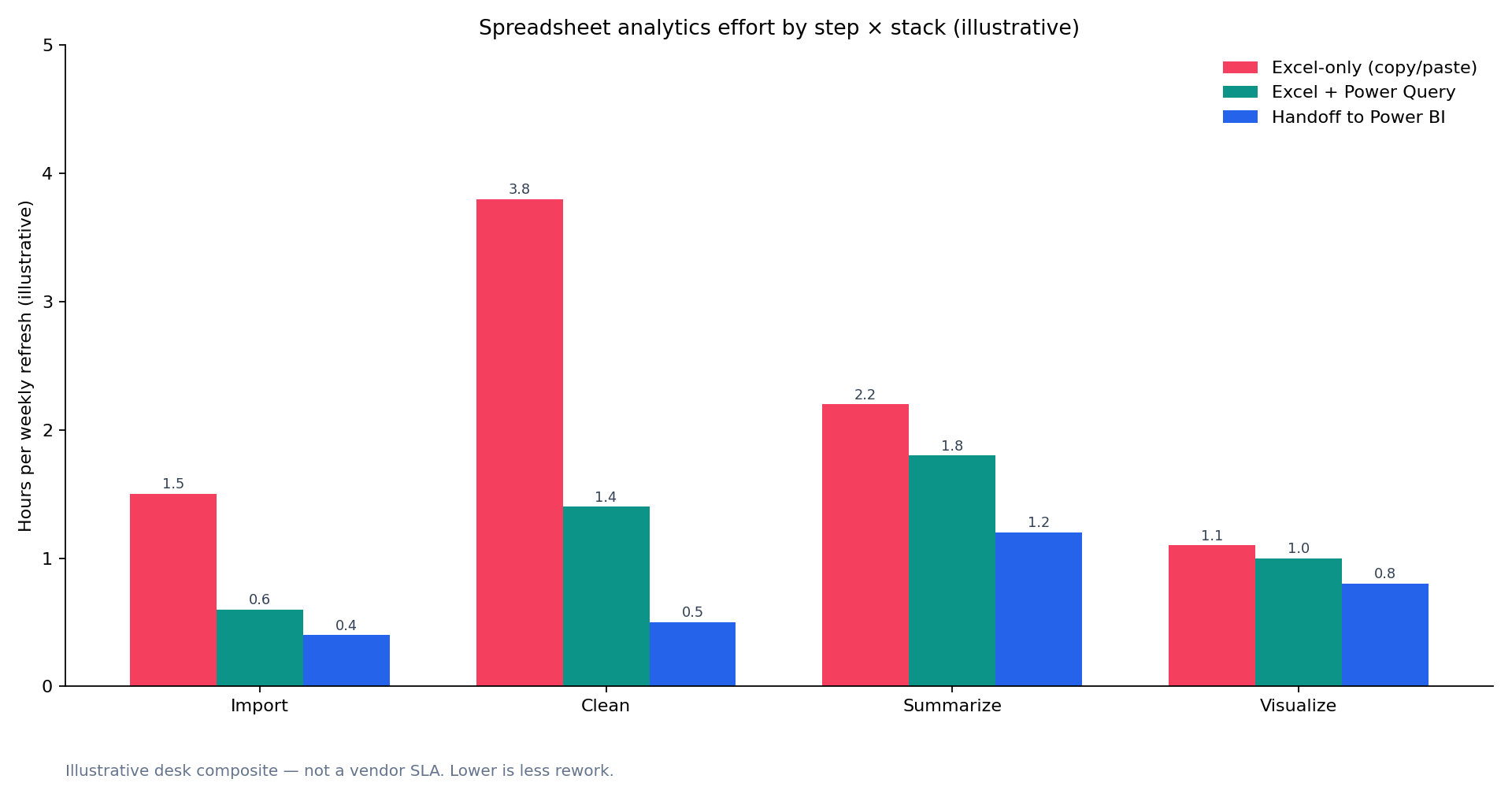
Figure — Illustrative desk composite of three mid-market teams. Hours by workflow step × stack, not a vendor SLA.
AI and Excel in 2026
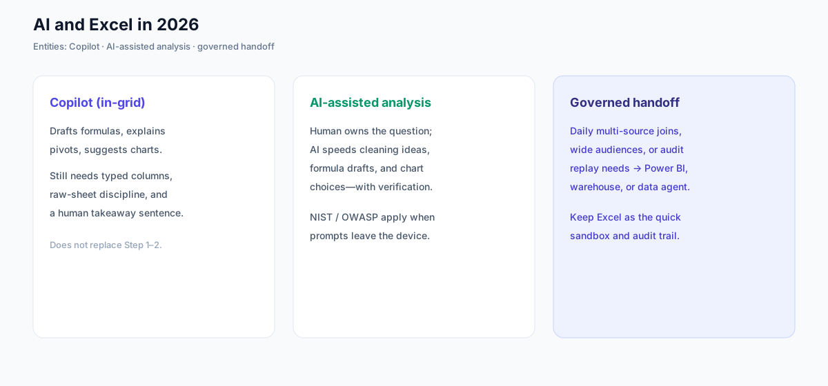
Three entities now sit beside classic excel data analysis:
Copilot (in-grid). Microsoft 365 Copilot in Excel can draft formulas, explain pivots, and suggest charts from natural-language prompts. Treat outputs as drafts: typed columns, protected raw sheets, and a human-written takeaway still gate trust. Copilot does not replace Steps 1–2. For a scored bake-off of ai tools for Excel that analyze data directly in the grid — including 2026 ChatGPT and Claude add-ins — see best AI for Excel data analysis.
AI-assisted analysis. A working definition: the human owns the decision question and verification; the model accelerates formula drafts, cleaning ideas, and chart selection. When prompts or files leave the device, map controls to the NIST AI Risk Management Framework and agent-specific risks in the OWASP Top 10 for LLM Applications. The Stanford HAI AI Index documents rising expectations for validated, repeatable AI-assisted outputs—hard to meet in a one-off sheet with no refresh story.
Governed handoff. Daily multi-source joins, wide audiences, or audit replay needs belong in Power BI, a warehouse, or a data agent. Keep Excel as the quick sandbox and audit trail—see what AI-native data analysis means.
Excel vs Google Sheets vs Power BI vs Python
Excel data analysis is one option among four surfaces teams routinely compare. Use the matrix below to decide whether to stay with excel data analysis or add another tool.
| Dimension | Excel | Google Sheets | Power BI | Python |
|---|---|---|---|---|
| Best for | Ad-hoc math, pivots, quick charts on modest tables | Lightweight collaboration and shared live sheets | Governed dashboards and recurring executive reporting | Custom statistics, ML, and reproducible pipelines |
| Data scale | Comfortable to ~500K rows; slows beyond | Similar ceiling; cloud row limits vary by plan | Warehouse-backed; millions of rows via models | Unlimited with engineering and compute |
| Collaboration | Desktop-first; co-authoring via OneDrive | Real-time multi-user editing native | Publish-and-consume dashboards for wide audiences | Notebooks and Git for technical teams |
| Statistics | Formulas plus optional Analysis ToolPak add-in | Built-in basics; fewer advanced stats | DAX modeling; not a full stats package | Full ecosystem (pandas, SciPy, statsmodels) |
| Automation | Macros, Power Query, Office Scripts | Apps Script | Scheduled refresh and semantic models | Scripts, schedulers, orchestration tools |
| Learning curve | Lowest; ubiquitous in business | Low; familiar grid metaphor | Moderate; data modeling concepts required | Steep; programming fluency expected |
Stay with excel data analysis when data is modest, the audience is small, and the question is ad-hoc. Add Power BI for recurring dashboards; add using Python in data analysis for custom methods; consider Google Sheets when live multi-user editing matters more than desktop Excel depth.
Common Mistakes to Avoid
The most common excel data analysis failure is charting before cleaning. The second is mixing raw and calculated data on one sheet so nobody knows which cells are safe to edit. The third is hard-coding constants that should live in a parameters table.
Another mistake is treating a workbook as a database. Files grow until recalc stalls and nobody can find the formula that drives the headline metric. When excel data analysis workbooks sprawl across dozens of tabs, that is a handoff signal.
Finally, do not confuse formatting with analysis. Conditional formatting helps exploration; it does not replace summarization or statistical checks.
Build a personal checklist and reuse it. Before closing any excel data analysis file, confirm the question is written, raw data is untouched, cleaning is repeatable, and the chart caption states the date range. That five-minute review prevents most spreadsheet regrets we see in support tickets.
Selection Scorecard
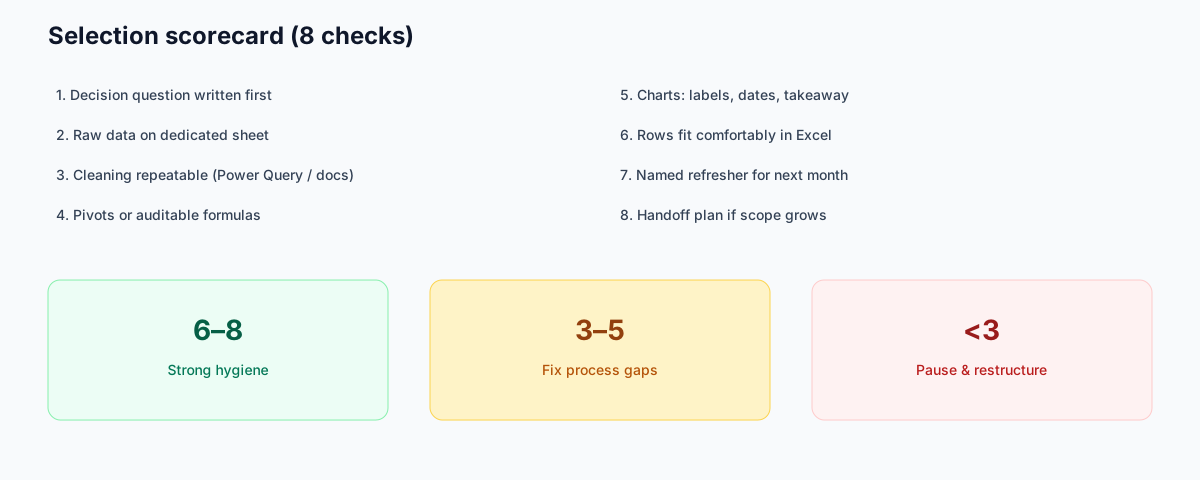
Evaluate your next excel data analysis project (1 point each):
| Check | Pass? |
|---|---|
| I stated the decision question before importing | |
| Raw data lives on a dedicated sheet | |
| Cleaning steps are repeatable (Power Query or documented) | |
| Summaries use pivots or auditable formulas | |
| Charts include labels, dates, and a written takeaway | |
| Row counts fit comfortably in Excel (~500K heuristic) | |
| I know who will refresh this next month | |
| I have a handoff plan if the scope grows |
6–8: strong excel data analysis hygiene. 3–5: fix process gaps before sharing widely. Below 3: pause and restructure before stakeholders rely on the numbers.
Save intermediate versions when exploring messy data. A file named with the date and hypothesis helps you roll back if a cleaning step goes wrong, without losing the afternoon's work entirely.
Key Statistics
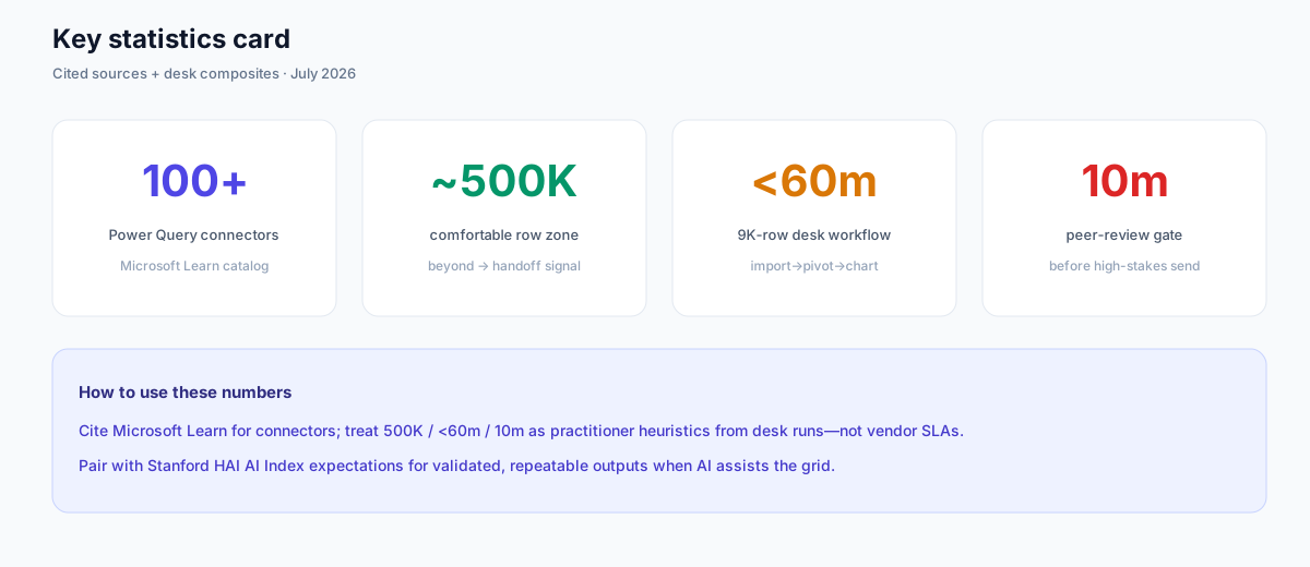
| Statistic | Value | Source / note |
|---|---|---|
| Power Query connectors in Microsoft's catalog | 100+ | Microsoft Learn — Power Query connectors (catalog count; not a performance claim) |
| Comfortable spreadsheet row zone | ~500K rows | Practitioner heuristic from the comparison matrix; beyond this, plan a handoff |
| Desk time for 9,000-row import→pivot→chart | <60 minutes | InfiniSynapse desk replay (composite); not a vendor SLA |
| Peer-review gate before high-stakes send | 10 minutes | Checklist: change one filter, verify totals, read takeaway |
| Scorecard checks for project hygiene | 8 | Selection scorecard above |
Practical Next Steps
Verify against real job postings
Before committing time or budget, pull five recent job postings in your target market and list the SQL, visualization, and communication skills each repeats. Align your learning plan to those patterns rather than a generic syllabus.
Authority References
- [Vendor / Docs] Microsoft Learn — Excel training paths. Structured practice for import, formulas, and pivots. learn.microsoft.com/training/excel.
- [Vendor / Docs] Microsoft Support — Excel documentation. Feature reference for desktop Excel. support.microsoft.com/excel.
- [Vendor / Docs] Microsoft Learn — Power Query connectors catalog. Lists 100+ connectors for Get Data / refresh workflows. learn.microsoft.com/power-query/connectors.
- [Vendor / Docs] Microsoft Learn — Power BI documentation. Destination when recurring dashboards outgrow the grid. learn.microsoft.com/power-bi.
- [Vendor / Docs] Google — Sheets Help. Collaboration-first alternative surface. support.google.com/docs.
- [Vendor / Docs] Python.org — Language documentation. Scale and reproducible pipelines. docs.python.org.
- [Independent] IBM — Augmented analytics overview. Automated prep still needs human judgment on edge cases. ibm.com/topics/augmented-analytics.
- [Independent] Stanford HAI — AI Index. Tracks rising expectations for validated AI-assisted outputs. hai.stanford.edu/ai-index.
- [Standard] NIST — AI Risk Management Framework. Control framing when AI assists spreadsheet work. nist.gov/ai-rmf.
- [Standard] OWASP — Top 10 for LLM Applications. Agent-specific risks when prompts leave the device. owasp.org/llm-top-10.
- [Policy / About] InfiniSynapse — Editorial standards & author credentials. infinisynapse.com/en/editorial-standards.
Frequently Asked Questions
What is excel data analysis?
Excel data analysis is the practice of importing, cleaning, summarizing, and visualizing data in Excel to answer a business question. People searching data analysis Excel mean the same workflow. It relies on structured tables, pivot tables, formulas, and charts—often with Power Query for repeatable transforms.
Where is Data Analysis in Excel?
On Windows desktop, enable Analysis ToolPak (File → Options → Add-ins → Excel Add-ins → Go), then open the Data tab and click Data Analysis. Microsoft 365 also puts Analyze Data on the Home tab for natural-language suggestions. Those are different commands. Everyday excel data analysis still starts with a table and a pivot, not the add-in. See Where is Data Analysis in Excel?.
What is spreadsheet analytics?
Spreadsheet analytics is answering a question in a grid with a refresh path and a written takeaway. Excel data analysis is the Excel instance of that practice. If the file cannot be replayed next month, it was a chart—not analytics.
Where should beginners start?
Define your question, import data with consistent headers, clean types and categories, build a pivot or summary table, chart the result, and write a one-sentence takeaway. Microsoft Learn Excel training offers structured practice if you are new.
Which features matter most?
Pivot tables, Power Query, SUMIFS/XLOOKUP, and clear chart labeling cover most excel data analysis work. Add the Analysis ToolPak only when you need formal statistical tests.
When should you graduate beyond Excel?
When row counts stall the file, when joins span multiple systems with different refresh schedules, or when the same dashboard must update daily for a large audience. Those are signals to add Power BI, a warehouse, or Python while keeping Excel for quick views.
How does Excel compare to Python?
Excel data analysis wins on speed and accessibility for modest, inspectable work. Python wins on scale, custom statistics, and reproducible pipelines. Many analysts prototype in the grid and promote stable logic to Python when repetition or rigor demands it.
How does Copilot change the workflow?
Copilot accelerates formula and chart drafts inside Excel; it does not remove the need for structured imports, repeatable cleaning, or a human takeaway. Pair Copilot with the four-step sequence and the 10-minute peer review.
Conclusion
Excel data analysis rewards discipline more than feature hunting. Follow the four-step workflow, keep raw data separate, make cleaning repeatable, and write the takeaway sentence before you share the chart. That is also what spreadsheet analytics requires: a file someone else can refresh. Graduate to BI or code when scale, governance, or repetition outgrow excel data analysis.
To practice the AI-era skills employers want, read what AI-native data analysis means and try the InfiniSynapse web app free on registration, no credit card required.