Data Analysis Techniques with Real Examples
- Problem: Dozens of data analysis techniques exist, and picking the wrong one wastes hours and produces results no one trusts.
- Solution: Map every question to one of four core categories — descriptive, diagnostic, predictive, prescriptive — then pick the method. That is how teams shortlist data analysis techniques without guesswork.
- Result: A working framework for data analysis techniques, a method shortlist, seven data analysis examples mapped to those techniques, and what AI changes in 2026.
What are the main data analysis techniques?
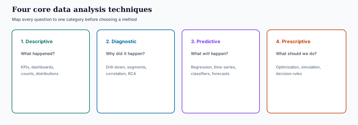
- Descriptive analytics — what happened
- Diagnostic analytics — why it happened
- Predictive analytics — what will happen next
- Prescriptive analytics — what to do about it
This four-part framework — the backbone of data analysis techniques in most curricula — is the map you should keep when planning any analysis. Aligns with the taxonomy summarized in the Gartner analytics glossary and the broader Wikipedia Analytics overview. The rest of this guide walks through each category, the methods inside them, and how AI changes how analysts execute data analysis techniques in 2026.
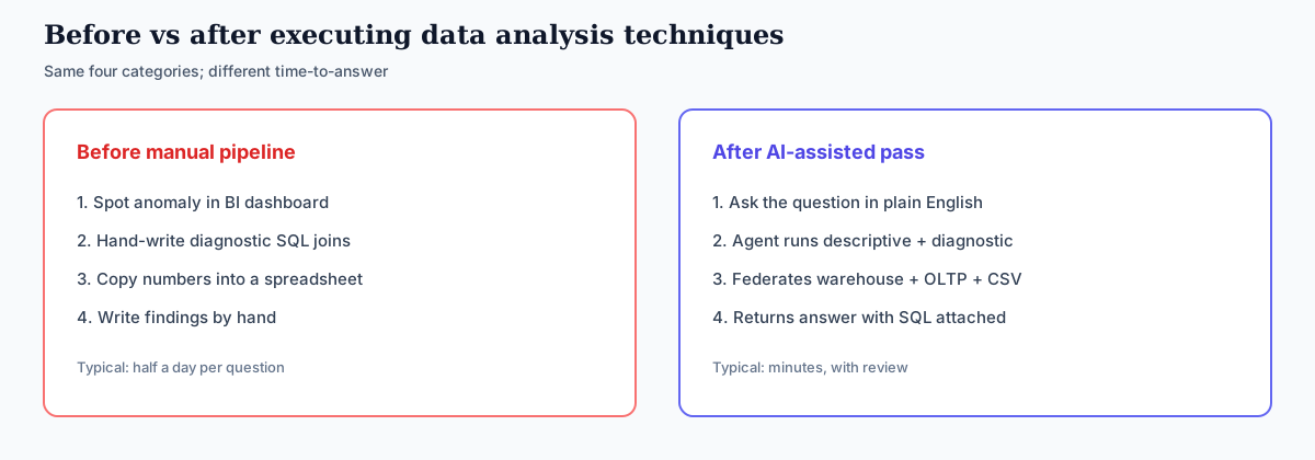
Before and after: how the workflow changed
Executing data analysis techniques used to mean a multi-tool handoff. The same four categories still apply; the bottleneck moved from SQL labor to review quality.
The 4 core data analysis techniques
Every entry in a catalog of data analysis techniques falls into one of four categories. The names matter less than the question each one answers. If you remember the question, you will always know which technique you need.
Descriptive analytics — what happened
Descriptive analytics summarizes what has already occurred. It is the default reporting layer of every business: dashboards, monthly KPIs, sales-by-region tables, conversion rate by channel. The methods are usually simple — counts, sums, averages, percentages, distributions — but the value is high because most operational decisions rely on accurate descriptive answers.
Diagnostic analytics — why it happened
Diagnostic analytics asks why a pattern appears. The methods here are drill-down, segmentation, correlation analysis, and root-cause analysis. The discipline is to keep splitting the data — by channel, by region, by user segment, by time — until you find the slice where the effect actually lives.
Predictive analytics — what will happen
Predictive analytics estimates future outcomes from historical patterns. The methods are statistical (regression, time-series forecasting, ARIMA) or machine-learning (classification, gradient boosting, neural networks). The output is a probability or a forecasted value, never a certainty — calibration matters as much as the prediction when you use predictive data analysis techniques.
Prescriptive analytics — what to do about it
Prescriptive analytics recommends an action. It builds on predictive results by adding optimization, simulation, or decision-rule logic. This is the hardest category of data analysis techniques to do well because it requires both a reliable prediction and a clear objective (revenue, retention, cost, risk).
Most real work with data analysis techniques is a sequence across all four. You start descriptive, move diagnostic when something looks off, run predictive once you have a stable hypothesis, and only attempt prescriptive when prediction is trusted and the cost of action is well understood. The seven data analysis examples later on this page show that sequence in e-commerce, SaaS, operations, marketing, healthcare, and finance.
Common data analysis methods beyond the four types
The four categories of data analysis techniques tell you what kind of question you are asking. The specific data analysis method you choose tells you how to answer it. Here are the methods you will encounter most often when applying data analysis techniques in business work:
Regression analysis
Quantifies the relationship between an outcome and one or more predictors. Linear, logistic, and multiple regression are the workhorses of predictive work.
Correlation analysis
Measures how strongly two variables move together. Useful early in diagnostic work to surface candidate causes, but never confused with causation.
Cluster analysis
Groups records that resemble each other. k-means and hierarchical clustering are common; the output is segments you can act on.
Cohort analysis
Tracks a defined group over time. Standard for retention, churn, and product-led growth metrics.
Time-series analysis
Models data ordered in time. Handles seasonality, trend, and forecast horizons. ARIMA, Prophet, and exponential smoothing are typical.
A/B testing
Compares two variants on a randomized population. The cleanest way to establish causality on a single change.
Sentiment analysis
Classifies text by emotional valence. Powered by NLP models; common for reviews, support tickets, and social posts.
Factor analysis
Reduces many variables to a few underlying factors. Useful when you suspect ten survey questions are really measuring three things.
A working analyst does not need to master every method under data analysis techniques. Be fluent in three or four that match your domain, and know enough about the rest to recognize when to bring in help.
Data analysis examples: seven cases mapped to techniques
Frameworks for data analysis techniques make sense once you see them used. A usable data analysis example is not a vignette — it is a decision question, the technique that answers it, the method inside that technique, the data grain you can re-run, and an action. The seven data analysis examples below are scenario composites drawn from common industry patterns (not named-customer audits). The first three are the original e-commerce, SaaS, and operations cases; four more cover a beginner cut, marketing ROI, hospital readmissions, and fraud scoring so the cluster matches how people actually search this topic.
These cases are technique-mapped on purpose. For an industry-by-industry catalog of the same process, see 7 data analysis examples by industry. For one case worked through all six process steps, see a data analysis example, start to finish.

Case-study independence: Numbers below are composite teaching scenarios patterned on public e-commerce retention, SaaS trial conversion, funnel-leakage, readmission, and fraud-reporting practices — not third-party audited InfiniSynapse customer results. For independent buyer reviews of analytics platforms see Gartner Peer Insights. Corrections: zhuhl@infinisynapse.com.
Why did Q3 repeat-purchase rate drop?
The team noticed repeat purchases were down 8% quarter over quarter. Applying standard data analysis techniques, they started with descriptive analytics — splitting the rate by acquisition channel, product category, and customer cohort. The drop concentrated in customers who had signed up between April and June.
A cohort analysis confirmed it: this cohort had a noticeably worse 90-day retention curve than earlier cohorts. A diagnostic drill-down showed those customers had been acquired through a discount-heavy campaign — they bought once at 40% off and never came back.
Which trial users will convert to paid?
A B2B SaaS company had 600 new trial signups per week and a 6% conversion rate. The sales team could only follow up with 50 of them. The question: how to pick the right 50.
The data team built a classifier — predictive analytics — using historical features: company size, role of the signup, time spent in the product on day one, number of teammates invited. The model scored every new signup within an hour of signup. The sales team called the top 50 each week. Conversion in that segment more than doubled.
Where does the customer onboarding funnel actually leak?
An operations team owned a five-step onboarding funnel. Top-line conversion was 22% and had been flat for six months. They wanted to know which specific step was costing the most.
Diagnostic analytics on funnel data revealed that step three (verification document upload) had a 31% drop-off — twice as bad as the next-worst step. Further segmentation showed mobile users dropped at step three at 48%. Sentiment analysis on support tickets flagged "the photo upload keeps failing" as the dominant complaint.
Which region is actually underperforming?
This is the first data analysis example a new analyst should run. A retailer has a weekly sales export. Leadership asks “how are we doing?” The analyst does not open a model. They group orders by region, compute revenue, order count, and average order value, and express each region as a share of the total.
The cut shows West at 41% of revenue, East at 28%, South at 19%, and Central at 12% — but Central’s average order value is the highest. The insight is not “Central is weak”; it is “Central has fewer orders and a higher basket, so the next question is volume, not price.” That is descriptive analytics doing its job: a fact, a fair denominator, and a follow-up, not a cause.
Which channel actually pays for itself?
A growth team spends across paid search, paid social, email, and organic. The first cut is descriptive: spend, sessions, conversions, and cost per acquisition by channel. Paid social shows the most conversions; email shows the lowest CPA.
The diagnostic cut adds a second grain — new vs returning customers, and 30-day repeat rate. Paid social converts first-time buyers who rarely return; organic and email convert fewer sessions but a higher share of repeat purchasers. The useful data analysis example here is the sequence: describe the funnel, then diagnose value, not just volume. Budget moves toward channels that produce repeat buyers, not the channel with the largest conversion count.
Which patients return within 30 days — and why?
A hospital quality team tracks 30-day readmissions. The descriptive rate is flat. The diagnostic question is which groups drive the rate. The analyst segments by discharge department, comorbidity count, length of stay, and whether a follow-up appointment was booked within seven days.
The slice that moves is patients discharged without a booked follow-up who also have two or more recorded comorbidities. That is a candidate cause, not a proven one — healthcare data analysis examples stay at association until clinical review and a controlled intervention. The technique is still diagnostic: keep splitting until the effect has a home, then hand the finding to the people who can test an action.
Which new transactions look like known fraud?
A payments team already knows the descriptive and diagnostic pattern: confirmed fraud clusters on unusual amount × hour × merchant-category combinations. The next data analysis example is predictive — score new transactions against that pattern before they settle.
The model is a classifier trained on labeled historical fraud, with a holdout week and a precision/recall trade-off the operations team can live with. High-score transactions go to a review queue; low-score transactions clear. Prescriptive routing (auto-block vs review vs clear) only comes after the score is calibrated in production. That sequence — describe, diagnose, then predict — is the same ladder as the four techniques above.
Examples comparison table
The table maps every data analysis example on this page to the question, the technique, the method, and the output you should be able to reproduce.
| Example | Question | Technique | Method | Output |
|---|---|---|---|---|
| Sales by region | Where is volume vs basket? | Descriptive | Pivot / GROUP BY | Region share + AOV |
| Marketing channel ROI | Which channel pays? | Descriptive → Diagnostic | CPA + new/returning split | Budget reallocation |
| Repeat-purchase drop | Why did Q3 repeats fall? | Descriptive → Diagnostic | Cohort + campaign cut | Pause discount campaign |
| Onboarding leak | Where does the funnel drop? | Diagnostic | Step drop-off + sentiment | Fix mobile upload |
| Hospital readmissions | Who returns in 30 days? | Diagnostic | Segment + association | Follow-up pilot |
| Trial-to-paid score | Which 50 trials to call? | Predictive | Classifier + A/B | Ranked outreach list |
| Fraud pattern score | Which txns need review? | Predictive | Classifier + holdout | Scored review queue |
| Route swap (in Technique 4) | What should we do now? | Prescriptive | Forecast + optimizer | Swap routes 14 and 22 |
If a row has no method you can name, it is not yet a data analysis example — it is a story. Name the method, then re-run it. The Wikipedia overview of data analysis frames the same arc: inspect, clean, transform, model, then decide.
Which example a beginner should start with
Beginners searching for data analysis examples usually need a case they can finish in a spreadsheet this week, not a fraud model. Start here, in order:
- Sales by region — one table, one pivot, one percentage. You learn fair denominators.
- Marketing channel ROI — two grains (volume, then value). You learn that the first chart is rarely the decision.
- Repeat-purchase drop — cohort + one campaign cut. You learn diagnostic drill-down.
- Only then attempt the SaaS classifier or fraud score. Predictive data analysis examples fail when the descriptive baseline is missing.
Students can reproduce the first two cases on a public retail set such as the UCI Online Retail dataset. Analysts on a warehouse can run the same cuts in SQL. The technique does not change with the tool.
Modern ways of data analysis: how AI changed the workflow
The four categories of data analysis techniques have not changed. What changed is how much time, SQL skill, and tooling you need to execute them. Modern ways of data analysis are increasingly defined by what an AI agent can do between asking the question and reading the answer — while still applying the same data analysis techniques.
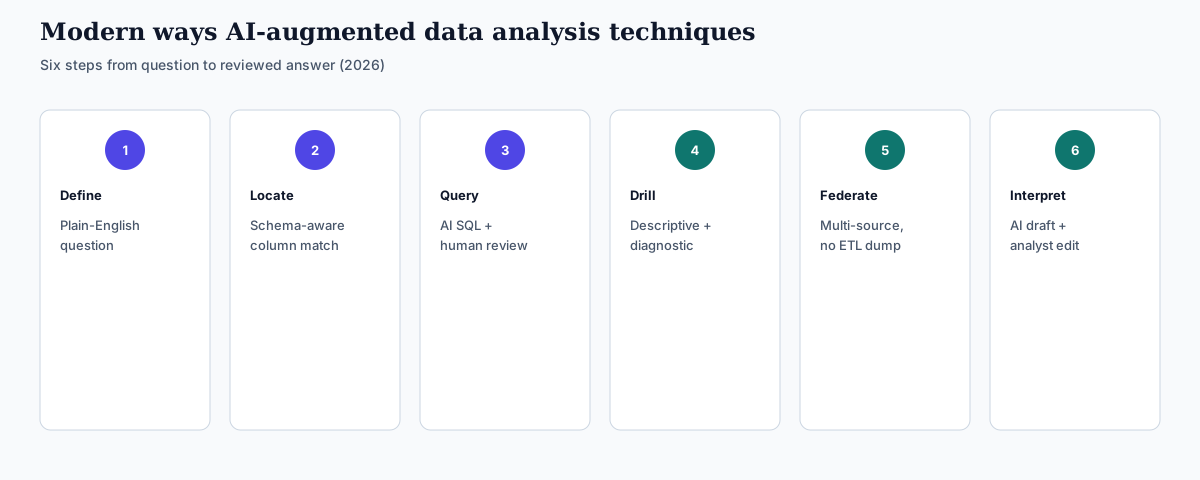
| Workflow step | Traditional approach | AI-augmented approach (2026) |
|---|---|---|
| Define the question | Analyst translates a business question into a data plan | Business user asks in plain English; AI clarifies ambiguity |
| Locate the data | Analyst maps which tables and sources hold the answer | Schema-aware AI links question terms to actual columns |
| Write the queries | Manual SQL, often multiple joins and CTEs | AI generates SQL; analyst reviews before running |
| Run descriptive + diagnostic together | Two separate cycles, often two analysts | One conversational pass; agent drills down on follow-ups |
| Federate across sources | Export to CSV, load into a warehouse, then query | Direct federation across databases and files, no ETL |
| Interpret results | Analyst writes summary in a report | AI generates summary; analyst validates and edits |
The AI-augmented column does not eliminate the analyst — it eliminates the slowest, lowest-value parts of the work. Modern AI tools each cover this shift differently, and the right choice depends on what you want to optimize:
- Julius AI fits teams that want fast descriptive and basic diagnostic charts from spreadsheets or simple databases. It is strongest on quick-look analysis where the dataset is already in one place. Verify capabilities on the vendor site before procurement.
- Tableau AI / Tableau Pulse fits teams already standardized on Tableau. It augments existing dashboards with natural-language summaries and anomaly alerts, but stays inside the Tableau ecosystem — see Tableau's official Pulse documentation.
- InfiniSynapse fits teams that need the full sweep of data analysis techniques — descriptive through prescriptive — across multiple data sources at scale. The agent federates queries across databases, files, and unstructured content, handles TB-scale workloads, and exposes both the SQL and the explanation. We disclose COI below.
Honest framing (third-party perspective): if your work lives in one spreadsheet, Julius is lighter. If your team has Tableau-centric BI maturity, Tableau Pulse is the path of least resistance per Tableau's docs. For complex multi-source production analyses, an AI data analyst like InfiniSynapse covers more of the workflow — independently compare platforms on Gartner Peer Insights and align agent risk controls with the NIST AI RMF.
How to choose the right technique
A simple decision rule for picking among data analysis techniques that works for most situations:
- What is the question about — past, present, future, or action?
- Past or present state of the business → descriptive
- Cause of an observed pattern → diagnostic
- Likely future outcome → predictive
- Best action to take → prescriptive
- What kind of data do you have? Structured numeric data fits regression, time-series, and clustering. Categorical or grouped data fits cohort analysis and segmentation. Text fits sentiment analysis and topic modeling. Mixed sources fit modern AI agents that federate across them.
- How much trust do you need? A directional answer can come from descriptive + correlation. A high-stakes decision (pricing change, hiring plan) needs predictive with cross-validation, ideally backed by an A/B test before rollout.
Three common mistakes when applying data analysis techniques. First, skipping descriptive analytics and jumping to predictive — you cannot trust a forecast if you do not know what the underlying data looks like. Second, confusing correlation with causation — most diagnostic findings are candidates for further testing, not conclusions. Third, building a prescriptive system on a predictive model that has not been validated in production — the recommendation will be confidently wrong.
Ready to apply these data analysis techniques on your real data?
InfiniSynapse runs descriptive, diagnostic, predictive, and prescriptive data analysis techniques across your databases and files via natural language. Free to start.
Try InfiniSynapse free →FAQ
GROUP BY, and still produces a decision: which region to investigate first. After that, move to marketing channel ROI, then the e-commerce cohort case, before attempting predictive scoring or prescriptive routing.Who wrote this & sources
Author: William Zhu (InfiniSynapse cofounder; GitHub @allwefantasy) with the InfiniSynapse Data Team. About: editorial standards / About · Company Vision. No personal LinkedIn is claimed here; use GitHub + editorial profile for verification.
Last updated: 2026-09-16 · Next review: 2026-12-16
Methodology: The four-category framework for data analysis techniques follows the descriptive / diagnostic / predictive / prescriptive taxonomy used in standard analytics curricula and summarized in the Gartner analytics glossary and Wikipedia Analytics. Agent risk context: NIST AI RMF.
Examples: Scenario composites (see independence note above), not named-customer audits. Re-run cuts on your data before citing as evidence.
Conflict of interest: InfiniSynapse is the publisher. Tool comparisons cite vendor primary docs (Julius, Tableau Pulse) and independent review markets (Gartner Peer Insights). Verify current capabilities on vendor sites.
Update cadence: Reviewed quarterly. Tool comparisons and 2026 references refreshed every 90 days. Corrections: zhuhl@infinisynapse.com · corrections policy.