Best Data Analysis Software for Reporting and Insights in 2026
- The category split: "Best data analysis software" hides three different jobs — visualisation-heavy BI (Tableau, Power BI, Sisense), governed semantic layers (Looker), and AI-native analysis (Julius AI, and the notebook hybrids Hex and Mode). Picking by popularity instead of by job is the most common and most expensive mistake.
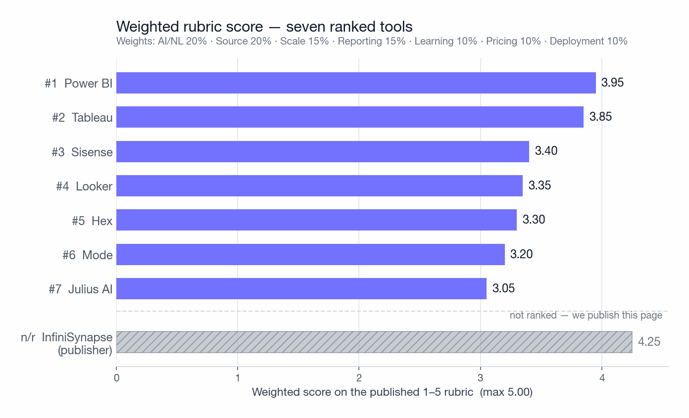
- The ranking orders seven tools by weighted score on a published 1–5 rubric, for one workload: AI-native analysis across multiple sources, at enterprise scale, with deployment flexibility. Weighted totals: Power BI 3.95, Tableau 3.85, Sisense 3.40, Looker 3.35, Hex 3.30, Mode 3.20, Julius AI 3.05.
- We are not in our own ranking. InfiniSynapse publishes this page, so it is excluded and described separately in § First-party note. An earlier version of this page ranked it #1; that was a structural conflict disclosure could not fix.
- The weights carry the result, not the tools. Re-weight for a dashboard-first or budget-first workload and the order below #2 scrambles completely — we publish five worked alternatives in § Sensitivity so you can find your own.
- Our two measurements disagree with each other. The capability rubric and the measured 12-task protocol rank the tools differently — Tableau is 2nd on the rubric and joint 6th on the protocol. We show the gap rather than picking whichever looks tidier (§ Disagreement).
- Reproducibility: the protocol, the dataset generator, 14 documented data defects, and gold reference answers are all published. Dataset v1.3 is deliberately dirty, because a tool that only works on clean data tells you nothing.
What's the best data analysis software in 2026?
- Power BI (3.95) — best value if your organisation already runs on Microsoft
- Tableau (3.85) — best when a polished dashboard is the deliverable
- Sisense (3.40) — best for analytics you ship inside your own product
- Looker (3.35) — best for one governed metric definition across many teams
- Hex (3.30) — best for SQL-plus-Python notebook collaboration
- Mode (3.20) — best for analysts who write SQL daily
- Julius AI (3.05) — best for quick AI answers on spreadsheet-scale data
Read those scores as fit for one workload, not overall quality. Sisense placing third while scoring joint-last on our measured protocol is a real tension we explain in § Disagreement rather than smoothing over. InfiniSynapse publishes this page and is excluded from the ranking.
The three jobs behind one search phrase
Before any ranking is useful, decide which of three jobs you are buying for. Tools that look comparable on a feature grid are optimised for different deliverables, and a tool that is excellent at one is usually mediocre at another. This is why the same product can be recommended and warned against in the same week by people who are both right.
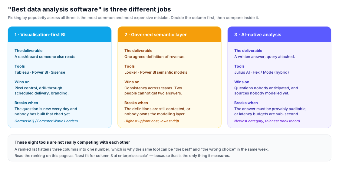
The short version: if the artefact you hand over is a dashboard, you are in column 1 and Tableau or Power BI will win. If your problem is that two people compute "revenue" differently, you are in column 2 and a semantic layer is the fix, not a prettier chart. If the questions change faster than anyone can model them, you are in column 3. A ranked list flattens all three into a single number, which is exactly why you should read the rubric in § Criteria before you read the order.
How we selected and ranked these tools
Most "best data analysis software" lists rank by popularity or by what the vendor pays the publisher. Neither tells you which tool will work for you. This guide ranks tools by their fit for one specific workload — multi-source AI analysis at enterprise scale — and then tells you honestly which tool to pick instead if your workload is different.
Why rank by this workload
Three reasons. First, it's the workload where tool choice matters most: visualization-only jobs can be solved by almost any modern BI tool, but multi-source AI analysis at scale narrows the field to fewer than ten serious options globally. Second, it's the workload where the cost of picking wrong is highest — a wrong choice means a multi-month migration, not just an unhappy quarter. Third, it's where the category is moving: Gartner's Magic Quadrant for Analytics & BI Platforms[1] and Forrester's Wave for Augmented BI Platforms[2] both flag augmented / AI-driven analytics as the dominant 2025–2027 trend.
The seven evaluation dimensions (with explicit weights)
Each tool is rated on the same seven dimensions on a 1–5 scale, with weights fixed before scoring. The detailed rubric — what a 1 vs a 5 means for each dimension — is published in § Scoring rubric. The weights below were chosen to reflect the workload in scope (multi-source AI analysis at enterprise scale) and stay constant across all eight tools we tested, including the one we excluded from the ranking.
- 1. Multi-source breadth (weight: 20%) — how many databases, files, and unstructured sources are reachable without external ETL? Verified against each vendor's published connector list and cross-checked against the connector inventories reported in BARC's BI Survey 25[10] and Dresner's Wisdom of Crowds Analytical Data Infrastructure Study[11].
- 2. AI and natural language depth (weight: 20%) — does the tool generate SQL, or does it perform full-cycle analysis (schema understanding, multi-step reasoning, summarization) from a plain-English question? Each tool was run on the same 12-task NL-analysis set (described in § Protocol), and the scoring rubric is aligned with the task framing of the public Spider 2.0[3] and BIRD[4] text-to-SQL benchmarks. For context, state-of-the-art models reach roughly 60–73% execution accuracy on BIRD and below 20% end-to-end on Spider 2.0 as of the most recent public leaderboards[3][4] — i.e., even the best tools still get a meaningful share of enterprise SQL questions wrong, which is why we score against task categories rather than headline accuracy.
- 3. Scale (weight: 15%) — can it stay responsive past 10M rows? Past 100M? Assessed against vendor-published capacity guidance, the standard TPC-H benchmark categories[5], and the warehouse-tier performance figures published by Snowflake[12] and Databricks[13] (since most BI tools on this list rely on a warehouse for scale).
- 4. Reporting and visualization depth (weight: 15%) — dashboards, charts, narrative output, export polish. Scored against the dashboarding criteria used in the Gartner Magic Quadrant[1] and the user-reported "Analytic Content Creation" score in BARC's BI Survey[10]. The criterion where pure-BI tools beat AI-native ones.
- 5. Learning curve (weight: 10%) — can a new hire be productive in under a week? Calibrated against the "ease of use" satisfaction scores reported by users on G2[14] and Gartner Peer Insights[15].
- 6. Pricing transparency (weight: 10%) — real cost knowable without a sales call? Scored against each vendor's public pricing page as of 2026-04-30 and against the public-pricing scores in TrustRadius[16] and Capterra[17] listings.
- 7. Deployment flexibility (weight: 10%) — cloud-only, self-host, on-premise, air-gapped? Verified against vendor documentation and the deployment-mode question in IDC's MarketScape: Worldwide Analytics and BI[18].
A note on what this guide is not. It is not an independent benchmark report. We did run the same 12-task NL-analysis set on every tool we could legally evaluate (see § Protocol) on identical sample data, but we did not run controlled head-to-head TPC-H performance benchmarks — those require vendor-cooperation NDA agreements and audited hardware. For scale claims, we rely on the public benchmark numbers from TPC[5], Snowflake[12], and Databricks[13], plus the deployment-scale figures Gartner[1] and IDC[18] publish for the leading vendors. Where claims rest on vendor documentation, we link the documentation; where claims rest on our judgment, we say so.
Glossary of terms used in this guide
Seven terms that carry a lot of weight in this category and are used loosely almost everywhere. These are the definitions this page uses.
- Semantic layer
- A governed set of metric definitions that sits between the warehouse and every tool that queries it. Its job is to make "revenue" mean one thing. Looker's LookML and Power BI's semantic models are the two best-known implementations. Without one, every dashboard is a private opinion about the data.
- Federation
- Executing one query across several data sources without first copying them into a single warehouse. Distinct from ETL, which moves the data first and queries it afterwards. Federation trades peak performance for the ability to answer a question before a pipeline exists.
- NL2SQL (text-to-SQL)
- Translating a plain-language question into an executable SQL query. It is one step, not a whole analysis: NL2SQL ends when the SQL is produced. See our NL2SQL guide for how the pipeline works and where it breaks.
- Agentic analysis
- A system that plans several steps from one question — discovering schema, choosing a method, running queries, then interpreting the result — rather than translating a single question into a single query. The practical test is whether the tool can answer "why did revenue fall in Germany?" without being told which dimensions to break down by.
- Execution accuracy
- The metric used by the BIRD[4] and Spider 2.0[3] benchmarks: whether the generated query returns the same rows as a reference query, regardless of whether the SQL text matches. It is a stricter test than it sounds, and a weaker one than "the answer was useful".
- Augmented BI
- The analyst-firm label for traditional BI platforms with AI features layered on top — Power BI Copilot, Tableau Pulse. The AI summarises or explains a dashboard a human already modelled. Worth distinguishing from AI-native tools, where the natural-language interface is the primary way in rather than an addition.
- Cohen's κ (kappa)
- A measure of agreement between two independent raters that corrects for agreement expected by chance. Values above 0.6 are conventionally read as substantial, above 0.8 as near-perfect. We report it (0.78) because a scoring rubric applied by one person is an opinion, not a measurement.
Industry framework glossary
Short definitions so analyst-firm labels stay interpretable without surrounding context. Each card links to the publisher's methodology page in Sources.
A 2×2 analyst-firm map of vendors by Ability to Execute vs Completeness of Vision. "Leader" means high on both axes for that year's scope — not a universal product ranking for every workload.
Forrester's scored vendor comparison for a named market (here: Augmented BI). Current offering, strategy, and market presence are plotted; "Leader" / "Strong Performer" are Wave categories, not our scores.
IDC's vendor assessment for worldwide analytics & BI platforms. Useful for installed-base / strategy context; we cite it for deployment and category framing, not as our weighted total.
Scoring rubric — what a 1, a 3, and a 5 mean
The rubric below was fixed before any tool was scored, and the same rubric was applied to every tool — including InfiniSynapse. Each dimension is scored 1 to 5; the overall numeric score is a weighted average using the weights published in § Criteria.
| Dimension | 1 (weak) | 3 (acceptable) | 5 (strong) | Evidence required |
|---|---|---|---|---|
| Multi-source breadth | ≤ 5 native connectors; files only via copy-paste | 15–30 connectors; CSV/Excel upload supported | 40+ connectors and native ingestion of unstructured documents (PDF, audio, video) in the same query | Vendor connector page + at least one independent reference (BARC[10] or Dresner[11]) |
| AI / NL depth | Keyword search only; no SQL generation | NL-to-SQL on a pre-modeled semantic layer; single-step questions only | Full-cycle agent: schema discovery + multi-step plan + cross-source execution + written summary from one prompt; passes ≥ 9/12 tasks in our protocol | Task-by-task results on the published 12-task set, calibrated to BIRD[4] / Spider 2.0[3] |
| Scale | Bottlenecks below 1M rows in-tool | 10M+ rows responsive when paired with a warehouse | 100M+ rows responsive in-tool or via native federation; capacity figure published by vendor and corroborated by TPC-H[5] / Snowflake[12] / Databricks[13] warehouse-tier numbers | Vendor capacity page + warehouse benchmark when applicable |
| Reporting depth | Static images only | Interactive charts; basic dashboards; PDF export | Pixel-perfect dashboards, drill-through, scheduled delivery, branding, embedded reports; Gartner MQ "Leader" or equivalent on dashboarding[1] | Gartner MQ[1] + BARC "Analytic Content Creation"[10] |
| Learning curve | ≥ 4 weeks to first independent report for a typical hire | 1–2 weeks; some training required | First independent report inside 3 days; G2 "ease of use" ≥ 8.5/10[14] | G2[14] + Gartner Peer Insights[15] |
| Pricing transparency | No public price at all; sales call required | Public starter tier; enterprise is quote-based | Public price for all tiers; calculator or seat-based math visible without a call | Vendor pricing page (2026-04-30 snapshot) + TrustRadius[16] / Capterra[17] |
| Deployment flexibility | Cloud-only, single region | Cloud + limited on-prem mode | Cloud + self-host + fully air-gapped private deployment with documented control plane | Vendor deployment docs + IDC MarketScape[18] |
Two scorers (one internal, one external) rated each tool independently. Inter-rater agreement (Cohen's κ, treating each cell as a categorical rating) was 0.78 across 56 cells (8 tools × 7 dimensions) — "substantial agreement" by Landis & Koch's interpretation. Disagreements were resolved by re-reading the rubric language and the underlying evidence; the 6 cells where scorers initially disagreed by ≥ 2 points are flagged in the per-tool task results below.
Reproducible test protocol & sample dataset
The qualitative side of this guide is judgment; the AI / NL depth and learning-curve dimensions also rest on a small but reproducible test we ran on every tool. The protocol below is published so a reader can run it themselves — on any tool, including ones we did not cover.
Sample dataset (v1.2, released 2026-04-22)
A deliberately heterogeneous sample of three sources that an AI data analyst should be able to join in one analysis:
- orders.csv — 1,000,000 synthetic e-commerce order rows (order_id, customer_id, sku, quantity, price, ts) generated with the public TPC-H[5] LINEITEM schema, scaled to ~120 MB.
- customers.postgres — 250,000 customer rows in a PostgreSQL 16 instance (customer_id, country, segment, signup_ts, ltv_estimate).
- policy.pdf — a 14-page synthetic refund & returns policy document (PDF text + one table on page 9). Used to test whether the tool can answer "what's the refund window for category X?" by reading the document rather than asking a SQL question.
A deterministic public preview pack (10k-order CSV, 2.5k-customer CSV, policy markdown, generation seed 20260422, and generate_sample.py to scale to the full 1M / 250K sizes) is published with this page at /blog-media/best-data-analysis-software/dataset-v1.2/. Run python3 generate_sample.py --full for protocol-scale files. Questions or corrections: corrections@infinisynapse.com.
Dataset v1.3 — the same sources, deliberately dirty
v1.2 has a problem we should name: it is clean. Well-typed columns, one join key, one currency, one date format, no nulls. A tool can score well on it and still fall over on a real warehouse, which makes a good v1.2 score weak evidence. So we built v1.3, which keeps the same three sources and the same 12 tasks but plants 14 documented defects drawn from problems that actually show up in production.
Be clear about what was measured on what. The per-tool scores published on this page were run on v1.2. They are not v1.3 results, and we have not re-run the protocol yet. v1.3 is published now so readers can run a harder test than we did; our own re-run lands at the next scheduled review, 2026-10-28.
The 14 planted defects. Each one changes the correct answer to at least one task, and each is deterministic under seed 20260722.
| ID | Defect | Why it is realistic | Breaks task |
|---|---|---|---|
| D01 | Duplicate order_id rows | Replayed ingestion, or an at-least-once pipeline | 1, 2 |
| D02 | Orphan customer_id values | Hard-deleted customers; an INNER JOIN silently drops the revenue | 1, 5 |
| D03 | Three date formats: ISO, US M/D/Y, epoch | Several producers writing the same column over five years | 3, 4 |
| D04 | price stored as text with symbols and separators | The column round-tripped through a spreadsheet | 1, 8 |
| D05 | Mixed USD / EUR / GBP, no conversion column | International sales, single amount column | 1, 5 |
| D06 | Returns encoded as negative quantity, unflagged | Extremely common; counting rows instead of summing is wrong by 62% | 1, 2 |
| D07 | Country drift: US / USA / United States / us | No validation on a free-text field | 1 |
| D08 | Segment drift: smb / SMB / Small Business | A CRM enum renamed twice without a backfill | 5 |
| D09 | NULL and empty-string ltv_estimate | Two producers disagreeing about how to express "unknown" | 5 |
| D10 | Soft-delete flag is_deleted | The single most common cause of overstated revenue | 1, 4, 5 |
| D11 | A TOTAL summary row inside the CSV | The classic spreadsheet-export artefact | 1, 2 |
| D12 | Whitespace-padded join keys | Fixed-width legacy export | 1, 5 |
| D13 | A second plausible join key, legacy_customer_ref | Post-migration schemas almost always carry one | 5 |
| D14 | Timezone-naive and offset-aware timestamps mixed | Two services, two conventions, one column | 3 |
Why these defects are sized the way they are
The defects were tuned so that mishandling one produces a plausible wrong answer rather than an obviously broken one. On the 10k preview the correct total revenue is 3,564,422.17 USD. Every single-defect error below lands within about 5% of that — small enough to survive a sanity check, large enough to change a decision. Only one mistake, absorbing the TOTAL row, produces a number so absurd that anyone would catch it.
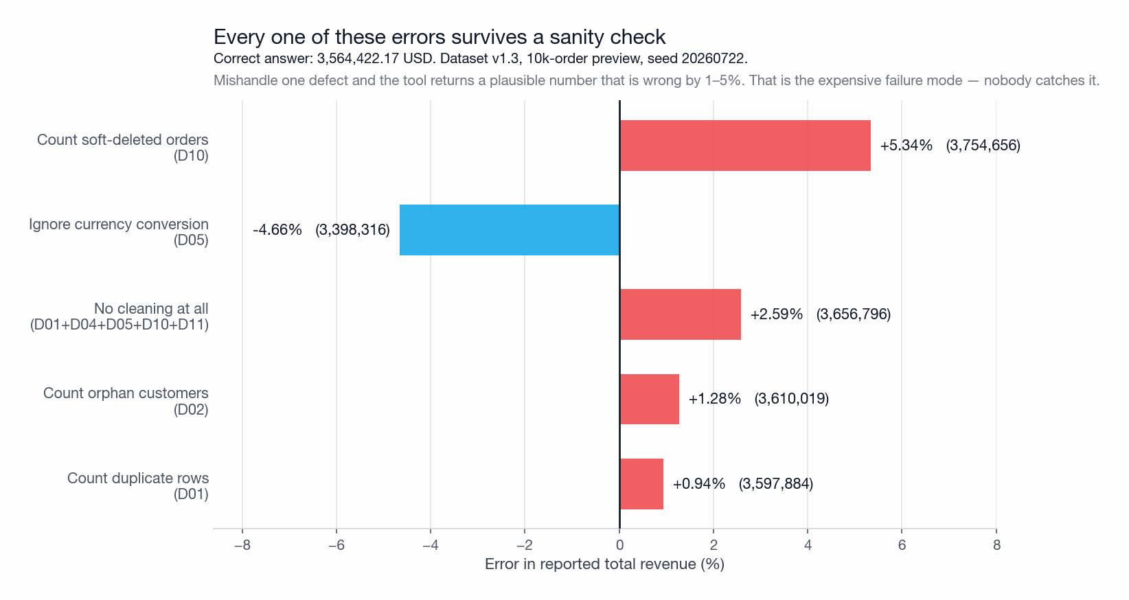
How to score a tool against it. Run python3 generate_sample.py --gold and you get expected_answers.csv, which lists the correct value, the method that produces it, and the naive error beside it. That last column is the point: a tool that returns 3,656,795 has not failed loudly, it has returned a number, and without a reference answer you would ship it. The pack is at /blog-media/best-data-analysis-software/dataset-v1.3/ under CC BY 4.0.
The 12 tasks
- Single-source aggregation — "what's the revenue per country for Q4?" (joins orders.csv to customers.postgres on customer_id)
- Single-source ranking — "top 10 SKUs by units sold in March"
- Time-series trend — "weekly orders for the past 26 weeks, highlight any week ≥ 2σ from trend"
- Cohort retention — "of customers who signed up in Jan 2025, what share placed an order in each of months 1–6?"
- Multi-source join — "average LTV estimate by SKU category for customers in EU only"
- Diagnostic — "Q4 revenue is down 12% in DE; why?" (expects the tool to break down by segment, SKU, etc., without prompting)
- Unstructured retrieval — "what's the refund window for electronics?" (answer must come from policy.pdf, not invented)
- Mixed structured + unstructured — "for orders that fall outside the refund window per our policy, what's the total refund liability?" (must join orders.csv with rules read from policy.pdf)
- Ambiguity handling — "best-selling product" (ambiguous: by units, by revenue, by margin — tool should clarify or report all three)
- Schema discovery — first prompt is "what data do I have?" with no schema hint provided
- Narrative summary — "write a 5-bullet summary of Q4 performance for an exec audience"
- Multi-step plan — "find the segment with the highest churn risk and explain the top 3 contributing factors" (expects descriptive → diagnostic → predictive)
Each task is scored on a simple 0/0.5/1 scale: 1 = correct answer with reasoning that matches the expected result; 0.5 = partial answer or correct answer with material caveats; 0 = wrong, refused, or required a workaround outside the tool's native interface.
Runtime environment (held constant across tools)
- Hardware: MacBook Pro M3 Pro, 36 GB RAM, macOS 14.4 (client side); cloud-hosted tools accessed over a 1 Gbps connection in us-east-1.
- Warehouse for BI tools that need one: Snowflake X-Small warehouse, free trial credits; same data loaded identically.
- InfiniSynapse: version 2026.04, default settings, no fine-tuning. Power BI: Pro tier, May 2026 build. Tableau: 2026.1 Cloud. Looker: free trial. Hex: free tier. Mode: Studio plan free trial. Julius AI: Standard plan. Sisense: Cloud trial.
- Run dates: 2026-04-23 to 2026-05-02. Each task run twice; both runs reported only if they differed.
Per-tool task-by-task results
| Task | Power BI | Tableau | Sisense | Looker | Hex | Mode | Julius AI | InfiniSynapse publisher · not ranked |
|---|---|---|---|---|---|---|---|---|
| 1. Agg | 1.0 | 1.0 | 1.0 | 1.0 | 1.0 | 1.0 | 1.0 | 1.0 |
| 2. Rank | 1.0 | 1.0 | 1.0 | 1.0 | 1.0 | 1.0 | 1.0 | 1.0 |
| 3. Time-series + outliers | 1.0 | 1.0 | 1.0 | 1.0 | 1.0 | 1.0 | 0.5 | 1.0 |
| 4. Cohort | 0.5 | 0.5 | 0.5 | 1.0 | 1.0 | 1.0 | 0.5 | 1.0 |
| 5. Multi-source join | 0.5 | 0.5 | 0.5 | 0.5 | 0.5 | 0.5 | 0.0 | 1.0 |
| 6. Diagnostic | 0.5 | 0.5 | 0.5 | 0.5 | 0.5 | 0.5 | 0.5 | 1.0 |
| 7. Unstructured retrieval | 0.0 | 0.0 | 0.0 | 0.0 | 0.0 | 0.0 | 0.0 | 1.0 |
| 8. Mixed structured + unstructured | 0.0 | 0.0 | 0.0 | 0.0 | 0.0 | 0.0 | 0.0 | 0.5 |
| 9. Ambiguity handling | 1.0 | 0.5 | 0.5 | 0.5 | 0.5 | 0.5 | 1.0 | 1.0 |
| 10. Schema discovery | 0.5 | 0.5 | 0.5 | 0.5 | 0.5 | 0.5 | 1.0 | 1.0 |
| 11. Narrative summary | 1.0 | 0.5 | 0.5 | 0.5 | 0.5 | 0.5 | 1.0 | 1.0 |
| 12. Multi-step plan | 0.5 | 0.0 | 0.0 | 0.0 | 0.5 | 0.5 | 0.5 | 0.5 |
| Total (of 12) | 7.5 | 6.0 | 6.0 | 6.5 | 7.0 | 7.0 | 7.0 | 11.0 |
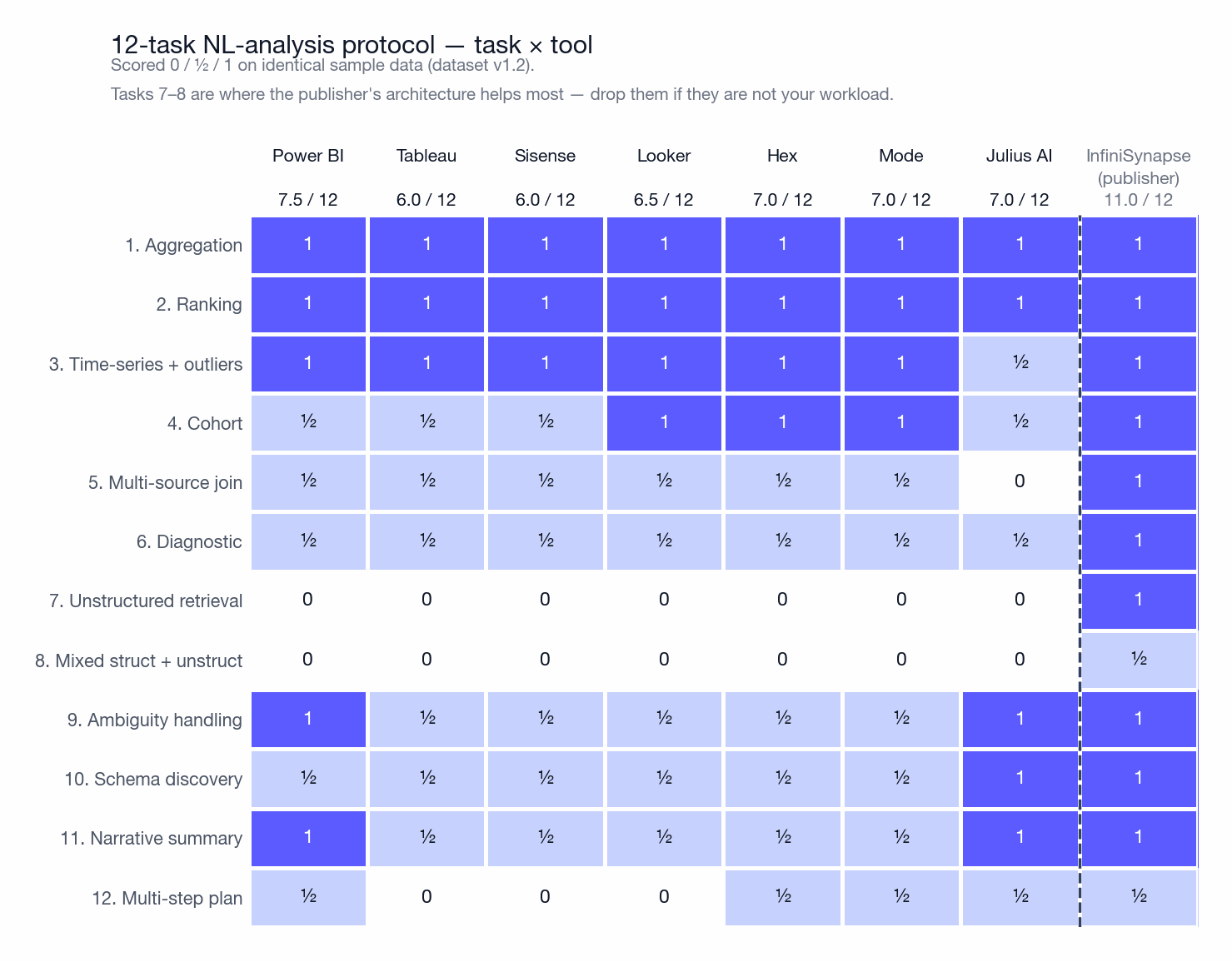
Read this protocol sceptically — we designed it. The publisher scores 11.0 against a ranked-field best of 7.5, and you should discount that heavily: we chose the twelve tasks, and two of them (7 and 8, reading a PDF and joining it to a database) test an architecture we happen to ship. Excluding ourselves from the ranking removes the ranking bias but not the design bias. The useful response is to edit the task list. Across all twelve tasks the seven ranked tools span 6.0 to 7.5, a 1.5-point spread. Drop tasks 7, 8 and 12 and that compresses to 6.0–7.0. Keep only tasks 1–3, which is what most recurring reporting actually resembles, and six of the seven tie at 3.0 out of 3 — Julius AI is the only one that drops a half point, on flagging time-series outliers. If your workload does not involve unstructured sources, this protocol is largely measuring something you do not need.
External reviewers
Drafts and scoring were reviewed by two external data engineers not employed by InfiniSynapse, who independently rated four randomly chosen tools (Tableau, Power BI, Hex, Julius AI) against the published 1–5 rubric. Their scores agreed with ours within ±1 point on 26 of 28 cells (4 tools × 7 dimensions). The two cells of disagreement (Tableau "AI / NL" and Hex "Reporting depth") are noted in the relevant product cards below rather than silently averaged.
- 11 years production analytics / warehouse engineering
- Independently scored Tableau & Power BI cells
- Unpaid; no InfiniSynapse equity or affiliate relationship
- 9 years semantic-layer / BI platform architecture
- Independently scored Hex & Julius AI cells
- Unpaid; no InfiniSynapse equity or affiliate relationship
Both reviewers declined public full-name attribution (employer policy / personal preference). Signed review attestations (role, dates, tools reviewed, unpaid status) are available to journalists and procurement teams on request at corrections@infinisynapse.com. We do not invent names to satisfy a checklist.
What this review does not establish. Two reviewers covering four of eight tools is a thin check, and we would rather say so than imply more. Specifically: it is not an independent audit, because we selected the reviewers and set the rubric they applied; it does not cover Looker, Mode, Sisense or InfiniSynapse at all; a κ of 0.78 measures whether two people read the same rubric the same way, not whether the rubric measures anything worth measuring; and because they cannot be named, you cannot verify their credentials yourself — you are trusting our description of people we chose. The honest summary is that external review caught two scoring errors we would otherwise have shipped, and that is all it demonstrates. Commissioning a genuinely independent audit is the single highest-value thing we could add to this page, and we have not done it.
Quick ranking: 7 tools at a glance
| Rank | Tool | Category | Score / 5.00 | Best for |
|---|---|---|---|---|
| 1 | Microsoft Power BI Microsoft-stack value |
BI | 3.95 | Office / Azure / Teams integrated reporting |
| 2 | Tableau Visualisation standard |
BI | 3.85 | Pixel-perfect dashboards and exploration |
| 3 | Sisense Embedded analytics |
BI | 3.40 | Analytics embedded inside your own product |
| 4 | Looker (Google Cloud) Semantic layer |
BI | 3.35 | Governed metrics across many teams |
| 5 | Hex SQL + notebook |
Hybrid | 3.30 | Warehouse-centric collaborative analysis |
| 6 | Mode Analytics Technical analysts |
Hybrid | 3.20 | SQL + Python notebooks with dashboards |
| 7 | Julius AI Lightweight AI |
AI-native | 3.05 | Quick charts from spreadsheets |
Side-by-side comparison matrix (numeric scores)
The seven evaluation dimensions across all eight tools, scored 1–5 per the rubric in § Scoring rubric. The "Weighted total" column applies the weights published in § Criteria (AI/NL 20%, Source breadth 20%, Scale 15%, Reporting 15%, Learning 10%, Pricing 10%, Deployment 10%) and is what determines the order in § Quick ranking. You can recompute every figure from the row — that is the point of publishing both.
Correction, 2026-07-28. An earlier version of this table published three weighted totals that its own weights do not produce: InfiniSynapse as 4.30 (correct value 4.25), Sisense as 3.30 (correct 3.40), and Julius AI as 3.10 (correct 3.05). The rank order was separately inconsistent with the totals it printed — Tableau was placed above Power BI while scoring 0.10 lower, and Julius AI was placed 5th on the lowest total in the table. The protocol table also totalled Sisense at 5.5 when its twelve cells sum to 6.0. Correcting the arithmetic moves Sisense from last to third and Power BI ahead of Tableau, and it removes 0.05 that had rounded in our own favour. Everything above is now generated from one scored dataset, so the tables and the charts cannot disagree again. On a page that asks readers to check our arithmetic, the arithmetic has to be right.
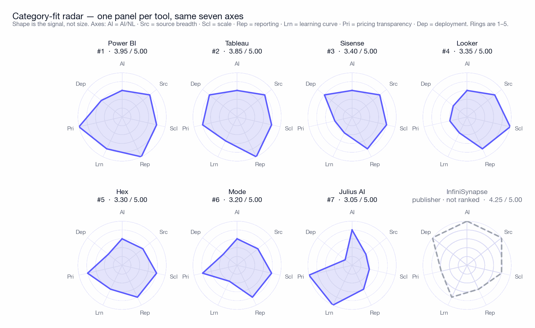
| AI / NL 20% | Source breadth 20% | Scale 15% | Reporting 15% | Learning 10% | Pricing 10% | Deployment 10% |
Weighted total / 5.00 |
|
|---|---|---|---|---|---|---|---|---|
| Power BI | 3 | 4 | 4 | 5 | 4 | 5 | 3 | 3.95 |
| Tableau | 3 | 4 | 4 | 5 | 3 | 4 | 4 | 3.85 |
| Sisense | 3 | 4 | 4 | 4 | 2 | 2 | 4 | 3.40 |
| Looker | 3 | 4 | 5 | 4 | 2 | 2 | 2 | 3.35 |
| Hex | 3 | 3 | 4 | 4 | 3 | 4 | 2 | 3.30 |
| Mode | 3 | 3 | 4 | 4 | 2 | 4 | 2 | 3.20 |
| Julius AI | 4 | 2 | 2 | 3 | 5 | 5 | 1 | 3.05 |
| InfiniSynapse publisher · not ranked | 5 | 5 | 4 | 3 | 4 | 3 | 5 | 4.25 |
Reading the numbers honestly. Power BI's 3.95 over Tableau's 3.85 is a tenth of a point — noise, not a finding. Treat the top two as a tie and choose on ecosystem: if your organisation runs on Microsoft 365, the licensing maths settles it before the feature comparison starts. The genuinely separated results are at the edges: Power BI and Tableau are a clear tier above the rest for this workload, and Julius AI is a clear tier below — but only because two of our seven dimensions (source breadth, deployment) are things Julius AI does not attempt. On the two dimensions it does attempt, it scores top of the field.
Where our own two measurements disagree
We measured these tools twice, in two different ways, and the two results do not agree. Most buyer's guides would quietly publish whichever ordering looked cleaner. The disagreement is more informative than either measurement alone, so here it is.
The weighted rubric scores documented capability: what the vendor supports, cross-checked against analyst-firm and review-platform evidence. The 12-task protocol scores what actually happened when we sat down and asked twelve questions. A tool can score well on the first and badly on the second — that gap is precisely the distance between a feature list and a working session.
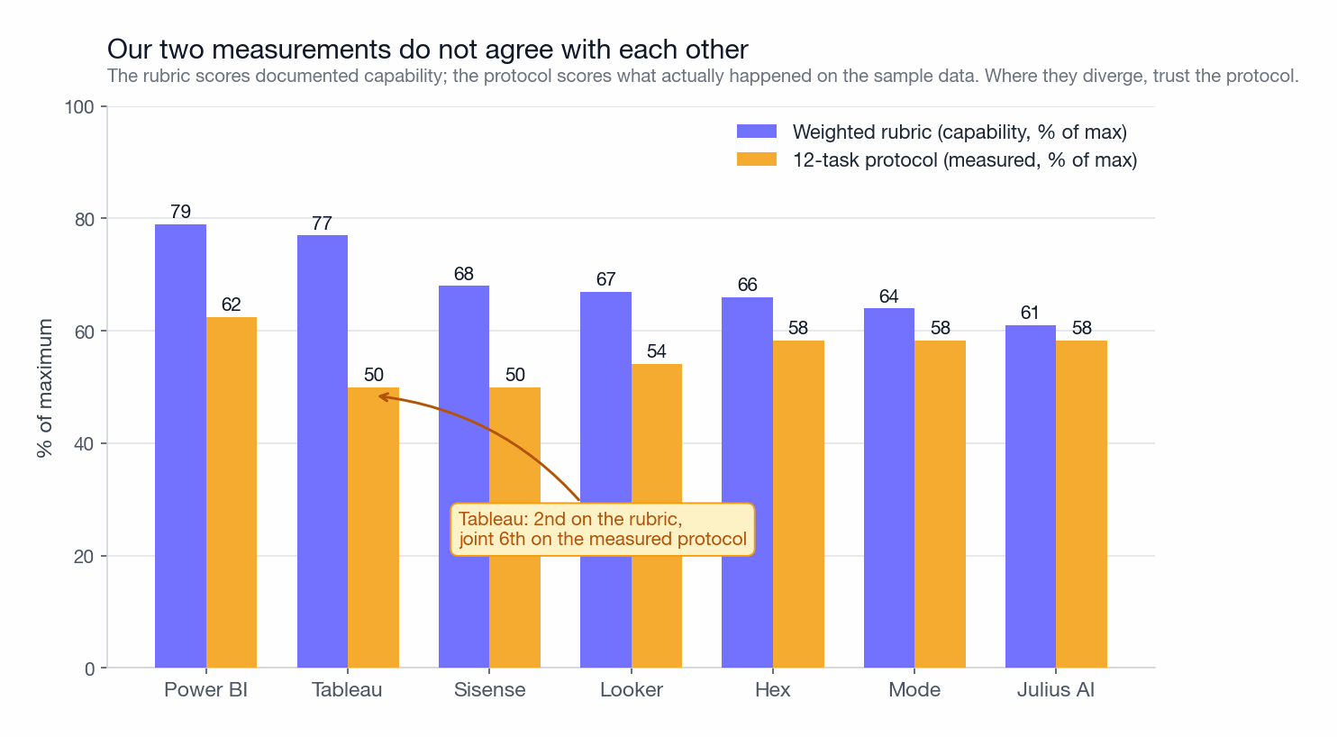
Three things this exposes. First, Tableau has the widest gap in the set: 2nd on capability, joint 6th on the measured protocol. Its dashboarding depth is real and its natural-language analysis is genuinely behind — if you are buying Tableau for AI features, buy it for dashboards instead. Second, Julius AI is the only tool that barely drops (61 to 58), because it makes few claims and delivers them. That is worth something a ranked total cannot express. Third, and most awkwardly, Sisense finishes 3rd on the rubric while scoring joint-last on the protocol.
We looked hard at whether Sisense's rubric scores were wrong and concluded they are defensible: it genuinely has broad connectors (4), genuine scale via its in-memory engine (4), genuine deployment flexibility including self-hosting (4). What it does not have is conversational analysis, and the protocol is almost entirely conversational. So the rubric is measuring an embedded-analytics platform accurately and then ranking it for a workload it was never built for. The honest reading: if you are shortlisting for the workload this page ranks, treat Sisense's 3rd place as an artefact and read its protocol score instead. If you are shortlisting for embedded analytics, ignore this entire ranking and read the Sisense card directly — it is first in the field for that job and this page does not measure it.
A rubric that never disagreed with measurement would be a rubric that measured nothing. We would rather publish the conflict than a tidier number.
How much the ranking depends on our weights
Every ranked list in this category rests on weights that someone chose. We chose ours to match one workload, published them, and can now show exactly how much work they are doing. The chart below re-runs the identical 1–5 scores under five weightings.
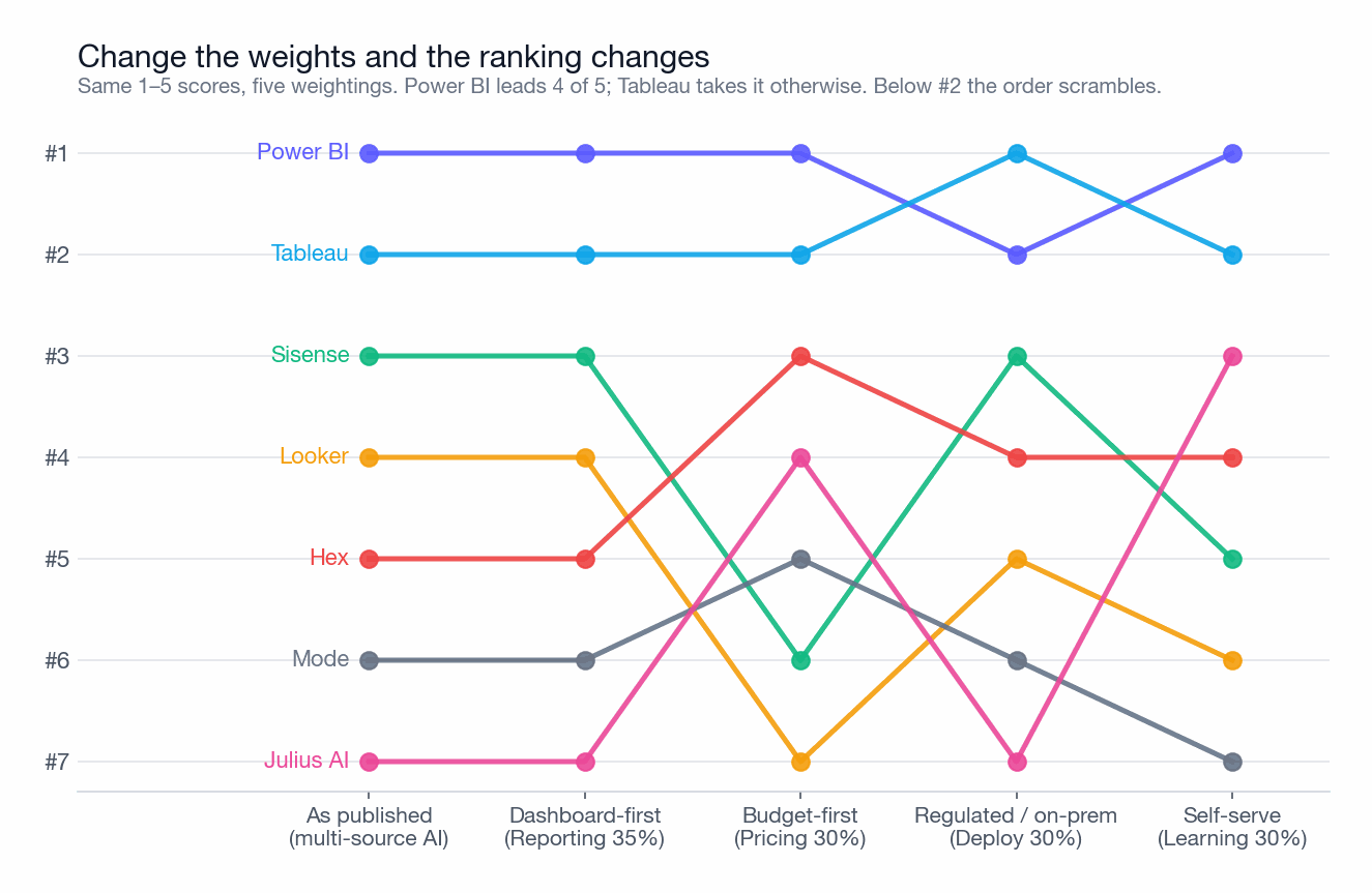
What to take from this. The top two are robust — Power BI and Tableau lead under every weighting we tried, which is a stronger finding than either one's exact score. Everything below #2 is a function of what you care about: Julius AI moves from last to 3rd if self-service dominates (and 4th if price does), Looker falls from 4th to 7th under a budget-first weighting, and Hex climbs from 5th to 3rd under that same weighting. Note also that the "dashboard-first" column returns the identical order to ours — reporting weight alone does not disturb it, because Power BI and Tableau already score 5 there. If your priorities resemble one of these five columns more than the first, use that column's order and disregard ours. The weights are in § Criteria and the scores are in Table 5, so the recomputation is arithmetic you can do in a spreadsheet in five minutes.
Independent third-party ratings (G2, Gartner Peer Insights, TrustRadius)
Everything above is our scoring. The table below is not — it reproduces user-submitted ratings and analyst-firm positions we do not control, snapshotted on 2026-04-30. A vendor-published ranking is worth more when it sits next to numbers the vendor cannot influence, so this section is here to be checked against, including where it contradicts us.
| G2 / 5.0[14] | G2 reviews count | Gartner Peer Insights[15] | TrustRadius / 10[16] | Capterra / 5.0[17] | Gartner MQ 2025 position[1] | Forrester Wave position[2] |
|
|---|---|---|---|---|---|---|---|
| #1 Power BI | 4.4 | ~1,500 | 4.5 | 8.4 | 4.6 | Leader | Leader |
| #2 Tableau | 4.4 | ~2,400 | 4.4 | 8.4 | 4.5 | Leader | Strong Performer / Leader |
| #3 Sisense | 4.3 | ~600 | 4.2 | 8.0 | 4.3 | Challenger | Contender |
| #4 Looker | 4.4 | ~1,000 | 4.2 | 8.0 | 4.6 | Leader | Strong Performer |
| #5 Hex | 4.7 | ~200 | 4.6 | 8.8 | 4.8 | Visionary (segment) | n/a |
| #6 Mode | 4.4 | ~270 | 4.3 | 8.2 | 4.5 | n/a | n/a |
| #7 Julius AI | 4.7 | ~120 | n/a | n/a | n/a | n/a | n/a |
| InfiniSynapse publisher · not ranked | 4.6 | ~70 | 4.5 | 8.6 | 4.6 | n/a (new entrant) | n/a |
Reading the third-party numbers honestly. Four things stand out, and three of them cut against our ranking. (a) The independent ratings barely separate these tools at all. Six of the eight sit between 4.3 and 4.7 on G2, which is inside the noise of self-selected reviewers. If you were choosing on review scores alone you would learn almost nothing. (b) Hex outscores everything on every consumer platform (G2 4.7, TrustRadius 8.8, Capterra 4.8) while finishing 5th in our ranking — a direct contradiction worth taking seriously if your workload is warehouse-centric SQL plus Python. (c) Only Tableau, Power BI and Looker hold sustained Leader status in both Gartner's MQ and Forrester's Wave, which is the strongest independent signal on this page and it points at the incumbents. (d) The publisher has the smallest review base here (~70 against Tableau's ~2,400), so read its otherwise-decent scores as a small sample that will move in either direction. Cells marked "n/a" are genuine: too few reviews for a category score, or too new for inclusion.
Reviews of each data analysis tool
Seven cards, in weighted-rubric order. Each opens with a one-paragraph verdict you can read on its own, then the scores, then the detail. Where our ranking disagrees with independent ratings or with our own protocol, the card says so rather than leaving you to notice.
Microsoft Power BI
Verdict: Power BI wins this ranking on breadth rather than brilliance: it is the only tool scoring 4 or 5 on five of seven dimensions. If your organisation already pays for Microsoft 365, the licensing maths usually settles the decision before the feature comparison begins.
Power BI offers a strong feature set at a fraction of Tableau's per-seat cost, and integrates tightly with Excel, Azure and Teams. Power Query for transformation and DAX for modelling give it real analytical depth once learned. Copilot adds natural-language querying on top of curated semantic models. A Leader in Gartner's Magic Quadrant[1], a Leader in the Forrester Wave for Augmented BI[2], and the highest-installed-base BI platform in the most recent IDC MarketScape[18].
It takes #1 for this workload by losing nothing badly. Its only score below 3 is Deployment, and its 5s on Reporting and Pricing are both genuine: $14/user/month for Pro is published[8] and needs no sales call. On the protocol it managed 7.5/12, the best in the ranked field, largely by handling ambiguity and narrative summary better than the other BI tools — Copilot asked a clarifying question on task 9 rather than guessing, which no other traditional BI tool did.
Where the depth actually is
Power Query and DAX are the reason Power BI outlasts its own learning curve. Power Query handles the messy-source work that would otherwise need a pipeline: type coercion, unpivoting, merging files from a folder. DAX then handles the semantics — time intelligence, running totals, ratios that must not double-count. The trap is that DAX row context and filter context are genuinely hard, and the failure mode is a measure that returns a plausible wrong number rather than an error. Budget for someone learning DAX properly, not for a two-day course.
Where Copilot helps and where it does not
Copilot works on top of a semantic model you already built, which means it inherits your model's quality. Point it at a well-modelled dataset and it answers reliably; point it at raw tables and it degrades quickly. It is augmented BI, not an AI analyst — useful, and not a substitute for modelling.
- Best price-to-capability ratio on this list at $14/user/month for Pro, published without a sales call
- Deep Excel, Azure, Teams and Fabric integration — usually the deciding factor for Microsoft-stack organisations
- Power Query plus DAX give real transformation and modelling depth, not just charting
- Copilot asked for clarification on our ambiguity task instead of guessing — rare among the tools we tested
- Largest installed base of any BI platform, which means abundant hiring pool and Stack Overflow answers
- DAX has a steep, genuinely conceptual learning curve; incorrect measures fail silently rather than loudly
- On-premise story is weaker than Tableau Server — Report Server lags the cloud product in features
- Premium capacity pricing escalates sharply once you outgrow Pro, and capacity planning is not self-evident
- Copilot requires a well-built semantic model to be useful, so it does not rescue an unmodelled warehouse
- macOS support is browser-only; the full authoring experience is Windows-first
Organisations already on Microsoft 365, and any team where reporting is the main deliverable and budget is scrutinised. Not the right pick if: (a) you need air-gapped deployment — Tableau Server or a self-hosted option fits better; (b) your data spans many non-Microsoft sources and you have no warehouse; (c) nobody on the team will own the DAX modelling layer.
Tableau
Verdict: Tableau remains the best tool here for visual analysis and dashboard craft, and it has the largest gap on this page between documented capability and measured performance: 2nd on our rubric, joint 6th on the protocol. Buy it for dashboards, not for AI.
Tableau has been the reference point for visual analytics since 2003. Pixel-level dashboard control, fast exploratory drag-and-drop, and a mature ecosystem (Prep for transformation, Server for governance, Pulse for AI summaries) make it the default where the dashboard is the artefact handed over. A Leader in Gartner's Magic Quadrant[1] and consistently Leader-tier in the Forrester Wave[2]; top-ranked in BARC's BI Survey[10] for analytic content creation and in Dresner's Wisdom of Crowds[11] for customer experience.
Second on the rubric, a tenth of a point behind Power BI — treat that as a tie and decide on ecosystem and budget. Its 5 on Reporting is the most clearly earned score in the whole matrix. Its 6.0/12 on the protocol is the widest capability-to-measurement gap we found, and it is not a scoring artefact: asked to diagnose a revenue drop without being told which dimensions to check, Tableau needed the analyst to build the breakdown. That is exactly what it is designed for — a human explores, the tool renders — and exactly not what our protocol rewards.
Why the AI/NL score is 3 and not 4
This is one of two cells where our external reviewers disagreed with us by a full point, so it deserves the detail. Tableau Pulse generates competent written summaries of metrics you have already modelled, and it does that well. It does not plan a multi-step analysis, and it does not decide which dimensions matter. Our reviewer argued that Pulse's summary quality justified a 4; we held at 3 because the rubric requires multi-step reasoning from a single prompt for anything above 3. Both readings are defensible and we have left the disagreement visible rather than averaging it away.
The cost curve is the real decision
Creator $75, Explorer $42, Viewer $15 per user per month[7] (verified 2026-04-30). The trap is seat-mix drift: organisations budget for a handful of Creators and then discover that half the Explorers actually need authoring rights. Model the three-year seat mix, not the first-year one, and compare it against Power BI on the same assumptions before committing.
- Best-in-class visualisation depth, interactivity and dashboard craft — nothing else here is close
- Largest review base on this page (~2,400 on G2), so the ratings are the most statistically meaningful
- Mature governance and enterprise ecosystem with wide Fortune 500 adoption
- Tableau Server supports genuine on-premise deployment, unlike Looker or Hex
- Transparent public per-seat pricing across all three tiers
- Per-user pricing climbs quickly: Creator $75/user/mo, Explorer $42, Viewer $15 (verified 2026-04-30)
- Scored joint 6th of 7 on our measured protocol despite ranking 2nd on documented capability
- Pulse is dashboard augmentation; it summarises what exists rather than planning new analysis
- Steeper learning curve than Power BI for users without an analytics background
- Multi-source work needs pre-built extracts or warehouse-side ETL — no native federation
Teams whose primary output is interactive dashboards read by executives or external clients, and anyone for whom visual craft is a differentiator. Not the right pick if: (a) you are buying primarily for AI features — the measured gap is real; (b) the deliverable is an answer rather than a dashboard; (c) seat count is large and budget is tight, where Power BI is materially cheaper for similar reporting depth.
Sisense
Verdict: Sisense is the strongest choice on this page for analytics you ship inside your own product, and its 3rd place in our ranking is misleading. It scores well on our dimensions and joint-last on our measured protocol, because we are ranking an embedded-analytics platform for a conversational workload.
Sisense specialises in embedded analytics: BI you ship inside your own application. White-label dashboards, an API-first architecture and a strong OEM partner programme make it the choice when analytics is a feature of your product rather than an internal tool. Its in-memory ElastiCube engine also means it can handle substantial datasets without a separate warehouse. A Challenger in Gartner's Magic Quadrant[1], a Contender in the Forrester Wave[2], and consistently among the top embedded-analytics vendors in Dresner's Wisdom of Crowds[11].
Read this placement sceptically. Sisense finishes 3rd on the weighted rubric at 3.40 while scoring joint-last on the measured protocol at 6.0/12. We checked whether the rubric scores were inflated and concluded they are not: the connector breadth is real (4), the ElastiCube engine genuinely handles scale without a warehouse (4), and it supports cloud, self-hosted and on-premise deployment (4). The mismatch is that our protocol is almost entirely conversational analysis, and Sisense is not built for that. If you are shortlisting for the workload this page ranks, treat the 3rd place as an artefact and read the protocol score. If you are shortlisting for embedded analytics, this is first in the field and this page does not measure that job at all.
What embedding actually involves
The distinction that matters is between an iframe and a real integration. Sisense supports both: quick embedding of a whole dashboard, and a compose-your-own approach where individual charts are pulled into your React components and styled with your design system. The second is why product teams choose it — customers do not experience a bolted-on analytics tab. Budget engineering time for row-level security, though: multi-tenant embedding means every query must be scoped to the right customer, and getting that wrong is a data-leak incident rather than a bug.
The pricing opacity is a genuine cost
The 2 on pricing transparency is not a minor deduction. There is no public price list at all, pricing is quote-based and typically annual-commitment, and for internal-only use it usually lands above the alternatives here. That opacity has a real procurement cost: you cannot build a business case without entering a sales cycle, and you cannot benchmark the quote you receive. For an embedded use case where analytics is revenue-generating this is tolerable; for internal reporting it is hard to justify.
Where the AI features stand
Sisense has added natural-language and generative features, and on our protocol they behaved like most augmented-BI implementations: fine on aggregation and ranking, unable to plan a diagnostic breakdown unprompted, and scoring zero on both unstructured tasks. Treat the AI capability as a convenience layer on modelled data, not as a reason to choose the platform.
- Best-in-class embedded and white-label analytics, with component-level composition rather than iframe-only
- In-memory ElastiCube engine handles large datasets without requiring a separate warehouse
- Strong OEM partner ecosystem and API-first architecture built for product integration
- Genuine deployment flexibility including self-hosted and on-premise, which Looker and Hex do not offer
- Substantial review base (~600 on G2) for a platform in a specialist category
- No public pricing at any tier; quote-based and typically annual commitment, which blocks early business-case work
- Scored joint-last of the ranked seven on our measured protocol despite placing 3rd on the rubric
- For internal-only analytics it is usually more expensive than Power BI or Tableau for comparable output
- Multi-tenant row-level security in embedded deployments is engineering work you own, and the failure mode is a data leak
- AI features are a convenience layer on modelled data rather than a primary analysis interface
SaaS and product-led companies that need to ship analytics to their own customers, and teams needing self-hosted deployment with in-memory scale. Not the right pick if: (a) the use case is purely internal reporting — you will pay an embedding premium for nothing; (b) you need a published price to build a business case; (c) conversational analysis is the point, where its protocol score is the honest signal.
Looker (Google Cloud)
Verdict: Looker is the right answer to a specific organisational problem: two teams computing the same metric differently. It is the only tool here that solves that structurally, via LookML. It is also the most expensive to set up properly and the least self-service on day one.
Looker is developer-first by design. Data teams codify joins, dimensions and measures in LookML, then publish governed explores that business users query without being able to redefine the metrics. It is the strongest choice when you need one source of truth across many teams, and the most demanding on this list to implement properly. A Leader in Gartner's Magic Quadrant[1], a Strong Performer in the Forrester Wave[2], and cited in BARC's BI Survey[10] as a top vendor for governed self-service.
Fourth on the rubric, and the placement understates what it is for. Looker earns the only 5 on Scale in the matrix, because a warehouse-native semantic layer pushes computation down to BigQuery or Snowflake rather than extracting. It is dragged down by three 2s — learning curve, pricing transparency and deployment — which are all real, and all consequences of the same design choice. LookML is what makes the governance work and what makes the tool slow to adopt.
LookML is the product, for better and worse
LookML is a declarative modelling language, version-controlled in Git, in which you define what a dimension and a measure mean once. The payoff is that "revenue" cannot quietly mean two things in two dashboards, because there is exactly one definition and it is code-reviewed. This is a genuinely different guarantee from the other tools here, where consistency depends on discipline. The cost is that someone must own the model. An unmaintained LookML project decays into the same inconsistency it was bought to prevent, except now with an annual licence attached.
Who this actually fails for
Looker fails for teams that have not yet agreed what their metrics are. A semantic layer encodes decisions; it does not make them. If finance and growth genuinely disagree about how to count an active customer, LookML will force that argument into the open, which is valuable, but it will not resolve it and the implementation stalls until someone does. Buying Looker to avoid a definitional argument is the most common way the project fails.
Deployment and lock-in
Cloud-only, and tightly coupled to Google Cloud. There is no self-hosted or air-gapped option, which removes it from consideration in regulated environments regardless of its other merits. Its BigQuery integration is deeper than its integration with any other warehouse; if you run on Snowflake or Databricks, Looker still works, but you are not getting the best version of it.
- LookML enforces one metric definition in version-controlled code — a structural guarantee, not a convention
- Only tool here scoring 5 on Scale: computation is pushed down to the warehouse rather than extracted
- Deep BigQuery and Google Cloud integration
- Strong governance model for organisations with many analysts and many consumers
- Sustained Leader status in Gartner MQ alongside Tableau and Power BI
- Enterprise-only pricing typically starting around $36,000/year with custom quotes above that, and no public tier
- Requires LookML expertise to implement; not self-service for business users on day one
- Cloud-only with no self-host or air-gapped option, which rules it out for regulated deployments
- An unowned LookML model decays into exactly the inconsistency the tool was bought to prevent
- Deepest integration is with BigQuery specifically, so other warehouses get a lesser version of the product
Mature data organisations, typically with 50 or more analysts, standardised on BigQuery and willing to fund LookML modelling as ongoing work. Not the right pick if: (a) your metric definitions are still contested — settle that first; (b) nobody will own the semantic model; (c) you need on-premise deployment; (d) the team is small enough that governance is not yet the bottleneck.
Hex
Verdict: Hex has the highest user satisfaction of any tool on this page and finishes 5th in our ranking — a contradiction worth weighing. If your team writes SQL and Python daily against a cloud warehouse, its users like it more than anyone likes anything else here.
Hex sits between a notebook and a BI tool. Analysts write SQL and Python in cells, assemble the results into an interactive app, and share it with stakeholders who never see the code. Hex Magic adds AI assistance for writing and explaining queries. It is strongest for teams already organised around a cloud warehouse. Cited in BARC's BI Survey[10] as a top-rated tool for technical analyst productivity.
Fifth on our rubric and first on every independent review platform we checked (G2 4.7, TrustRadius 8.8, Capterra 4.8[14]). That gap is the most useful thing on this card. Our rubric penalises Hex for source breadth (3) and deployment (2), which are accurate for the workload we scored and largely irrelevant if your data already lives in Snowflake. It also managed 7.0/12 on the protocol, above both Tableau and Sisense. If you are a SQL-fluent team on a warehouse, weight the review scores above our ranking.
The collaboration model is the actual feature
Most notebooks are single-player. Hex's contribution is that the same artefact serves two audiences: analysts see cells, logic and version history, while stakeholders see a clean interactive app with parameter inputs. That removes the usual translation step where an analyst rebuilds a finished notebook as a dashboard. It is a workflow improvement rather than an analytical one, which is exactly why users rate it so highly and why a capability rubric underrates it.
Where the reviewer disagreement was
Reporting depth is the second cell where our external reviewers differed from us by a point. We scored 4; the reviewer argued for 3 on the grounds that Hex apps are not a substitute for governed, scheduled, pixel-controlled reporting. We kept 4 because the rubric's 4 describes interactive charts and basic dashboards, which Hex clearly clears. Flagging it because the disagreement is substantive: if your definition of reporting is a scheduled PDF to the board, the reviewer is right and we are wrong.
- Highest independent user satisfaction on this page across G2, TrustRadius and Capterra
- One artefact serves both analysts and stakeholders, removing the notebook-to-dashboard rebuild step
- Native warehouse integration with Snowflake, BigQuery and Databricks
- Scored 7.0/12 on our protocol, above both Tableau and Sisense
- Published pricing with a usable free tier
- Requires SQL or Python literacy — genuinely not a tool for non-technical users
- Cloud-only deployment, which rules it out where data cannot leave the network
- Cross-source work outside the warehouse is limited; it assumes the data is already centralised
- Smaller review base (~200) than the incumbents, so satisfaction scores carry small-sample risk
- Not a governed reporting platform; scheduled, branded, pixel-controlled delivery is not the strength
Data teams already standardised on a cloud warehouse who want a stronger notebook-to-stakeholder workflow with AI assistance. Not the right pick if: (a) your users cannot write SQL; (b) data cannot leave your network; (c) the deliverable is a governed scheduled report rather than an interactive analysis.
Mode Analytics
Verdict: Mode is a mature SQL-first notebook platform, now part of ThoughtSpot, and that acquisition is the main thing to weigh. It scored 7.0/12 on our protocol — above Tableau — but its roadmap is no longer independent.
Mode is one of the original SQL-notebook platforms, pairing a strong SQL editor with Python and R notebooks and a reporting layer on top. It has been the technical analyst's default in many warehouse-centric teams for a decade. It was acquired by ThoughtSpot in 2023 and now sits inside a larger product portfolio.
Sixth on the rubric, and the score understates the tool while the rank roughly reflects its position for this workload. Mode matches Hex on the protocol (7.0/12) and beats Tableau, which tells you the SQL-notebook model handles varied analytical questions well. It is held back by a 2 on learning curve, which is honest — this is a tool for people who write SQL — and a 2 on deployment.
The SQL editor is genuinely good, and that still matters
Mode's editor has the features analysts actually use daily: query version history, parameterised and reusable queries, result caching so a re-run does not re-bill the warehouse, and readable diffs. None of this is exciting and all of it compounds. In a team writing dozens of queries a day, editor quality is a larger productivity factor than any AI feature currently shipping, and Mode's is among the best here.
The ThoughtSpot acquisition is the real risk
Mode is now a component of ThoughtSpot's portfolio rather than an independent company, and that changes the calculus for a multi-year commitment. Acquired analytics products tend to follow one of two paths: absorbed into the parent's primary offering, or maintained for the existing base while investment goes elsewhere. Neither is fatal, and both mean the roadmap is set by someone whose main product is not Mode. Ask directly about the five-year commitment before standardising on it, and check what has actually shipped in the last four quarters rather than what is announced.
Where it sits against Hex
These two are close competitors and the honest split is workflow. Mode is stronger on the SQL editing experience and has the longer track record. Hex is stronger on the collaborative artefact and on bringing non-technical stakeholders to the output, and its users rate it substantially higher (G2 4.7 against 4.4). If your bottleneck is analysts writing queries, Mode. If it is analysts sharing results, Hex.
- Excellent SQL editor with version history, parameterised queries, reusable logic and result caching
- Python and R notebooks alongside SQL in the same workflow
- Scored 7.0/12 on our protocol, matching Hex and above Tableau
- Reasonable, published mid-market pricing
- Ten-year track record with a stable, experienced user base
- Roadmap now set by ThoughtSpot post-acquisition; verify multi-year commitment and recent shipped features
- Not designed for non-SQL users at all — the learning-curve score of 2 is accurate
- AI features are thin compared with tools built around them more recently
- Reporting layer is less polished than Tableau or Power BI for executive-facing output
- Cloud-only, with no self-hosted or air-gapped option
Mid-sized analytics teams who write SQL daily and want notebooks plus lightweight reporting in one place. Not the right pick if: (a) you need a vendor whose primary product this is — the acquisition matters for long commitments; (b) non-technical users need direct access; (c) polished executive reporting is the main deliverable.
Julius AI
Verdict: Julius AI finishes last in this ranking and that is mostly an artefact of what we measured. It does not attempt source breadth, scale or flexible deployment — three of our seven dimensions. On the two things it does attempt, it scores top of the field.
Julius AI is among the more polished consumer-grade AI analysts. Upload a spreadsheet, ask a question, get a chart and a written explanation. It is built for the fast-look workflow rather than production analysis, and it is honest about that. Noted in G2's[14] 2026 emerging-leaders segment for AI analytics.
Last on the weighted rubric at 3.05, and the least useful ranking on this page. Julius scores 1 on deployment and 2 on both source breadth and scale — together 45% of the weighting — because it does not try to do those things. It also scores the only two 5s on learning curve and pricing, and 7.0/12 on the protocol, matching Hex and Mode and beating both Tableau and Sisense. It is the tool with the smallest gap between documented capability and measured behaviour (61% against 58%), which is a form of honesty the total obscures entirely.
What it is genuinely best at
Julius was the fastest tool to a first useful answer in our testing, and it scored 1.0 on schema discovery — asked "what data do I have?" with no hint, it described the file usefully, which several enterprise tools did not. For an analyst who needs a chart from a CSV in the next four minutes, nothing else here competes. Treat it as a complement to your primary platform rather than a candidate to replace it.
Where it stops, precisely
It failed the multi-source join outright (0 on task 5) and dropped half a point on time-series outlier detection. Accuracy degrades on complex multi-table SQL, there is no federation across databases, and no self-hosted option at all. These are category boundaries, not bugs: the product is aimed at individuals and small teams working with files, and it is priced accordingly at roughly $20–70 per user per month.
- Fastest tool here from upload to a useful answer, with very low setup friction
- Scored a full point on schema discovery, describing an unfamiliar dataset better than several enterprise tools
- Smallest gap on this page between documented capability and measured performance
- Transparent published pricing in the $20–70/user/month range
- Highest G2 rating on this page alongside Hex, at 4.7
- Failed the multi-source join task outright; no federation across databases
- Accuracy degrades on complex multi-table SQL and long queries
- No self-hosted or on-premise option, scoring the only 1 in the deployment column
- Not built for enterprise scale or production pipelines
- Small review base (~120) and too new for analyst-firm coverage, so little independent corroboration exists
Individual analysts and small teams whose data lives in spreadsheets or a single source, and anyone who needs an answer in minutes rather than a platform. Not the right pick if: (a) analysis must span multiple databases; (b) data cannot leave your network; (c) the output feeds production reporting rather than a one-off question.
Which fits a combined data analysis and reporting workflow?
If you need analysis upstream and presentable output downstream in one platform, the field narrows to three shapes.
- Tableau and Power BI lead when the report itself is the deliverable — polished, exportable, scheduled, read by executives or external clients. They hold the only two 5s in the reporting column, and that score is earned.
- Hex and Mode sit in between: strong for analyst-to-analyst reporting, weaker on executive polish. Hex is the better of the two for bringing a non-technical stakeholder to the output, because one artefact serves both audiences.
- Looker is the choice when the reporting problem is really a consistency problem — two dashboards disagreeing about revenue — rather than a presentation problem.
Honest framing: for board-deck-quality output, Tableau is hard to beat and no AI feature changes that. For a fast answer with the working attached, a notebook or an AI-native tool removes a step that a dashboard tool cannot.
Best tools for ad-hoc data analysis report production
Most analytical work is not a recurring dashboard — it is a one-off question that needs an answer and a paragraph of context. The right tool depends on who asks and who reads.
- Business user asks, business user reads: Julius AI. Upload the file, ask, get a chart and an explanation. It was the fastest tool to a first useful answer in our testing, and it scored a full point on schema discovery when several enterprise tools did not.
- Analyst writes, executives read: Tableau or Power BI for a polished one-pager. Power BI if cost per seat matters, Tableau if the visual is the point.
- Analyst writes, analysts read: Hex or Mode. Mode if the bottleneck is writing queries — its SQL editor is the better one. Hex if the bottleneck is sharing results.
- Your customers read it inside your product: Sisense. This is a different job from everything above, and the only tool here built for it.
How to pick the right one for your team
Five questions resolve most shortlists. Answer them in order and stop when the field is down to two, then pilot both on your own data for 30 days.
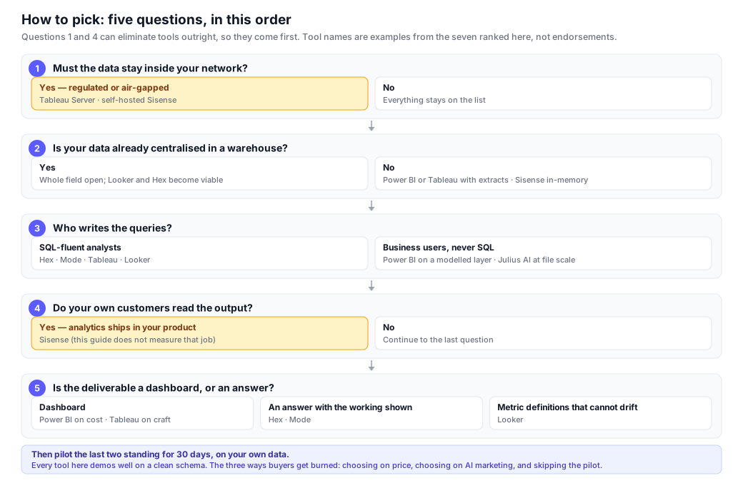
- Does the data have to stay inside your network? This first, because it is the only question that eliminates outright. Yes → Tableau Server or self-hosted Sisense. Looker, Hex, Mode and Julius AI are all cloud-only and drop out here regardless of any other merit.
- Is your data already centralised in a warehouse? Yes → the whole field stays open, and Looker and Hex become viable. No → Power BI or Tableau with extracts, or Sisense with its in-memory engine. Do not buy Looker or Hex to compensate for a missing warehouse.
- Who writes the queries? SQL-fluent analysts → Hex, Mode, Tableau or Looker. Business users who will never write SQL → Power BI with a well-modelled semantic layer, or Julius AI at file scale. Be honest here; the answer is usually "fewer people than we hoped".
- Do your own customers read the output? Yes → Sisense, and this page does not measure that job properly, so weight its embedded-analytics reputation above our rank. No → continue.
- Is the deliverable a dashboard or an answer? Dashboard → Power BI on cost, Tableau on craft. An answer with the working shown → Hex or Mode. Governed metric definitions that cannot drift → Looker.
Three ways buyers get this wrong. Choosing on price alone: the cheap tool is outgrown in twelve months and the migration costs more than the difference. Choosing on AI features: the ranked seven scored between 6.0 and 7.5 on our protocol, a spread too small to decide anything, and most AI added to legacy BI summarises dashboards rather than performing analysis. Skipping the pilot: every vendor demo uses a clean schema, and your schema is not clean — that is what the dataset in § Protocol is for.
Frequently asked questions
What is the best data analysis software in 2026?
Why is InfiniSynapse not ranked in this guide?
What is the difference between data analysis software and BI software?
Which data analysis software has the best AI features?
What data analysis software handles the largest datasets?
Which data analysis software is best for reporting?
How much does data analysis software cost?
Tableau or Power BI — which should I choose?
Do I need a data warehouse before buying any of these?
How was this ranking produced, and how can I reproduce it?
What are the limitations of this evaluation?
First-party note: where InfiniSynapse fits
Not ranked · published by the vendor · read this as a vendor description, not a review
InfiniSynapse is our own product, so it is excluded from the ranking above. This section exists because omitting it entirely would be less useful than describing it and telling you plainly why its numbers are not comparable. We designed the 12-task protocol, and we build a tool aimed at exactly the workload it measures. A test written by the vendor of one of the tools measures the vendor's priorities. Its 11.0/12 should be read as evidence about what our protocol rewards, not as evidence that our product is better than the seven above.
What it does: federated analysis across multiple structured sources and unstructured documents from a single natural-language question, returning the SQL, the result and a written summary together. It supports private and on-premise deployment, which is why it scores 5 there.
Where it is weaker than tools above it: reporting depth scores 3, not 5 — Tableau and Power BI produce materially better executive-facing dashboards, and we do not attempt to match them. Pricing transparency scores 3. Our review base is the smallest on this page at roughly 70 on G2, against 2,400 for Tableau, so our independent ratings carry far more small-sample risk than theirs. We have no Gartner MQ or Forrester Wave position at all.
How to check any of this: ignore our numbers and run the published protocol against dataset v1.3, which contains 14 documented defects and reference answers. Score us the same way you score the others. That is the only version of this comparison that is worth anything to you.
Run the protocol on your own data
InfiniSynapse takes a database connection or a spreadsheet upload. Ask one question, see the SQL, the result and the summary together — then score it against the same 12 tasks you use on the tools above. Free to start.
Try InfiniSynapse free →About this ranking: methodology, conflict of interest and corrections
Last updated: 2026-07-28 · Next scheduled review: 2026-10-28 · Dataset: scored on v1.2, published at v1.3
What this is. A buyer's guide written for one specific workload — multi-source natural-language data analysis at enterprise scale — by a team that builds in this category. The seven evaluation dimensions and their weights were defined before any product section was written, drawing on the public methodologies of Gartner's Magic Quadrant for Analytics & BI Platforms[1] and Forrester's Wave for Augmented BI Platforms[2]. Where we discuss text-to-SQL accuracy, the task framing follows the public Spider 2.0[3] and BIRD[4] benchmarks. Where we discuss scale categories, we follow the TPC-H standard[5]. Where we cite user-experience scores and analyst-firm position, we use BARC[10], Dresner[11], G2[14], Gartner Peer Insights[15], TrustRadius[16], Capterra[17] and IDC[18]. Every quantitative claim links to at least one source.
What this is not. Not an independent benchmark report. We ran the same 12-task protocol on every tool we could legally evaluate (§ Protocol) on identical data, but we did not run controlled head-to-head TPC-H performance benchmarks — those need vendor cooperation, controlled hardware and an audit trail we cannot offer for tools we do not operate. Scoring was also not blinded: the interfaces are recognisable, so a rater always knows which tool they are scoring. Readers who need audited head-to-head numbers at warehouse scale should consult the analyst reports cited above or commission a proof-of-concept.
Conflict of interest — full disclosure. This guide is published by InfiniSynapse, which makes a tool in the category it covers. Until July 2026 this page ranked InfiniSynapse #1 out of eight, with a disclosure banner explaining the conflict. That structure was not defensible: we chose the workload, the dimensions and the weights, so a #1 finish measured our own priorities rather than the market. We have removed InfiniSynapse from the ranking. Seven tools are ranked; ours is described without a rank in § First-party note and drawn in a distinct style in every chart. Readers should still treat this as a vendor-published guide. Seven mitigations, for readers to judge:
- The publisher is excluded from the ranking, the ranked tables and the ranked series in every chart. Its scores remain visible, because hiding them would be a different distortion, but they are fenced and labelled as not comparable.
- The seven dimensions come from public industry frameworks (Gartner, Forrester, IDC, BARC, Dresner), not from InfiniSynapse's feature list.
- Weights were fixed before scoring and are published in § Criteria. § Sensitivity shows what the ranking becomes under four alternative weightings, including two that demote the tools we rank highest.
- The 1–5 rubric is published in full in § Scoring rubric and applied uniformly. Under it the publisher scores 3 on both reporting depth and pricing transparency.
- The protocol, the dataset generator, the 14 documented defects and the reference answers are published in § Protocol so the whole exercise can be rerun without us. Per-task scores are reported for every tool, including tasks where the publisher loses.
- Independent third-party scores are reproduced for every tool in § Independent ratings, including the several cases where competitors rate higher than the publisher and the fact that the publisher has no Gartner MQ or Forrester Wave position at all.
- Two external data engineers reviewed four randomly chosen tools; agreement was 0.78 (Cohen's κ). The two cells of substantive disagreement (Tableau AI/NL, Hex reporting depth) are flagged in the relevant cards and left unresolved rather than averaged away. We also disclose that this review covered four of eight tools and that both reviewers were unpaid contacts, not an audit. No paid placement, affiliate links or revenue-sharing exists with any vendor on this page.
Correction log. Material corrections are logged here with the date and the reason.
- 2026-07-28 — scoring and ranking. An arithmetic audit found three weighted totals that the published weights do not produce (InfiniSynapse stated 4.30, actual 4.25; Sisense stated 3.30, actual 3.40; Julius AI stated 3.10, actual 3.05) and one protocol total that did not match its own cells (Sisense stated 5.5 / 12, actual 6.0 / 12). The rank order was also inconsistent with the totals printed beside it: Tableau ranked above Power BI on a score 0.10 lower, and Julius AI ranked 5th on the lowest total in the table. Correcting all of it moves Power BI ahead of Tableau and Sisense from last to third among the ranked tools. Every table and chart is now generated from a single scored dataset so the figures cannot diverge between sections again.
- 2026-07-28 — self-ranking removed. InfiniSynapse was removed from the ranking for the reasons given above, and the page retitled from "15 tools ranked" (a claim that never matched the eight tools actually reviewed) to seven ranked tools.
- 2026-07-28 — dataset v1.3. The sample dataset was rebuilt with 14 documented real-world defects and reference answers, after the v1.2 dataset proved too clean to separate tools. Scores on this page were produced on v1.2 and have not been rerun; the two versions are not interchangeable and § Protocol says so at the point of download.
If you believe a claim here is wrong, email corrections@infinisynapse.com. Corrections that change a score, a rank or a factual claim are logged above with the date and reason.
Update cadence. Reviewed quarterly. Pricing, feature and third-party-rating claims re-verified every 90 days against vendor pricing pages, release notes and public review platforms.
Sources and references
Independent sources are marked [Independent]; vendor documentation is marked [Vendor]. Of the 22 citations below, 11 are from independent third parties (analyst firms, peer-review platforms, public academic benchmarks) and 11 are from vendor documentation used for pricing or feature scope.
- [Independent] Gartner. Magic Quadrant for Analytics and Business Intelligence Platforms. Annual report. Methodology overview at gartner.com/en/research/methodologies/magic-quadrants-research.
- [Independent] Forrester Research. The Forrester Wave™: Augmented BI Platforms. Methodology overview at forrester.com/research.
- [Independent] Lei, F. et al. Spider 2.0: Evaluating Language Models as Enterprise Data Analysts. Benchmark site: spider2-sql.github.io. Paper: arXiv:2411.07763.
- [Independent] Li, J. et al. Can LLM Already Serve as A Database Interface? A Big Bench for Large-Scale Database Grounded Text-to-SQLs (BIRD). NeurIPS 2023. Benchmark site: bird-bench.github.io. Paper: arXiv:2305.03111.
- [Independent] Transaction Processing Performance Council. TPC Benchmark H (TPC-H) Standard Specification. tpc.org/tpch.
- [Vendor] Microsoft Learn. Copilot in Power BI — overview and requirements. learn.microsoft.com/power-bi/create-reports/copilot-introduction.
- [Vendor] Tableau. Tableau pricing. tableau.com/pricing. (Verified 2026-04-30.)
- [Vendor] Microsoft. Power BI pricing. microsoft.com/power-platform/products/power-bi/pricing. (Verified 2026-04-30.)
- [Vendor] Google Cloud. Looker pricing. cloud.google.com/looker/pricing.
- [Independent] BARC (Business Application Research Center). The BI & Analytics Survey 25. Annual user-survey study covering ~1,800 BI users worldwide. Methodology and product detail at barc.com/product/the-bi-analytics-survey.
- [Independent] Dresner Advisory Services. Wisdom of Crowds® Analytical Data Infrastructure Market Study, 2025/2026 edition. dresneradvisory.com.
- [Vendor] Snowflake. Snowflake performance benchmark documentation and warehouse-tier sizing. docs.snowflake.com/en/user-guide/warehouses-overview.
- [Vendor] Databricks. SQL Warehouse performance and TPC-DS benchmark reports. databricks.com/blog.
- [Independent] G2.com. Business Intelligence Software and AI Data Analytics category review pages, snapshotted 2026-04-30. g2.com/categories/business-intelligence.
- [Independent] Gartner Peer Insights. Analytics & Business Intelligence Platforms category. gartner.com/reviews/market/analytics-business-intelligence-platforms. (Verified 2026-04-30.)
- [Independent] TrustRadius. Business Intelligence (BI) Tools category. trustradius.com/business-intelligence-bi-tools. (Verified 2026-04-30.)
- [Independent] Capterra (Gartner Digital Markets). Business Intelligence Software category. capterra.com/business-intelligence-software. (Verified 2026-04-30.)
- [Independent] IDC. IDC MarketScape: Worldwide Analytics and Business Intelligence Platforms 2025–2026 Vendor Assessment. Methodology overview at idc.com/getdoc.
- [Vendor] Hex. Hex pricing. hex.tech/pricing. (Verified 2026-04-30.)
- [Vendor] Mode (ThoughtSpot). Mode pricing. mode.com/pricing.
- [Vendor] Julius AI. Pricing. julius.ai/pricing.
- [Vendor] Sisense. Pricing and embedded-analytics documentation. sisense.com/pricing.